- Mobile app
- Operations
- Design system
Patronim · case study
From Excel sheets to a service that beats the guest to the door.
A mobile app for a Tel Aviv company that cleans short-term rentals. I designed it in 2019 to replace spreadsheets for six roles; in 2026 I redesigned it around one deadline, the next guest's check-in, and built it as a working prototype with AI.
- Role
- UI/UX Designer
- Timeline
- 2019 · revisited 2026
- Company
- Patronim
- Location
- Tel Aviv, Israel
- Team
- The only UI/UX designer in a team of 8: 2 mobile, 1 front-end and 1 part-time web developer, 2 QA, 1 PM
Deliverables
- UX audit
- User flows
- Service blueprint
- Mobile prototype
- Design system
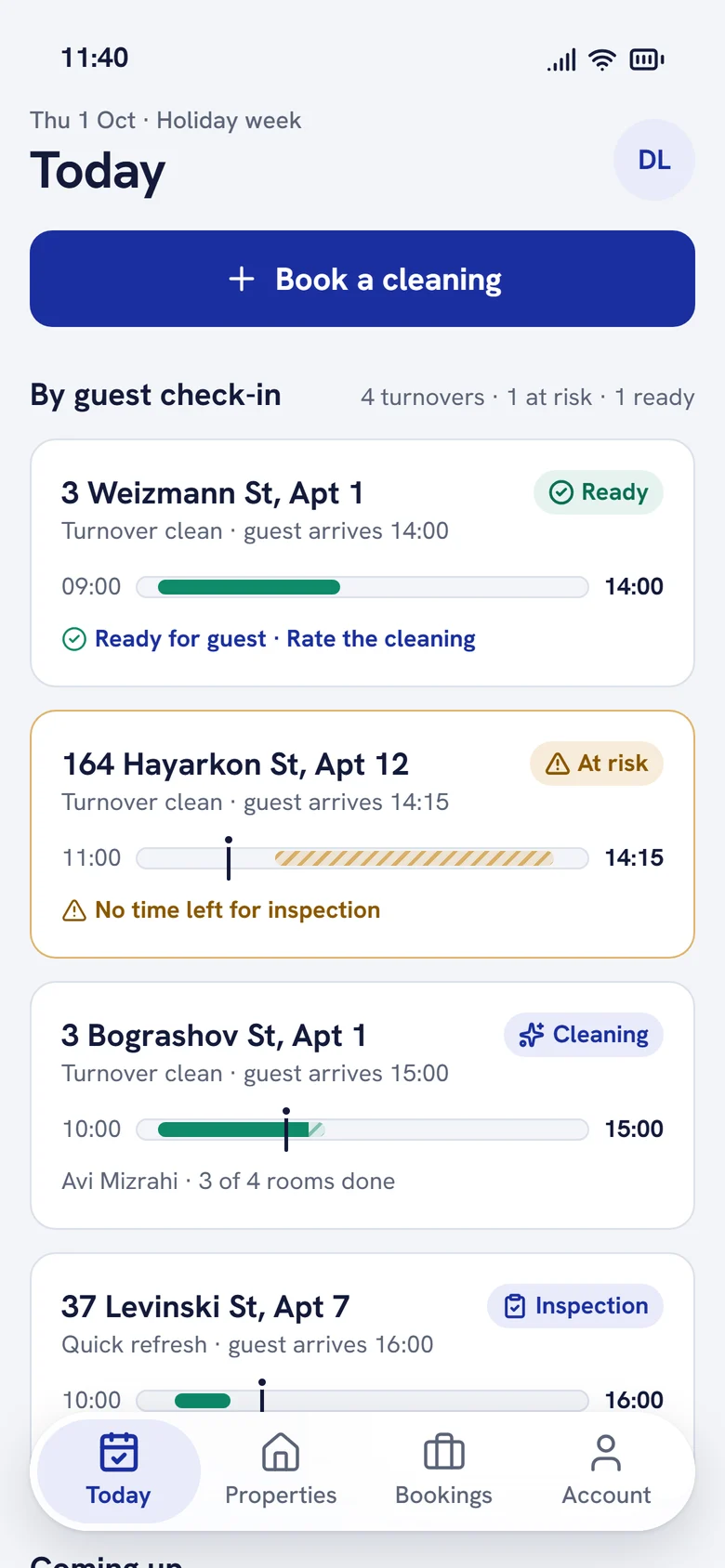
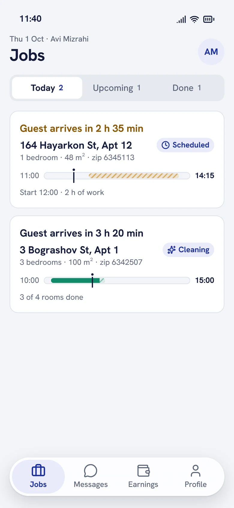
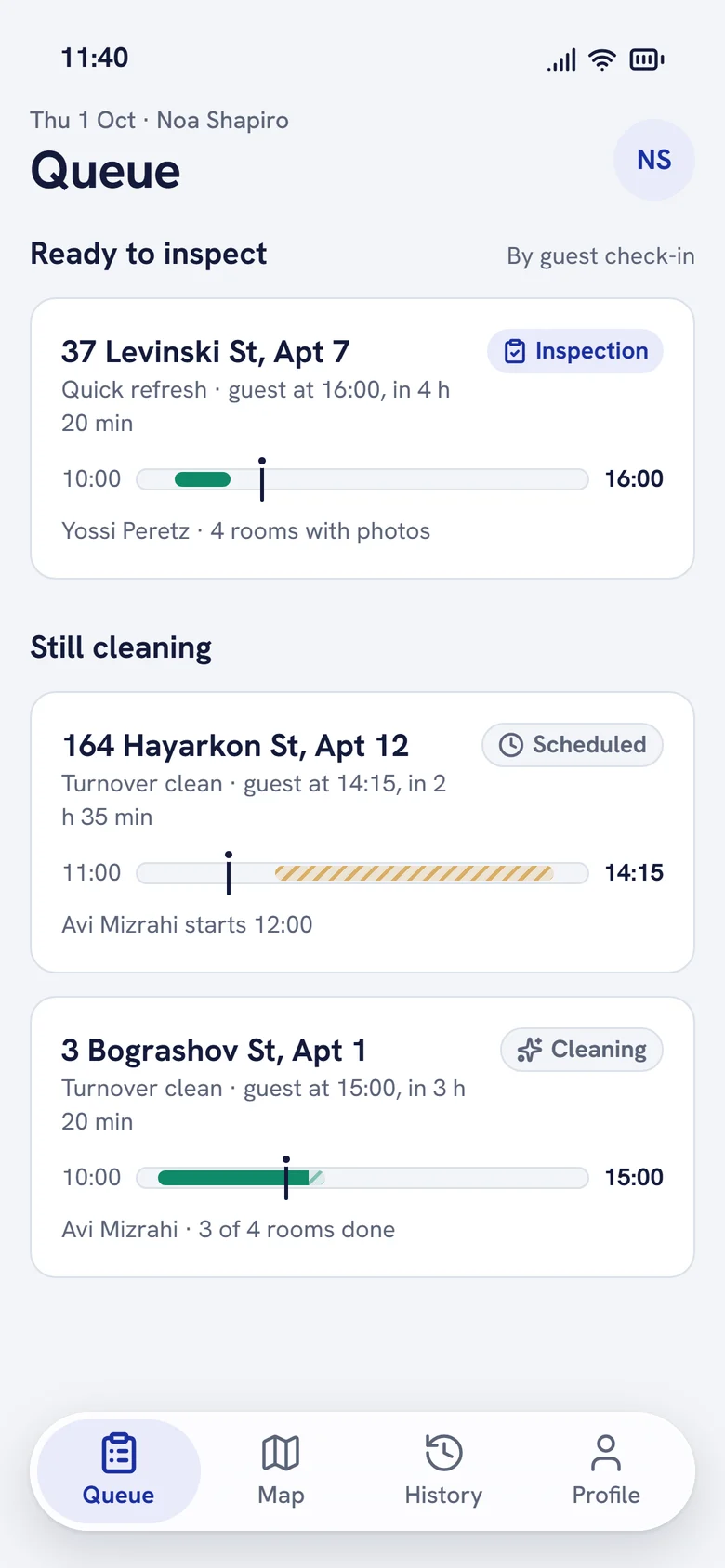
- roles in the 2019 app, replacing spreadsheets
- 6
- of clients said the app made working together easier
- 69%
- roles in one clickable 2026 prototype
- 3
- deadline drives every screen: the guest's check-in
- 1
Overview
In 2019 we replaced Excel. In 2026 I made the app keep its promise.
Patronim cleans short-term rental apartments in Tel Aviv for Airbnb hosts and property managers. Between one guest's checkout and the next guest's check-in there are a few hours. If the flat is not ready, the host loses a review and Patronim loses a client.
In 2019 I was the only UI/UX designer on a team of eight that replaced the company's spreadsheets with a mobile and web app for six roles, with payments, dynamic pricing and refunds. It was used every day.
In 2026 I audited our own screens, redesigned the app around that turnover window and built it as a working prototype with AI, for the three roles who do the work.
Three people, three very different contexts.
Property manager
On a phone between guests. Orders, pays, tracks.
Know the flat will be ready before the guest arrives, and what it costs.
Cleaner
Mid-job in a bright apartment, wet hands, one thumb.
See how much time is left and what counts as done.
Quality inspector
Walking between buildings, checking several flats a day.
Judge the work from evidence and send back one thing, not the whole flat.
Research
Our 2019 app tracked orders. It never promised the flat would be ready.
I went back to our 2019 screens and the original case study, and reviewed them against the real job: a cleaning that has to fit between two guests.
- 01The deadline was optional
- 02The price appeared last
- 03Services spoke our jargon
- 04The cleaner couldn't see the clock
- 05Inspection had no evidence
- 06One blue for everything
Define
One element carries the whole product: the turnover window.
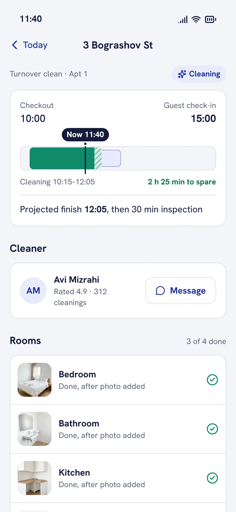
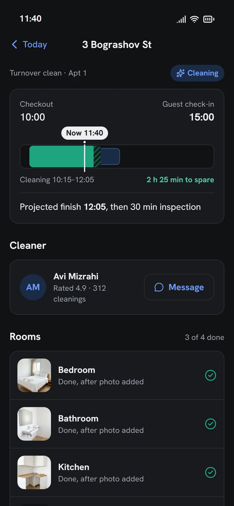
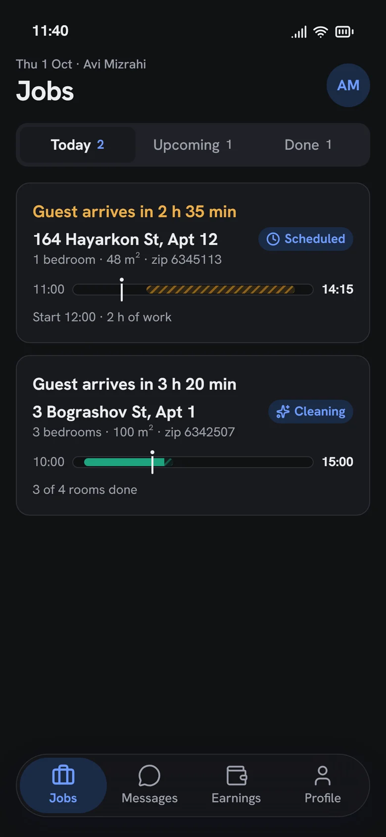
A bar from checkout to the next check-in, with the cleaning block inside and a "now" marker. The same bar appears for the manager, the cleaner and the inspector, and its colour and label say whether the job is on track, at risk or late.
I mapped the hand-offs before drawing a screen.
One job crosses three people. The flow shows where work passes from one role to the next, and where each role sees what the others did.
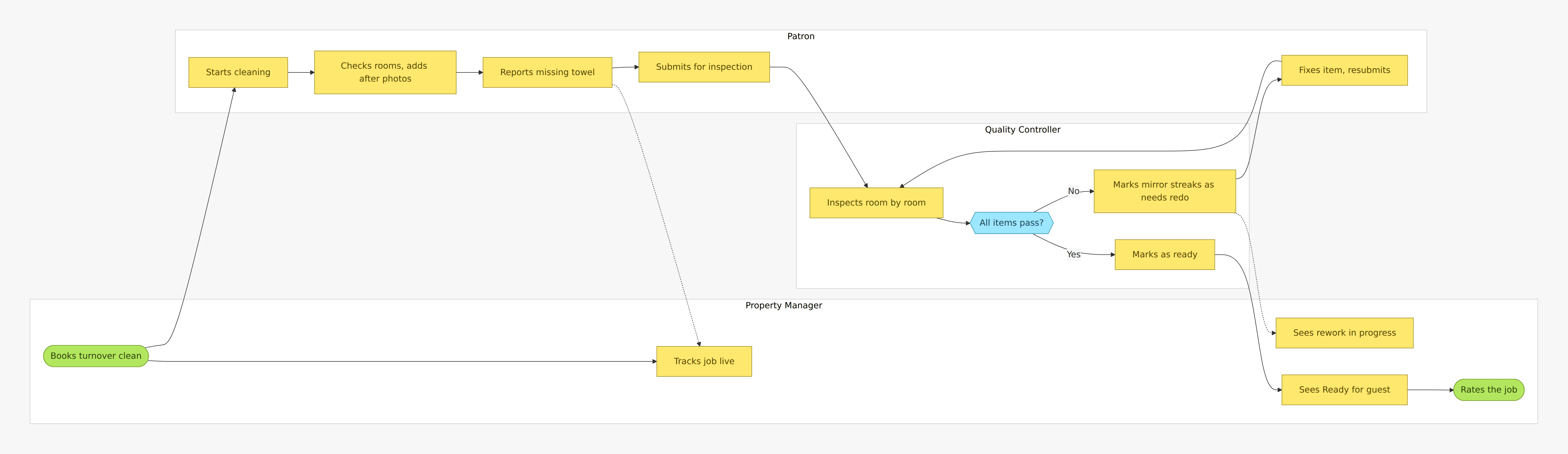
The service blueprint keeps all six roles in view.
The prototype covers three roles. The dispatcher, administrator and client still shape each step, so the blueprint shows them, and the last two rows turn 2019's pain points into the redesign's answers.
01 · Book
- Turnover window
- Guest checks out at 11:00
- Property manager
- Books, sets guest check-in, pays
- Administrator
- Sets pricing rules
- Pain point in 2019
- Check-in optional, price hidden, jargon
- Redesign answer
- Required check-in, live price with reasons, plain names
02 · Assign and prepare
- Turnover window
- Window opens
- Property manager
- Gets next steps
- Cleaner
- Gets the job, sorted by deadline
- Dispatcher
- Delivers linen and amenities
- Administrator
- Plans work, manages users
- Pain point in 2019
- No clear next steps
- Redesign answer
- Four-step what happens next
03 · Clean
- Turnover window
- Cleaning runs inside the window
- Property manager
- Follows rooms and photos
- Cleaner
- Room checklist with photos
- Dispatcher
- Delivers reported missing items
- Quality inspector
- Sees cleaning progress
- Administrator
- Monitors performance
- Pain point in 2019
- Zip code, not the deadline
- Redesign answer
- Window bar and time left on every job
04 · Inspect
- Turnover window
- Inspection before check-in
- Property manager
- Sees rework if needed
- Cleaner
- Fixes items sent back
- Quality inspector
- Pass or needs redo, per item
- Administrator
- Handles disputes
- Pain point in 2019
- No photos, no item-level redo
- Redesign answer
- Photo proof and item-level redo
05 · Handover
- Turnover window
- Next guest checks in at 15:00
- Property manager
- Sees Ready, rates the job
- Cleaner
- Earnings updated
- Quality inspector
- Marks as ready
- Administrator
- Reviews feedback
- Pain point in 2019
- Ready status not explicit
- Redesign answer
- Explicit Ready for guest, then rating
Before and after
Every finding, next to what replaced it.
Finding 01
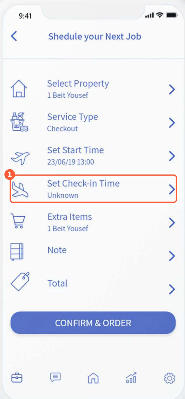
The guest's check-in was optional
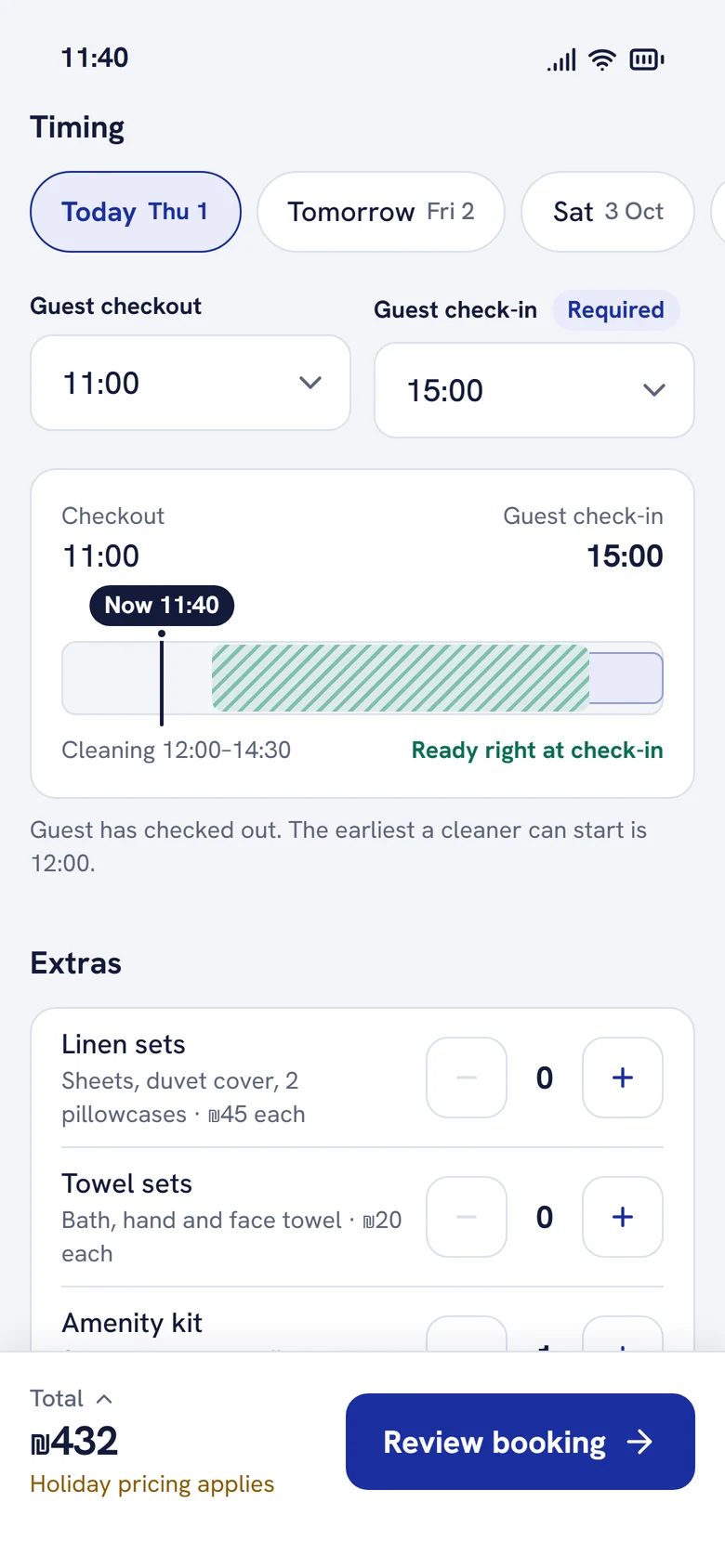
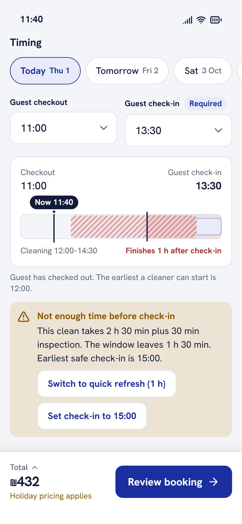
Check-in is required, and the window previews live while you book. If the service won't fit, the app says so and offers the earliest safe option.
Version 1 · 2019
Redesign · 2026
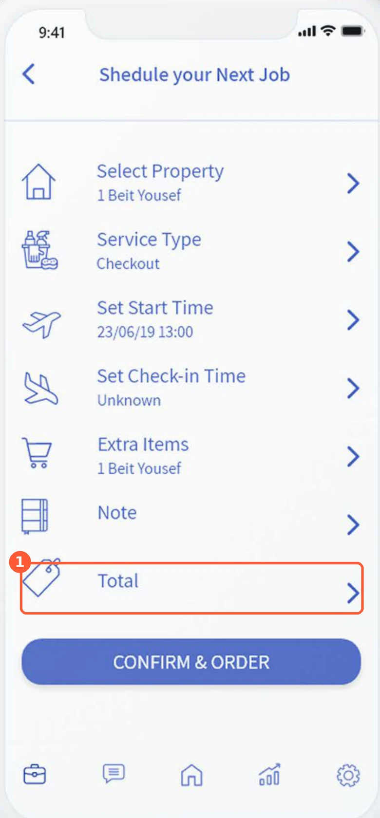
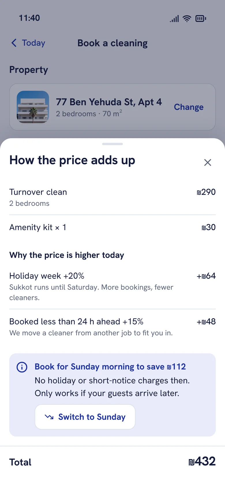
Finding 02
The price appeared only at the end
A live total sits in the footer from the first choice. Tapping it explains every adjustment in plain words, and points to a cheaper time when there is one.
Version 1 · 2019
Redesign · 2026
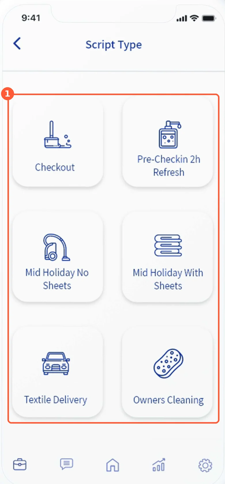
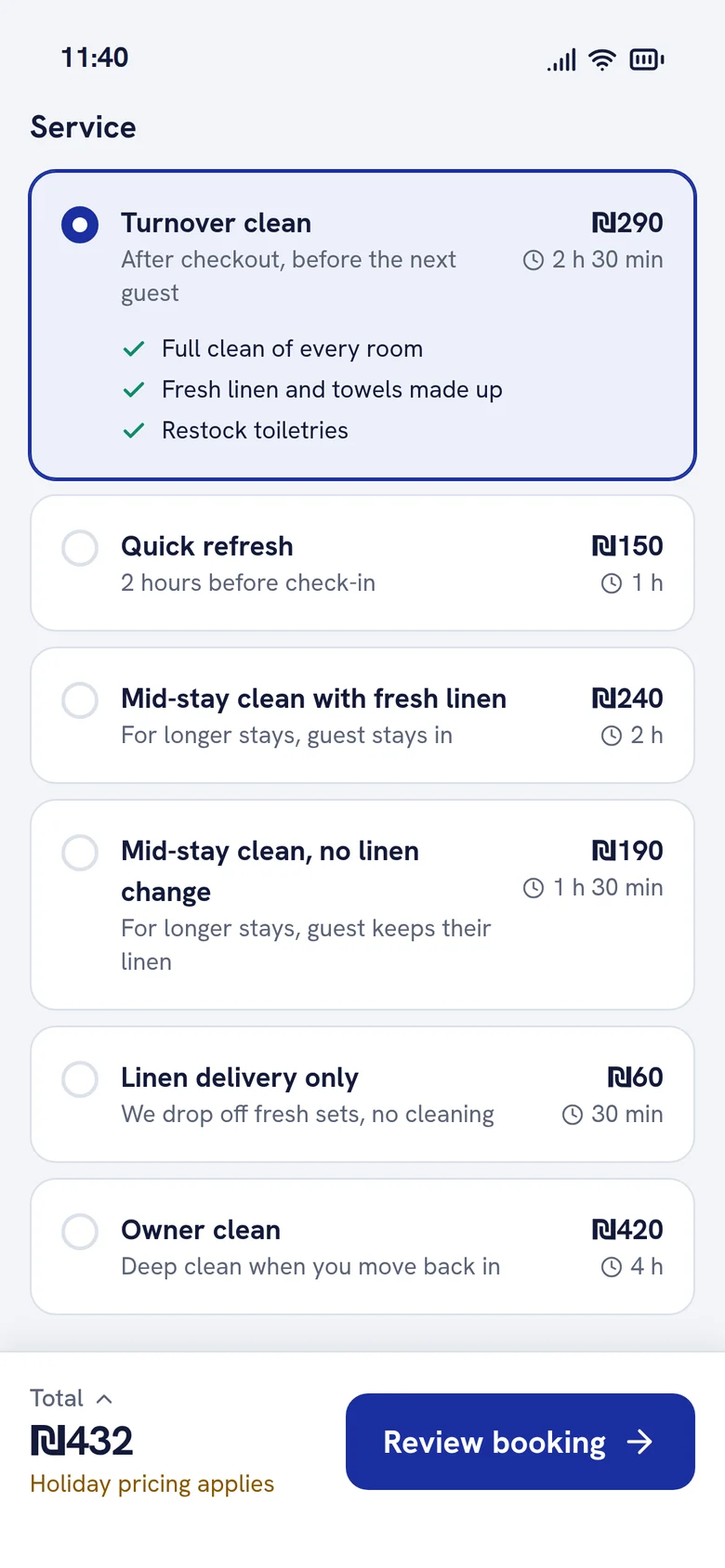
Finding 03
Service names were internal jargon
Plain names, what's included, how long it takes and the price, so a new host can choose without asking.
Version 1 · 2019
Redesign · 2026
Finding 04
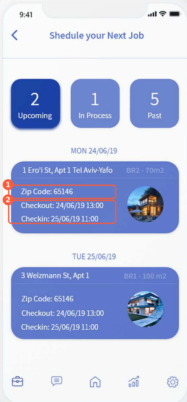
The cleaner couldn't see the deadline
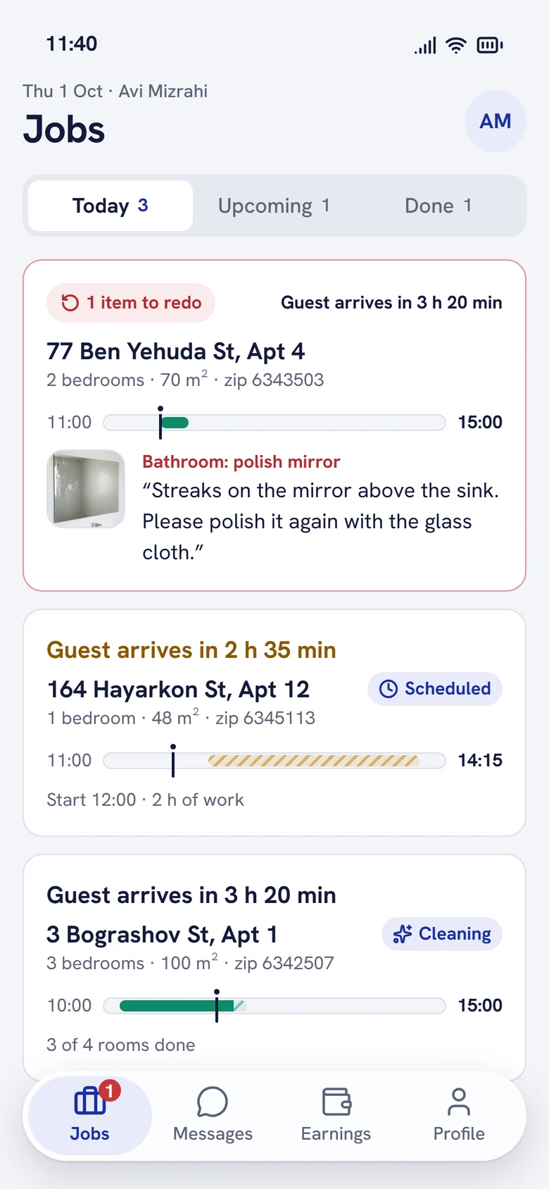
Jobs are ordered by deadline and lead with the time left before the guest arrives. The zip code moved to the second line.
Version 1 · 2019
Redesign · 2026
Finding 05
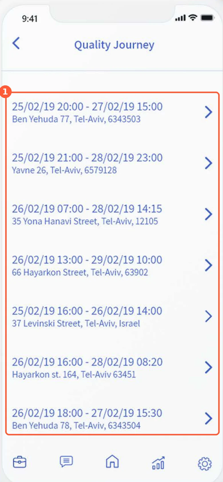
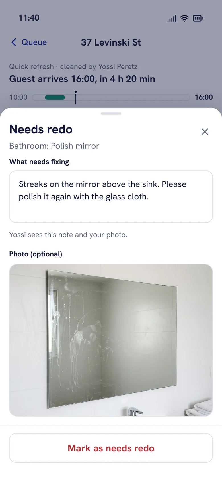
Inspection had no evidence
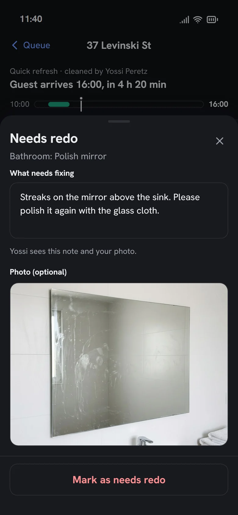
The inspector sees the cleaner's photos room by room, passes or sends back single items with a note and a photo.
Version 1 · 2019
Redesign · 2026
Key flows
Three roles, one job, clicked through end to end.
Property manager
Book, pay, track, rate
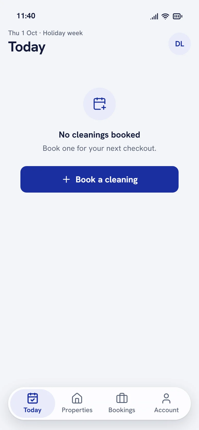
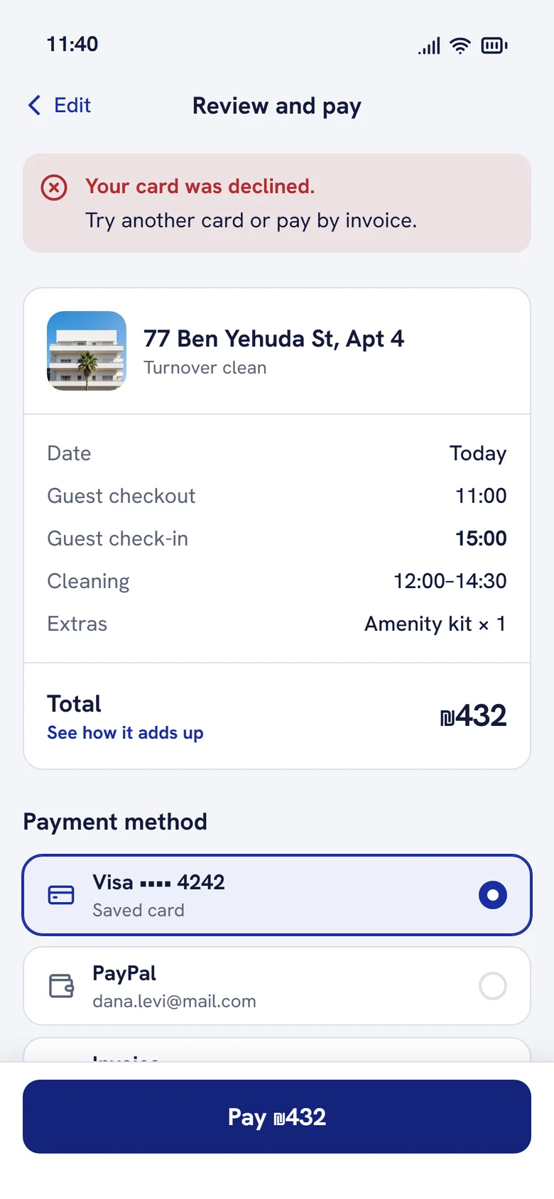
From an empty Today to a rated job. Payment errors say what happened and how to fix it; rework shows as a status, not a surprise.
See the property manager user flow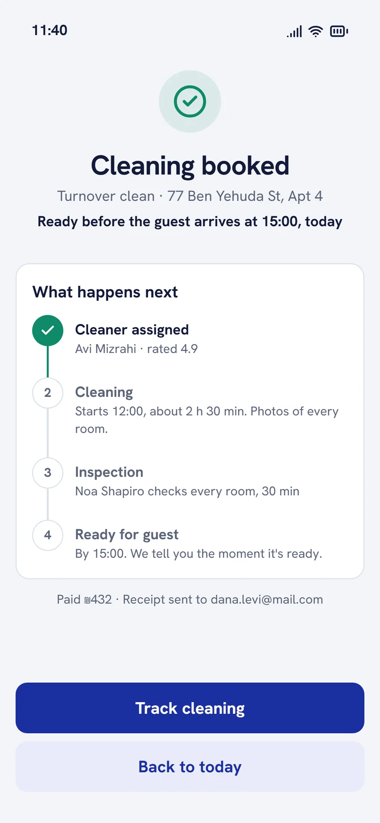
Cleaner
Clean with proof
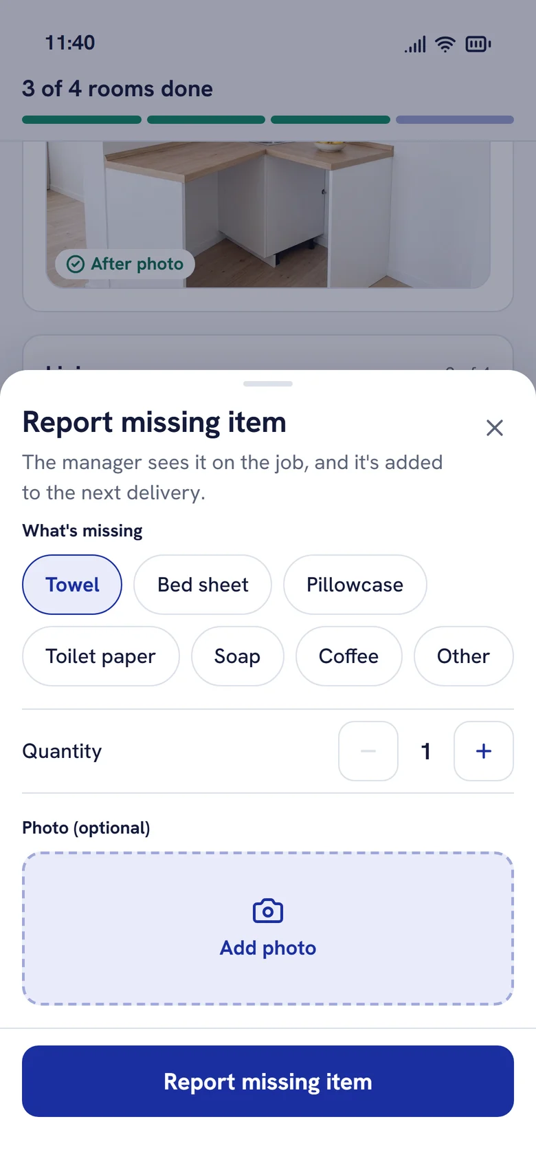
Rooms are sections with a short checklist and a required after photo. Missing items are reported from the job, and anything sent back returns to the top of the list.
See the cleaner user flow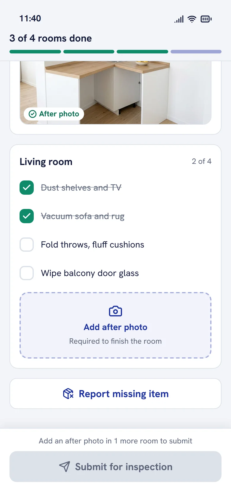
Quality inspector
Inspect and decide
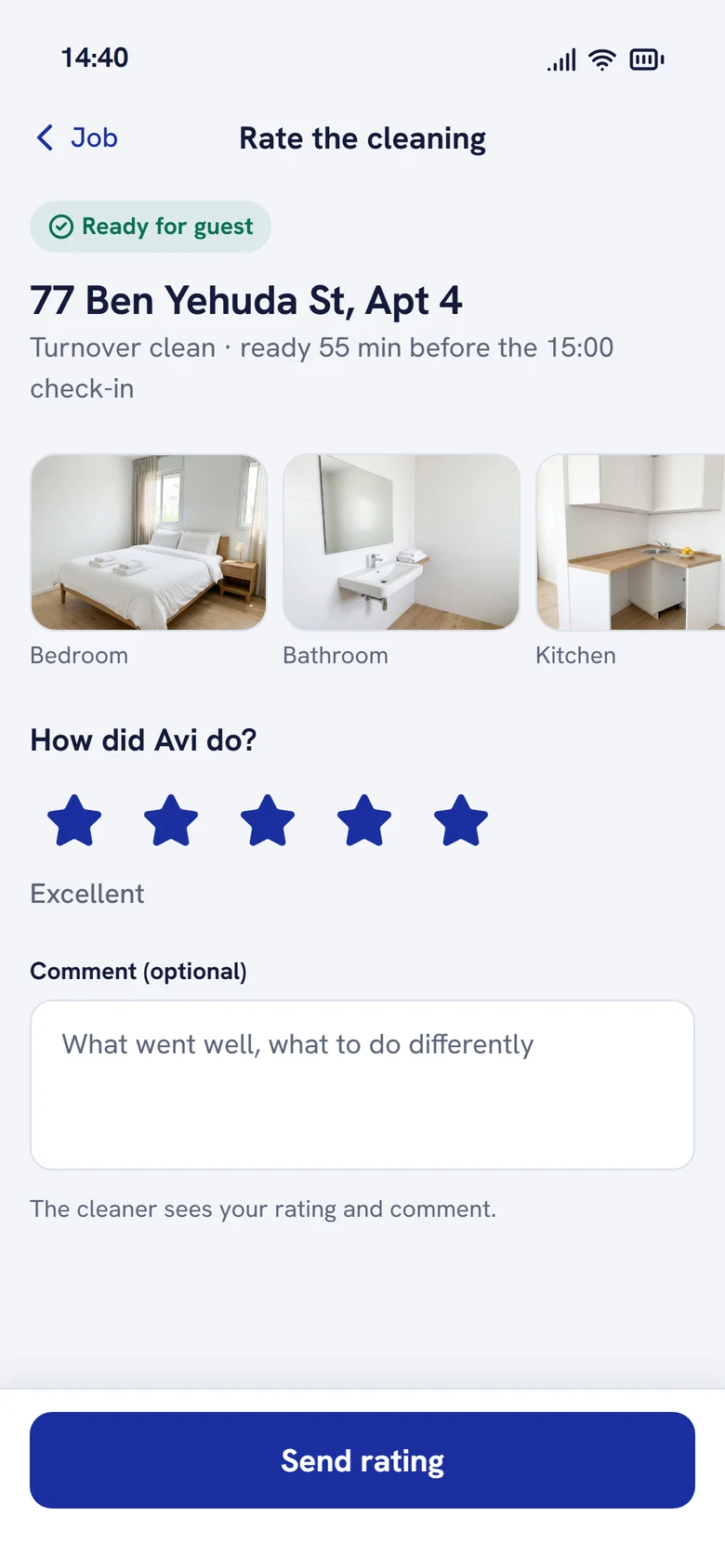
Room by room, item by item. One failed item sends the job back with a note; all passed marks it ready and tells the manager.
See the quality inspector user flowHard states
The screens nobody asks for are the ones that build trust.
Design system
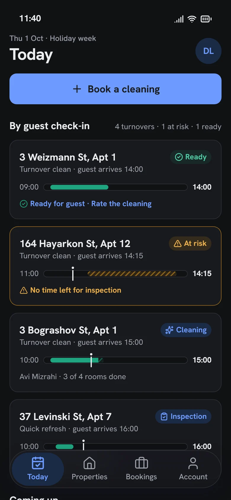
Built on a system, in light and dark.
Tokens for colour, type, radius and spacing live in one file and drive both the app and Storybook, where every component is documented. The dark theme uses neutral graphite with blue only for actions: my first dark palette drifted into purple, and I rebuilt it.
- •Status is always colour, icon and label, never colour alone
- •Separate text colours for success and risk, so labels pass AA contrast
- •Touch targets of at least 44 points for wet hands and one thumb
- •Tabular numbers for every time and price
Outcome
What 2019 delivered, and what 2026 adds.
8
people in the 2019 team, with me as the only UI/UX designer
1,460
hours of development for the 2019 app
69%
of clients said the app made working together easier
3
roles connected in one clickable 2026 scenario
15
key screens, in light and dark
6
hard states: empty, loading, error, at risk, offline, rework
We are happy with the app we got. [The team] are very proactive and provide recommendations before we even ask them. Some other companies we worked with waited for our instructions instead of making suggestions. [They] went above and beyond to meet all our needs.
Key takeaways
Three things this project taught me.
- 01
Design around the deadline
Guest check-in was an optional field. Making it required and visible to every role turned an order tracker into a promise.
- 02
Explain the price before it's a question
Dynamic pricing feels unfair when it's hidden. Explaining each adjustment, and offering the cheaper time, turns a surprise into a choice.
- 03
Proof beats a checkbox
Photos per room and item-level redo let the inspector send back one mirror, not a whole apartment.
Try it yourself
Switch between the manager, cleaner and inspector in the live prototype, or read the design system.