- Mobile app
- Public transport
- Design system
Eticket · case study
One tap at the turnstile, the next tram on Home.
Kharkiv's electronic travel card for the metro, trams, trolleybuses and buses. In 2020 I designed the first app with two developers; in 2026 I redesigned it around the two moments that matter, paying at the turnstile and knowing when the next tram comes, and built it as a working prototype with AI.
- Role
- Product Designer
- Timeline
- 2020 · revisited 2026
- Company
- Eticket
- Location
- Kharkiv, Ukraine
- Team
- Product designer in a team of 3, with 2 developers
Deliverables
- UX research
- UX audit
- User flows
- Mobile prototype
- Design system
- steps to pay at the turnstile, now a single tap with the phone
- 5 → 1
- of the riders we researched in 2020 rode with a plastic card
- 68.8%
- of the Kharkiv metro, with the current names after the 2022–2024 renaming
- 3 lines, 30 stations
- scenarios, clickable end to end, from a declined tap to a lost card
- 14
Overview
In 2020 we put Kharkiv's travel card into a phone. In 2026 I made paying take one tap.
Eticket is Kharkiv's electronic travel card for the metro, trams, trolleybuses and buses. You top it up, and each ride is charged at the turnstile or the validator.
In 2020 I was the product designer on a team of three, with two developers. We shipped the first Eticket app: the card in your phone, top-ups, nearby stops, route search and trip history.
In 2026 I audited our own app and redesigned it around the two moments a rider actually cares about: getting through the turnstile, and knowing when the next tram comes. I built the redesign as a working prototype with AI, with the design system in Storybook.
Three riders, three very different mornings.
Daily commuter
Same two or three routes every day.
Through the turnstile fast, and not to miss the tram.
Student with a reduced fare
Price-sensitive, rides daily.
The reduced fare to just work, and to know when it expires.
Visitor
No card, may not read Ukrainian.
A ticket in two minutes and simple directions.
The problem
Riders had four problems. Our app solved them on paper, not at the turnstile.
What riders told us in interviews, 2020
- 01Cash and queuesTopping up a plastic card meant a line at a terminal.
- 02Paper and plasticPaper tickets and cards, used once and thrown away.
- 03VisitorsIf you are not local, buying a ticket is hard.
- 04WaitingLong, unpredictable waits at stops.
What I found in our own app (audit, 2026)
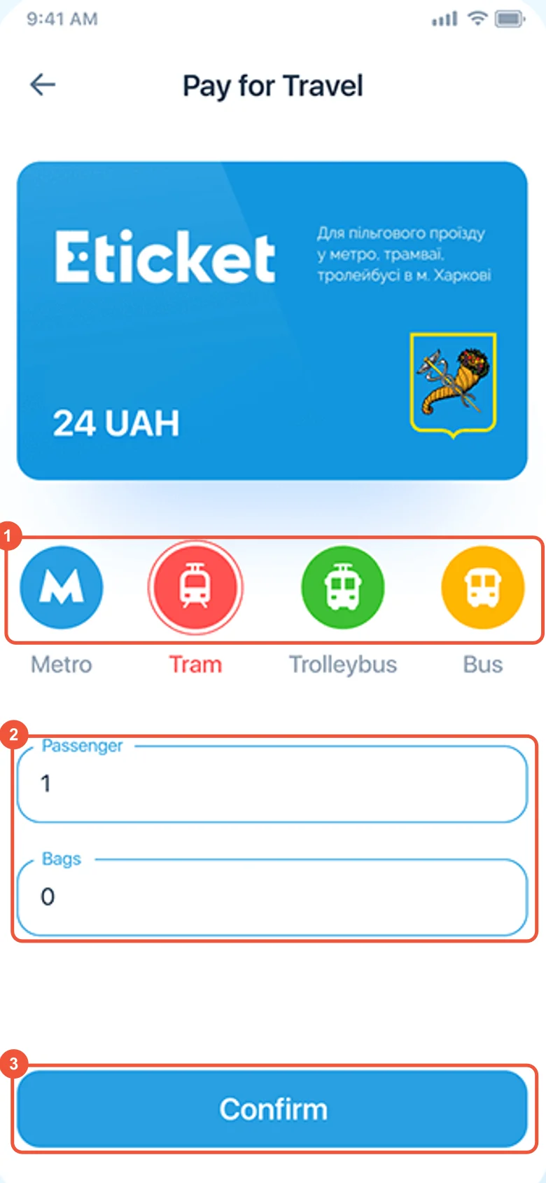
- 01Paying took five stepsOn "Pay for Travel": pick the transport type, passengers, bags, check the total, confirm, then hold the phone to the terminal. At the turnstile, the moment with the least patience.
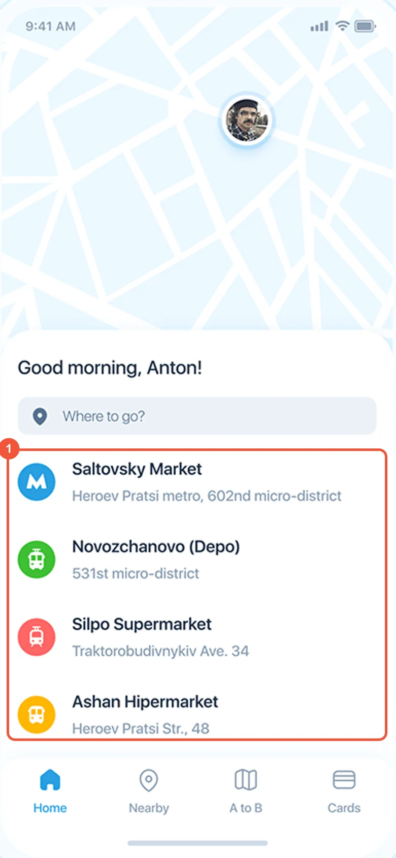
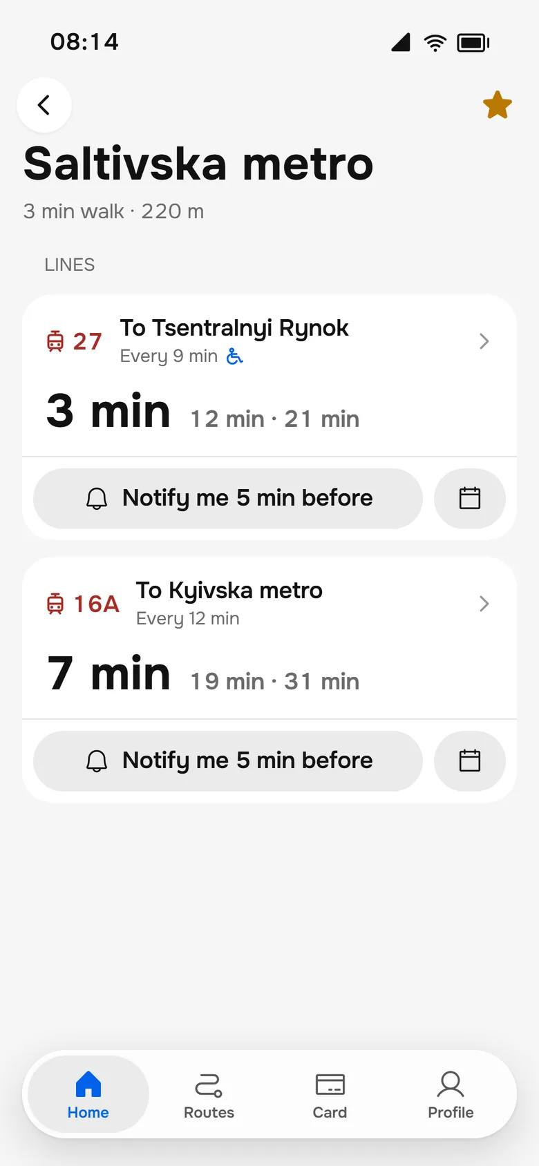
- 02Stops without arrivalsHome listed nearby stops but not when the next vehicle comes, although waiting was one of the four problems.
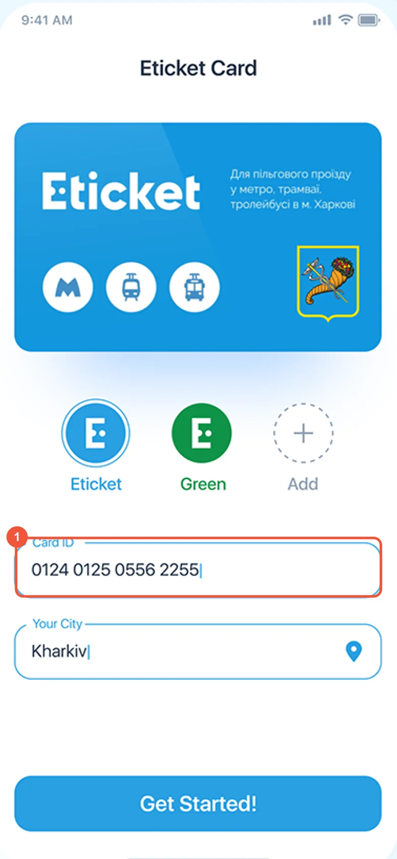
- 03Visitors could not startOnboarding asked for the number of a plastic card they don't have.
- 04No Apple Pay or Google PayTop-up offered a linked bank card and a custom keypad, while our research showed riders already pay by phone.
- 05Two places to search a routeHome and "A to B"; tabs named "Cards" and "Payments" for the same thing.
Research
We started with riders, not screens.
In 2020, before designing the first app, we interviewed Kharkiv riders and mapped a morning commute from home to work. The four problems above came from those conversations.
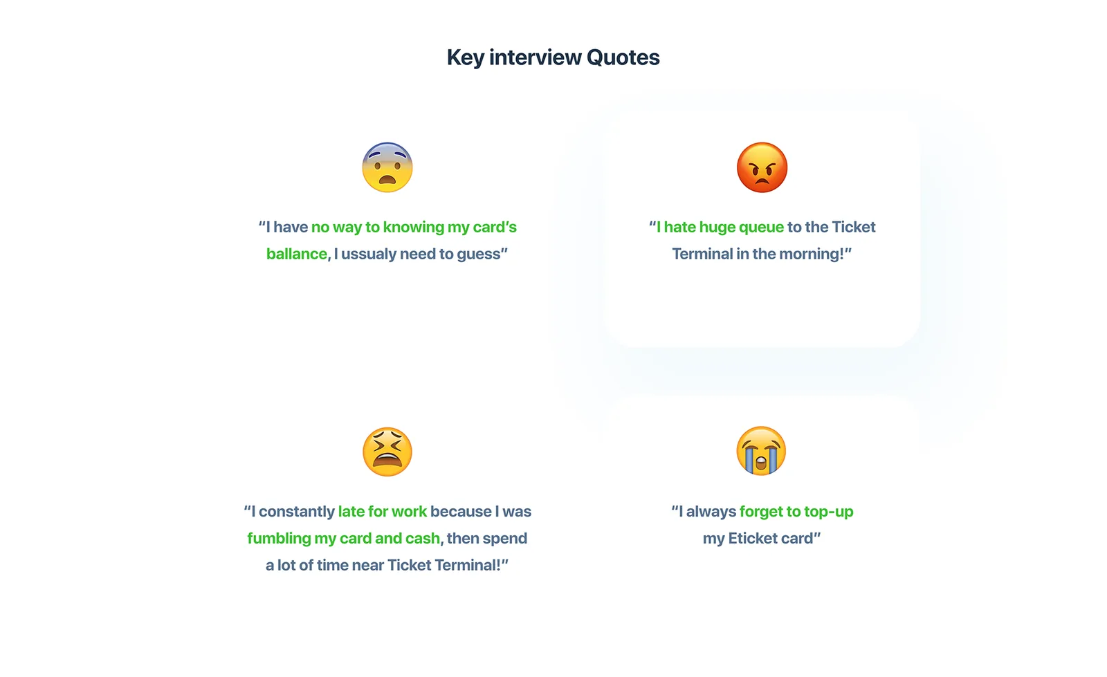
Key interview quotes
I have no way of knowing my card's balance, I usually need to guess.
Kharkiv rider, 2020 interview I hate the huge queue to the ticket terminal in the morning!
Kharkiv rider, 2020 interview I'm constantly late for work because I was fumbling with my card and cash, then spent a lot of time near the ticket terminal!
Kharkiv rider, 2020 interview I always forget to top up my Eticket card.
Kharkiv rider, 2020 interview
Customer journey: getting to work
01 · Goal
- Doing
- Often late, rushing to catch transport
- Pain
- Trams and trolleybuses break down; walks to the metro
- Feels
- Late and irritable all day
02 · Route
- Doing
- Decides how to get to work, checks Google Maps
- Pain
- No schedule and no routes on the Eticket website
- Feels
- Doesn't know the route
03 · Transport
- Doing
- Waits at the trolleybus stop, changes to the metro
- Pain
- Can't check the card balance at the stop; crowds at the door
- Feels
- Struggles to get on
04 · Payment
- Doing
- Pays in the trolleybus and the metro
- Pain
- Top-up only at a terminal
- Feels
- Can't pay, or struggles to
05 · Service
- Doing
- Buys a single ticket or tops up at a terminal
- Pain
- Slow, difficult processes
- Feels
- Loses time buying and topping up
Who we designed for
- •Riders who use public transport and a smartphone every day, mostly students and office workers.
- •68.8% of them rode with a plastic card: the green Eticket or the student travel card.
- •Card and phone payments were common next to cash; the metro and buses were used most.
68.8%
of the riders we researched rode with a plastic card
The priority we set in 2020: easy payment and top-up, no cash and no paper tickets; see the travel balance; pay by smartphone; link a bank card; move money to another Eticket card; track transport, see schedules, find the nearest stops and build a route from A to B.
The original 2020 research slides
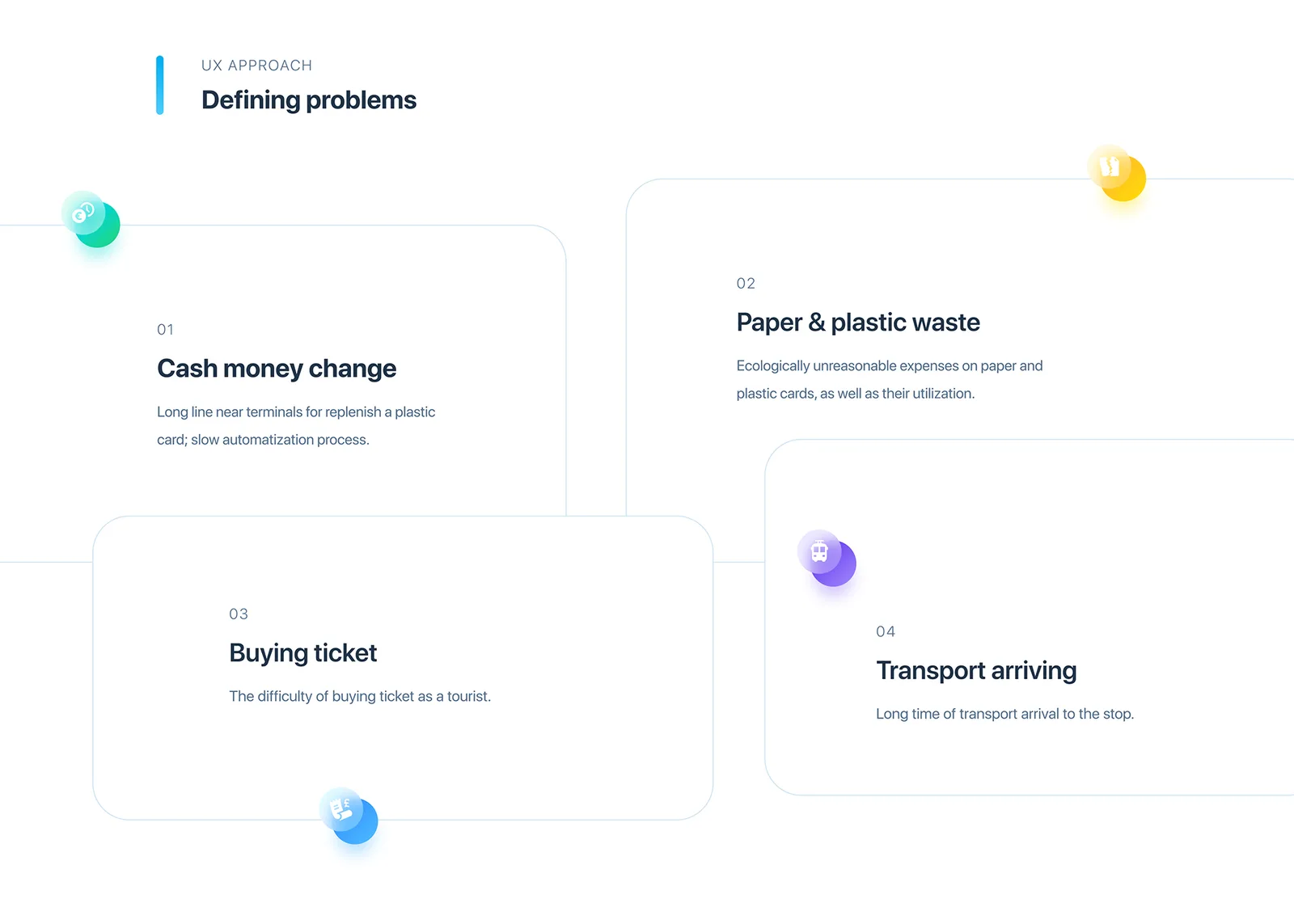
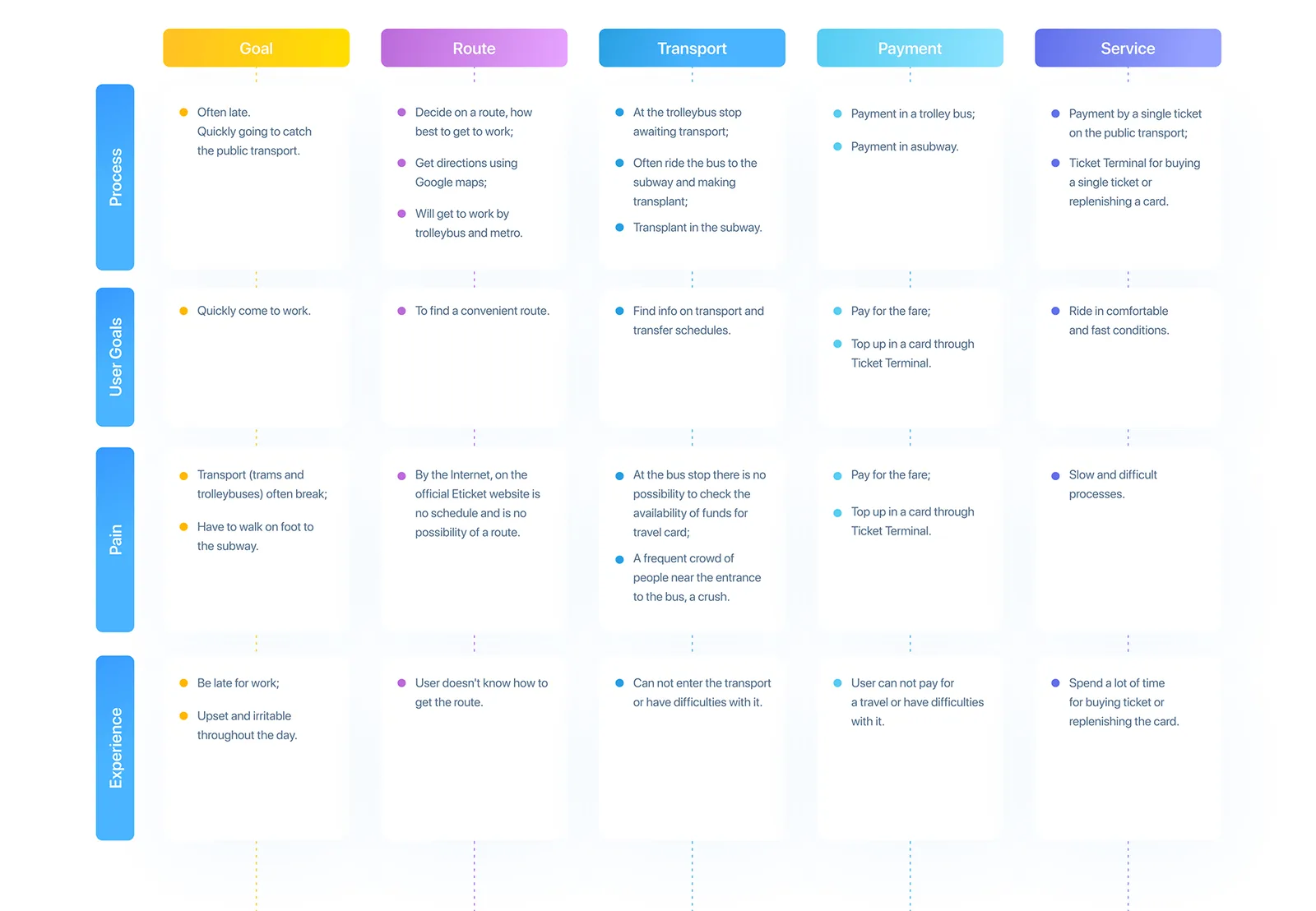
In 2026 I went back to these findings and audited our shipped app against them, screen by screen.
Goals
What the redesign has to do, for riders and for the city.
For riders
- 01Pay in one tap, even offline, without unlocking the phone.
- 02See when the next metro, tram or bus comes, right on Home.
- 03Never get stuck at the turnstile with no balance.
- 04Ride as a visitor without an account or a plastic card.
For the city and the operator
- 01Fewer paper tickets and shorter lines at top-up terminals.
- 02More rides paid digitally.
- 03Higher satisfaction through predictable arrivals.
Launch targets, to set with the operator
- Share of rides paid by phone
- Target: 60% in the first year
- Declined taps per 1,000 rides
- Target: down by half
- Top-ups in the app vs terminals
- Target: 70% in the app
- Visitor time from install to first ride
- Target: under 2 minutes
Four rules that decided every screen.
- 01
The turnstile moment is sacred
Nothing between the person and the gate.
- 02
Arrivals, not stops
A stop is only useful with the time of the next vehicle.
- 03
Money is visible
Balance, fare and trips left, one glance away.
- 04
Works for someone who just arrived
English, no account, no card.
Flows
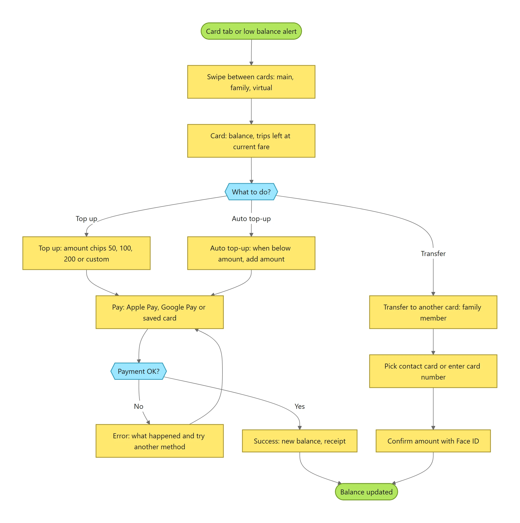
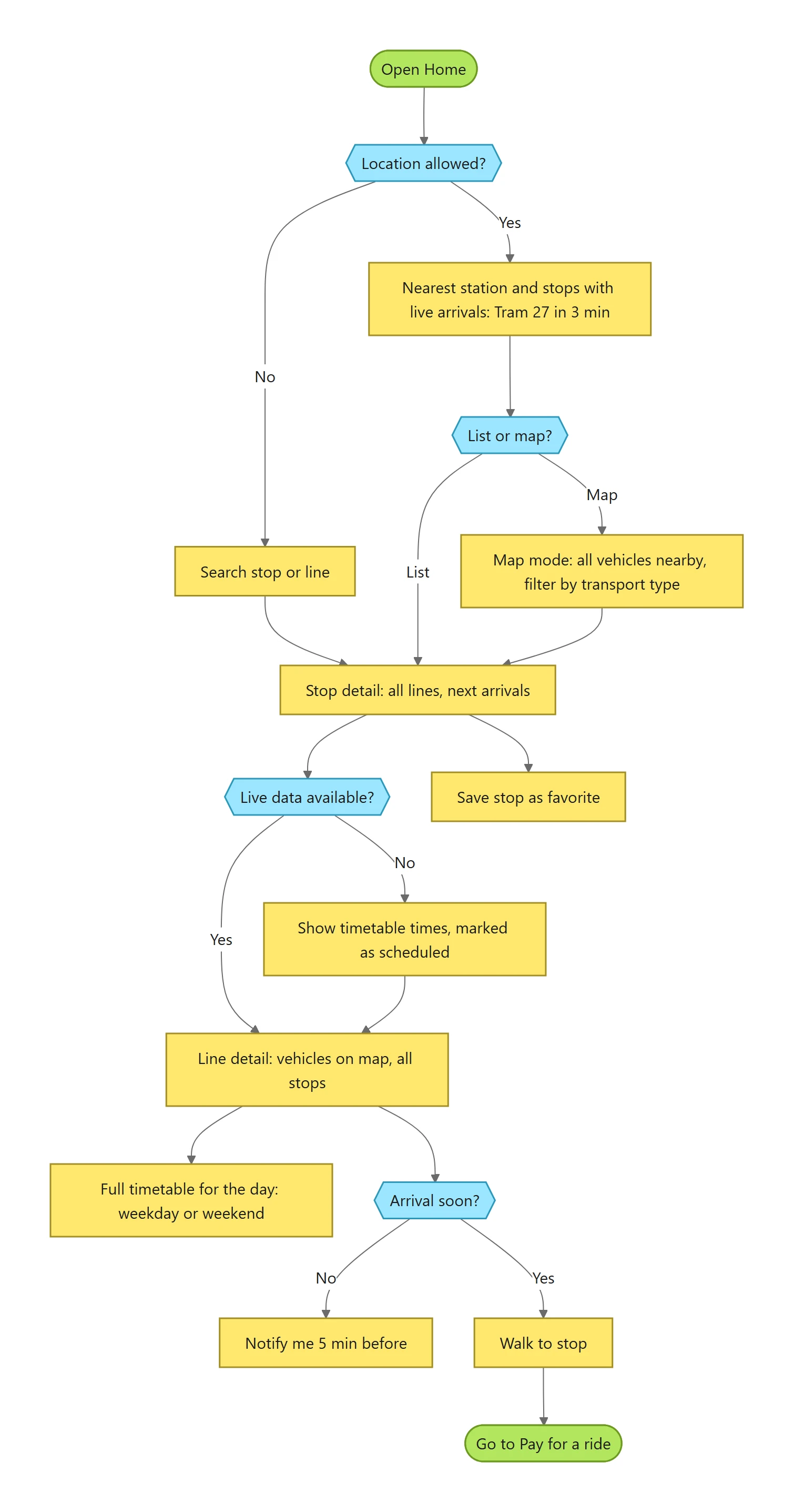
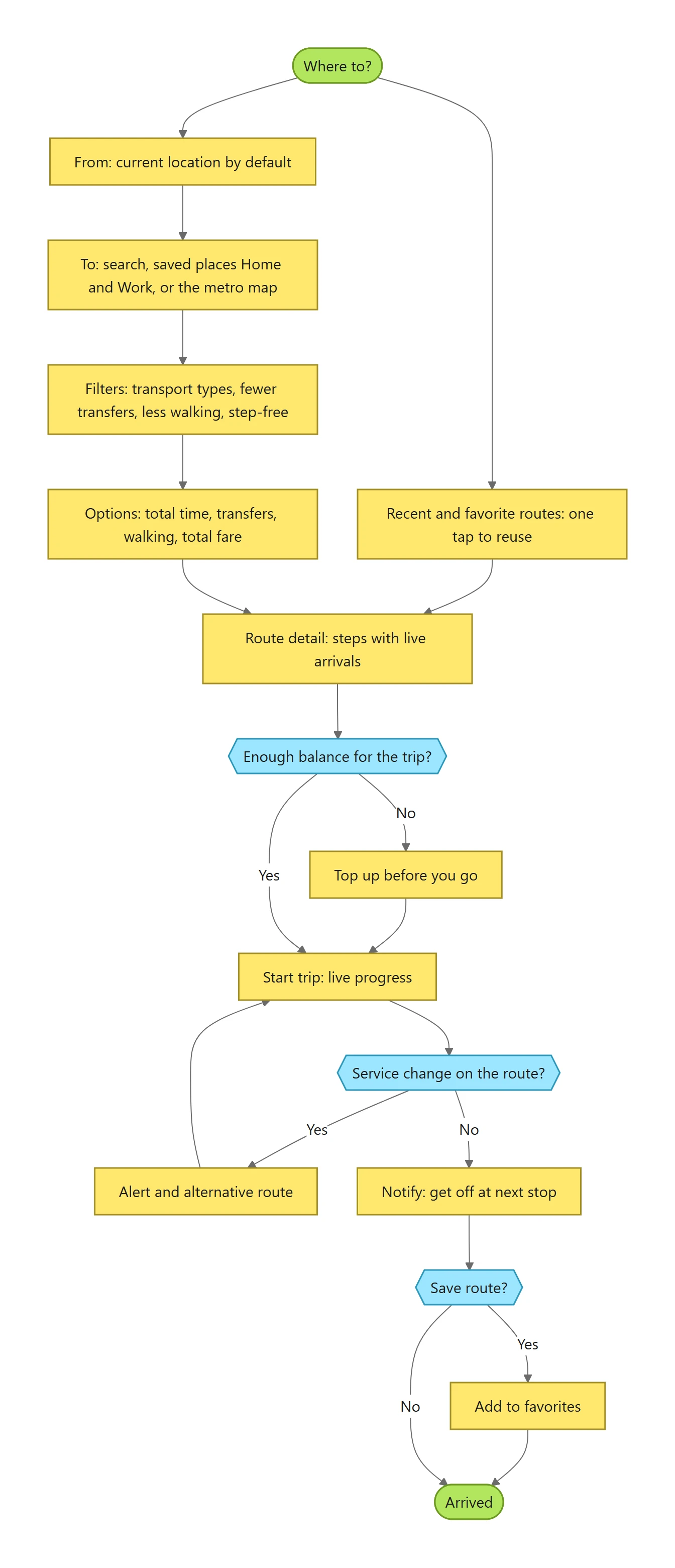
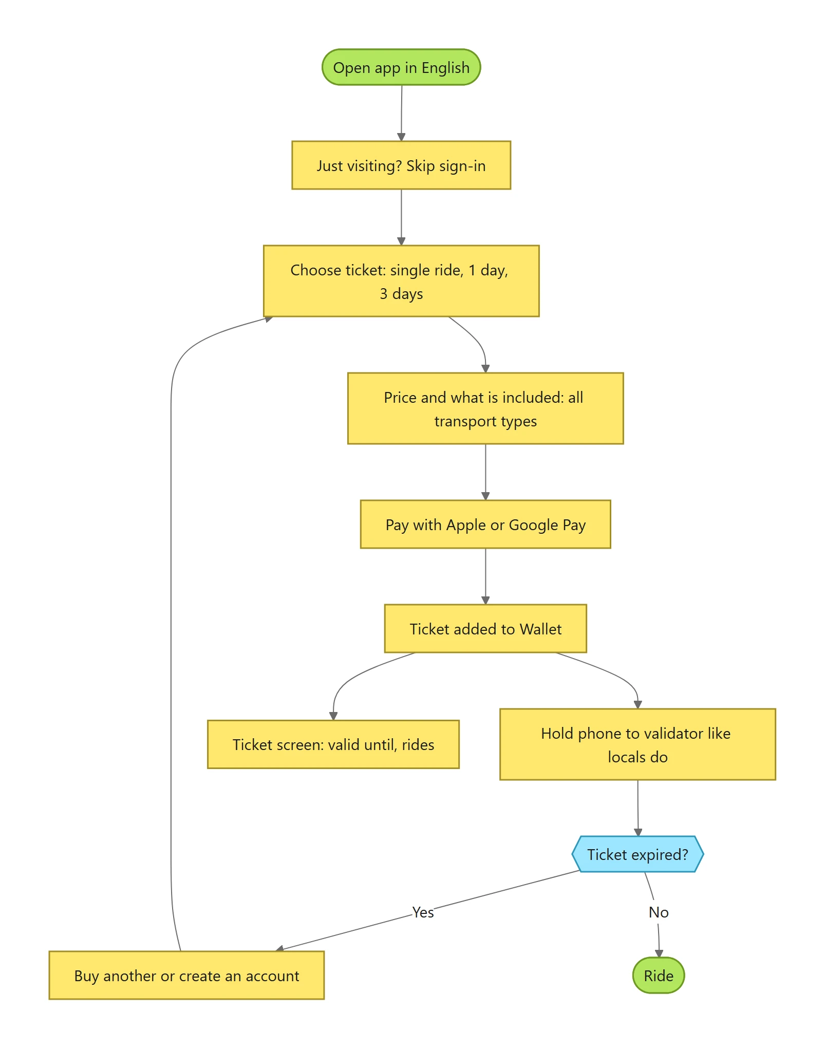
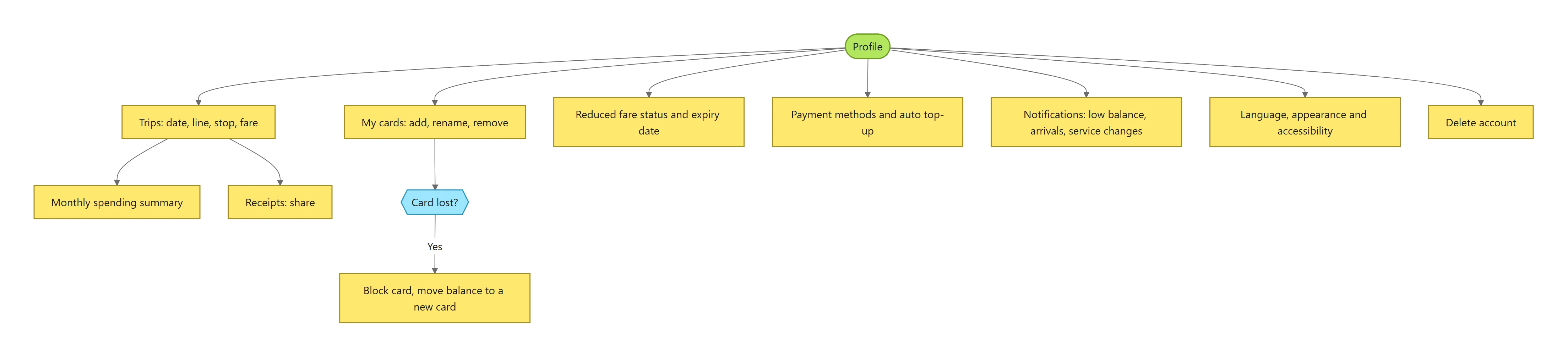
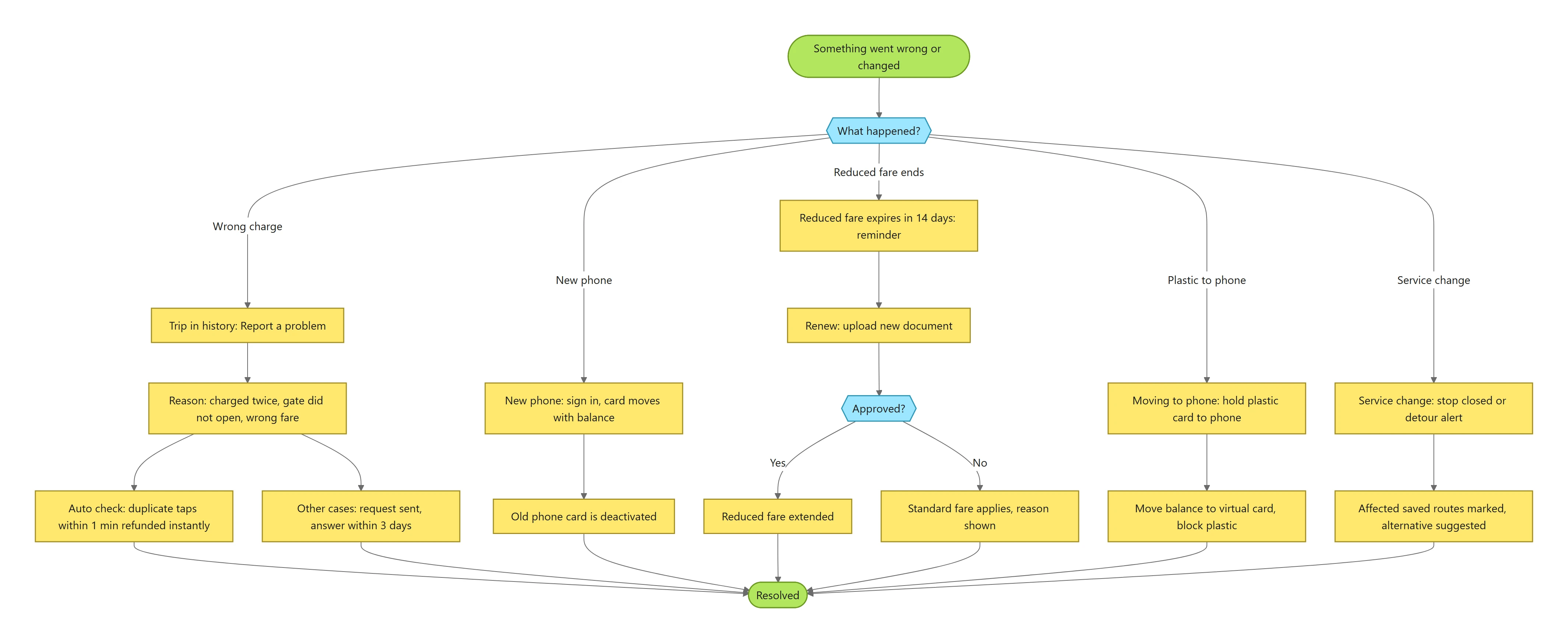
Eight flows, mapped before a screen was drawn.
Onboarding, paying for a ride, cards and top-up, nearby stops and live arrivals, route from A to B, the visitor, trips and account, and problems and special cases. Yellow is a step, blue a decision, green a start or an end.
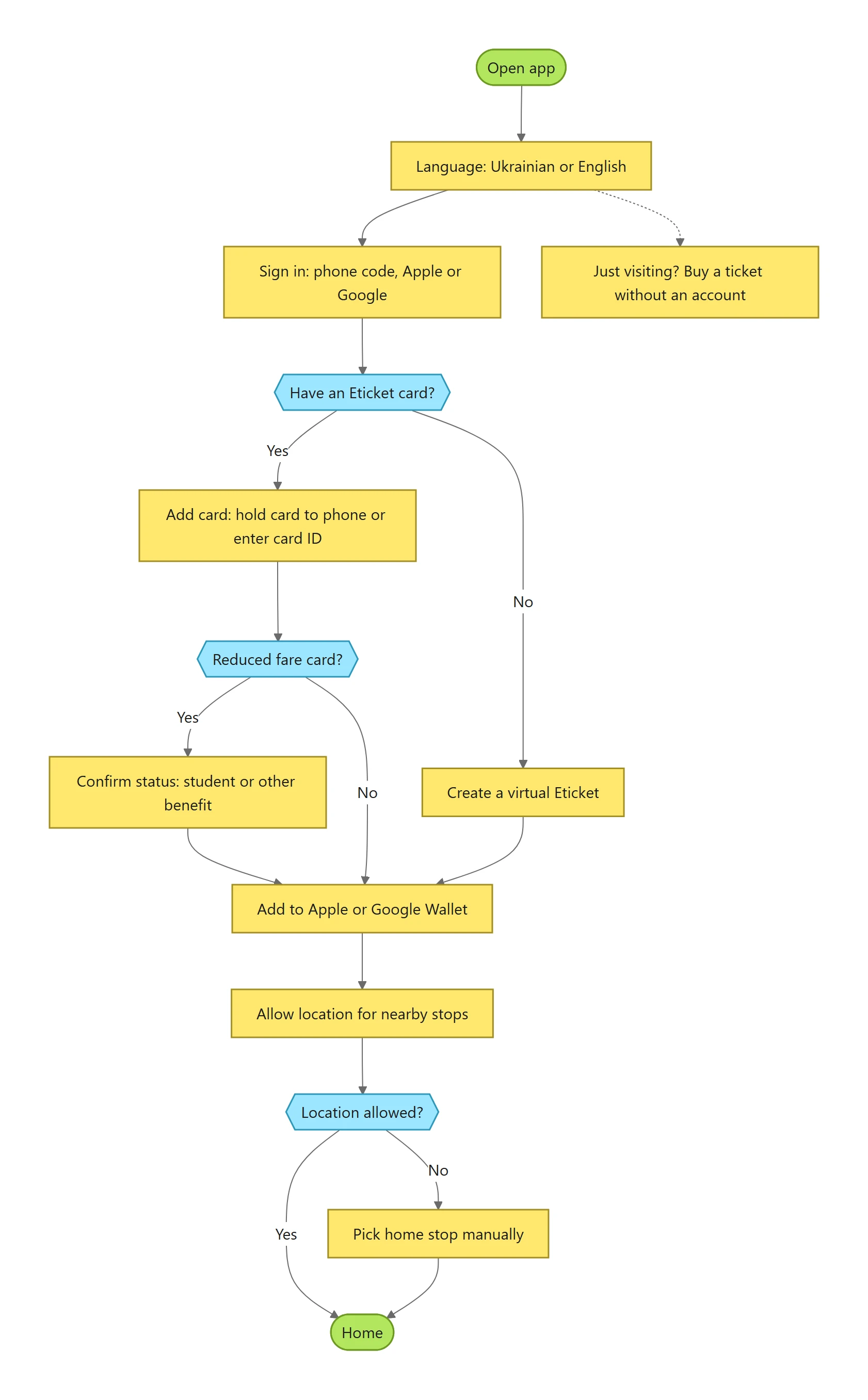
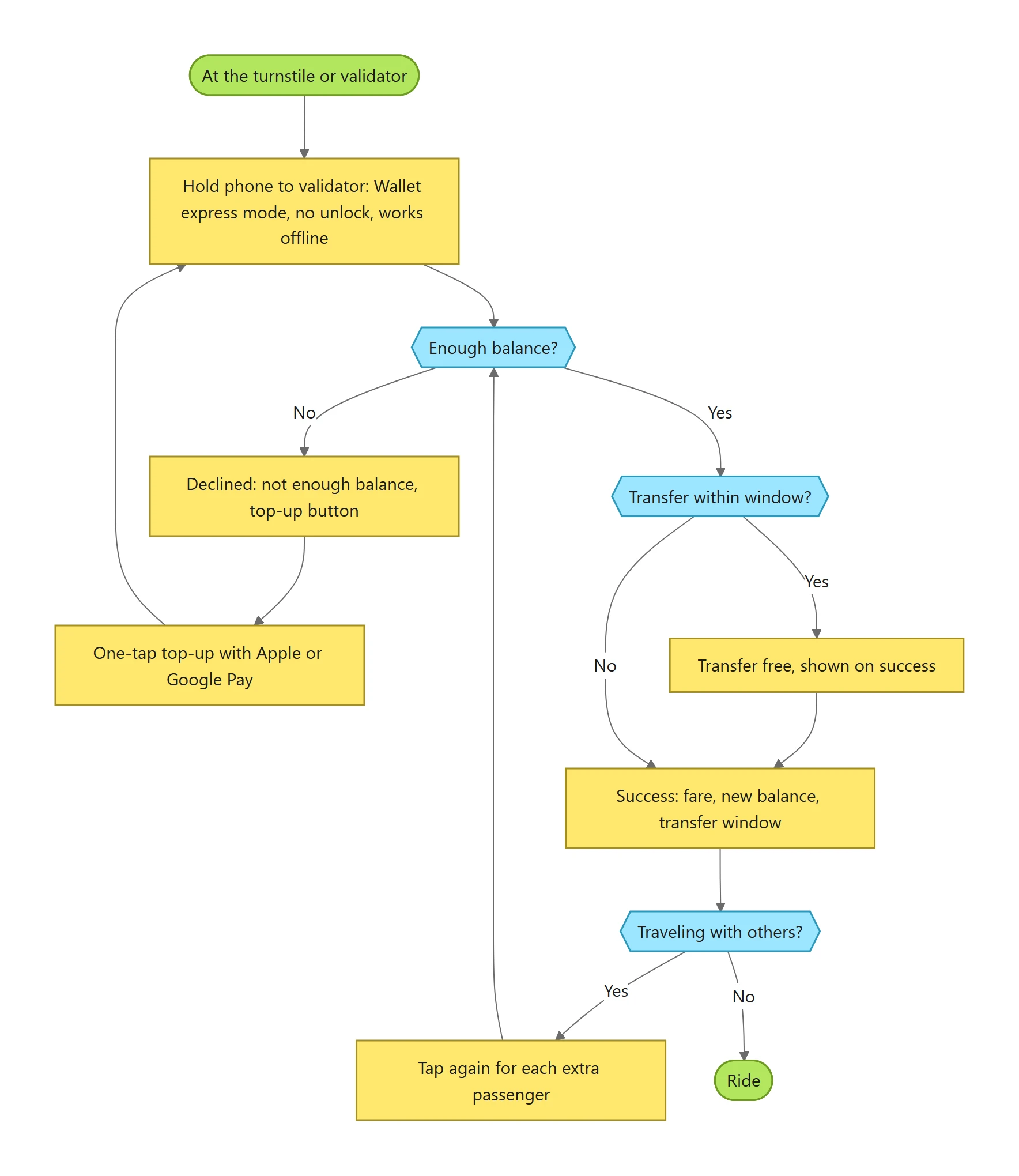
Before and after
Every finding, next to what replaced it.
Finding 01
Five steps to pay
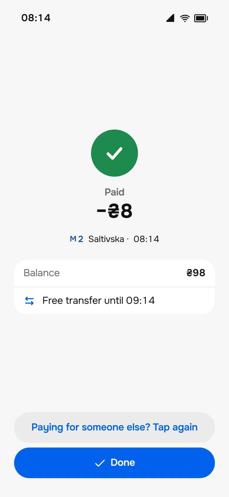
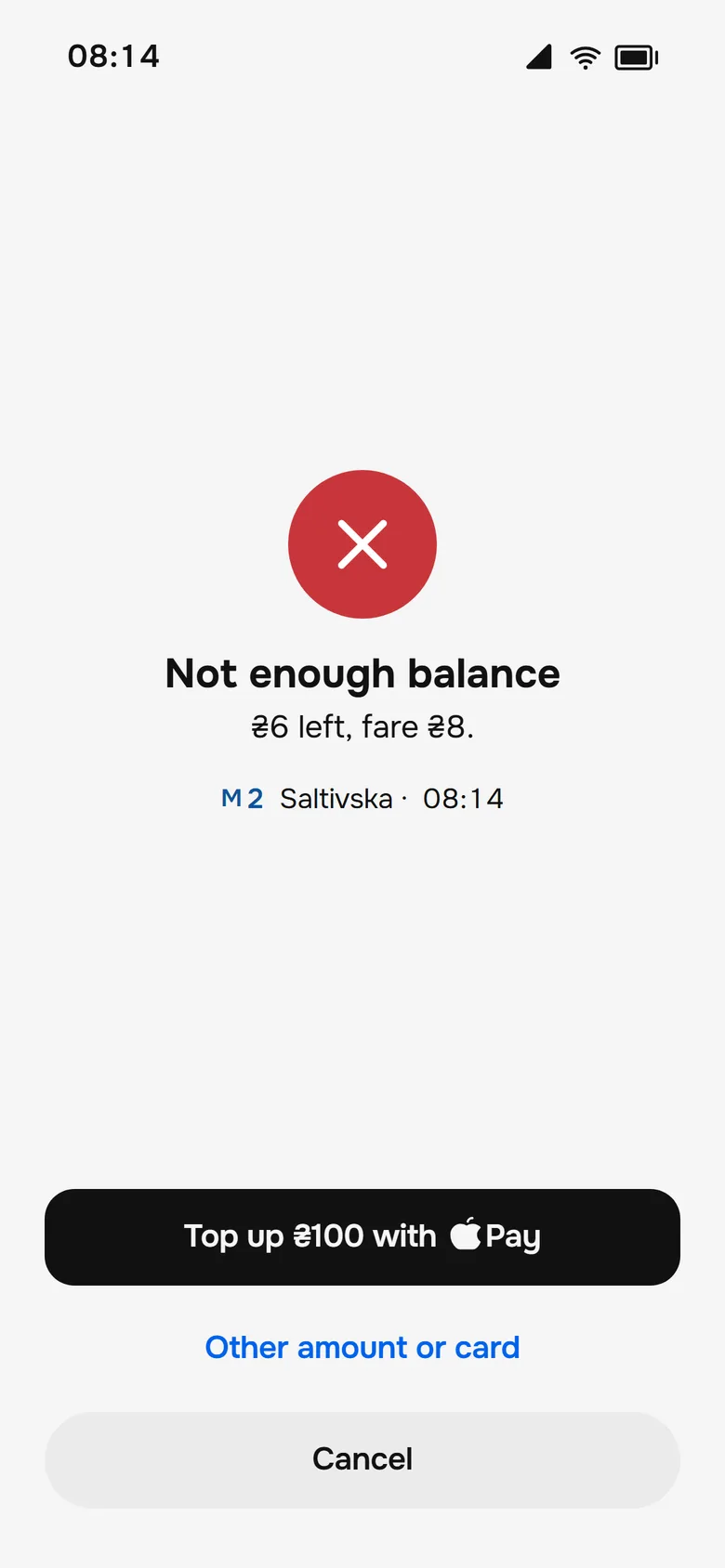
Hold the phone near the reader and it is done. The result screen shows Paid or Declined, and a decline carries the top-up right there.
Version 1 · 2020
Redesign · 2026
Finding 02
Stops without arrivals
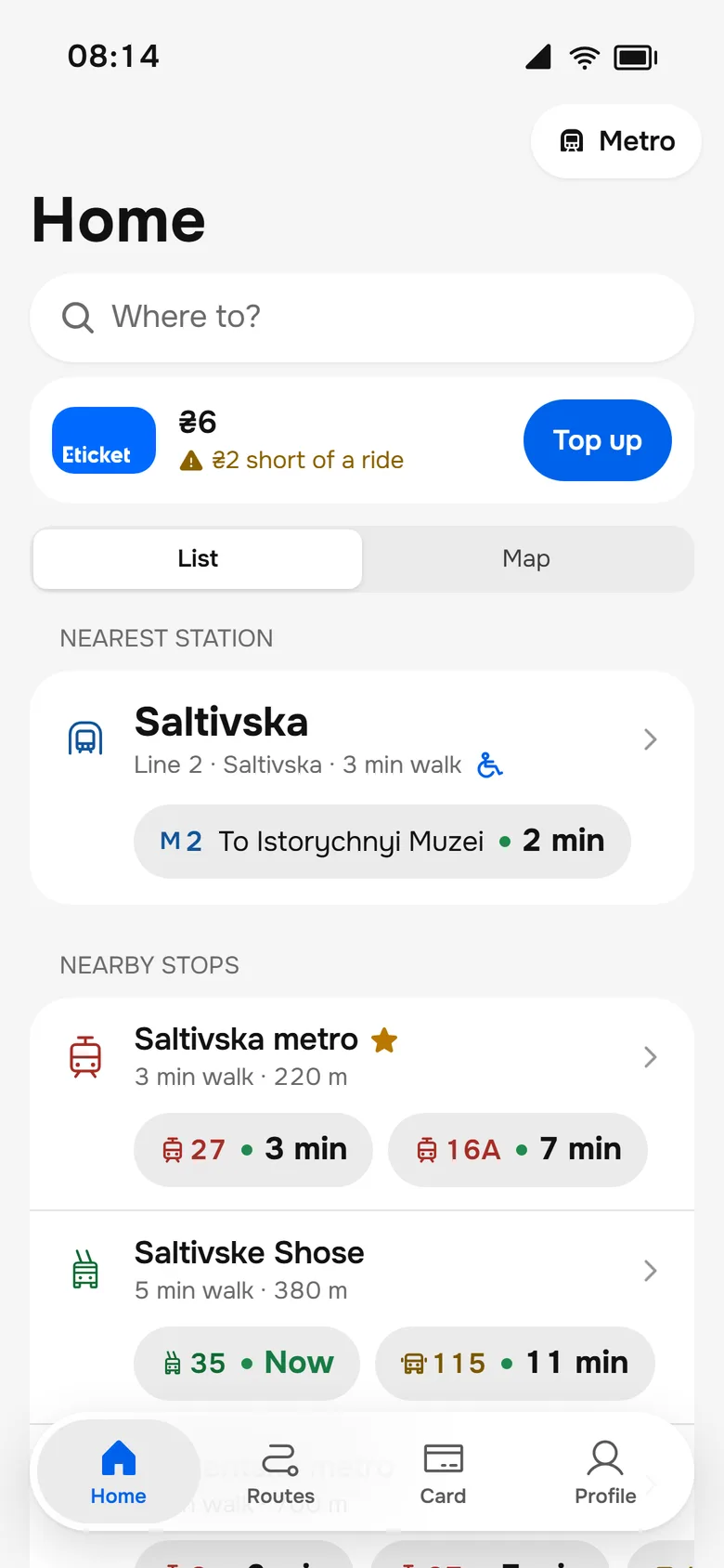
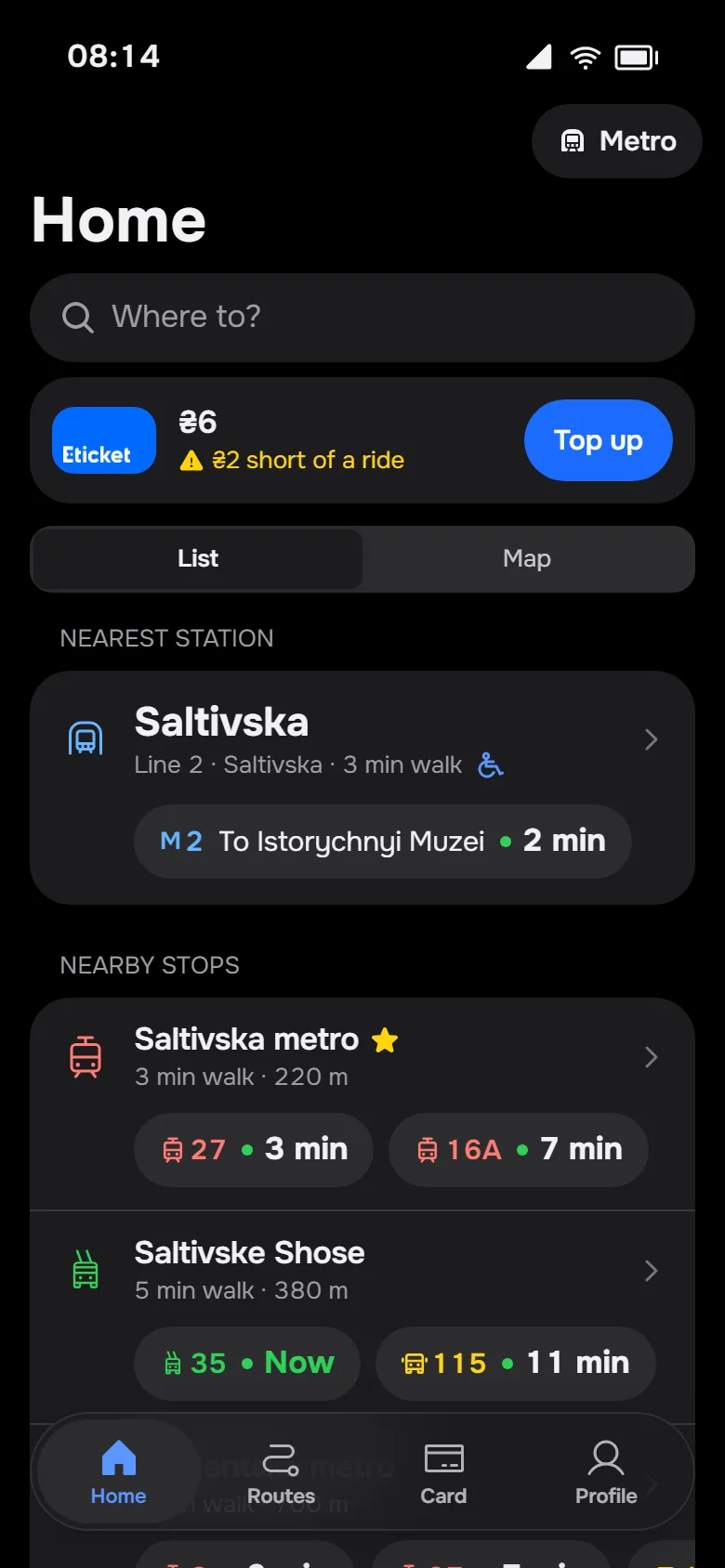
Home leads with the nearest station and a live chip for every stop nearby: the next vehicle, not just the name.
Version 1 · 2020
Redesign · 2026
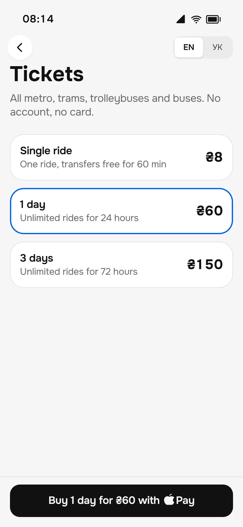
Finding 03
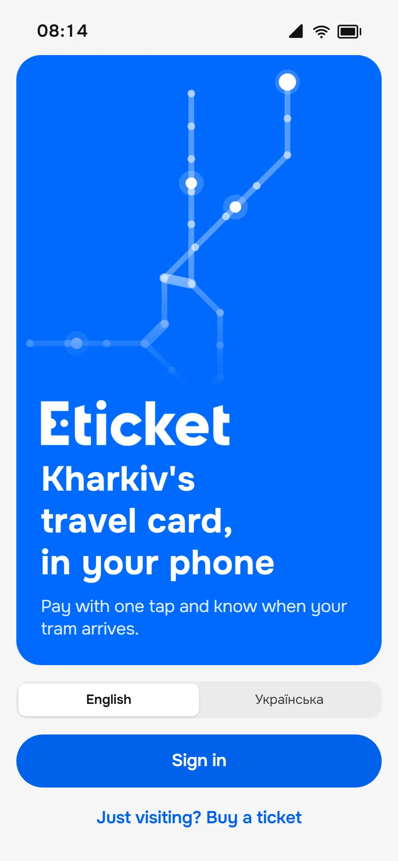
Onboarding needs a plastic card
Welcome offers "Just visiting? Buy a ticket", and the visitor ticket goes straight into Wallet, with no account and no card.
Version 1 · 2020
Redesign · 2026
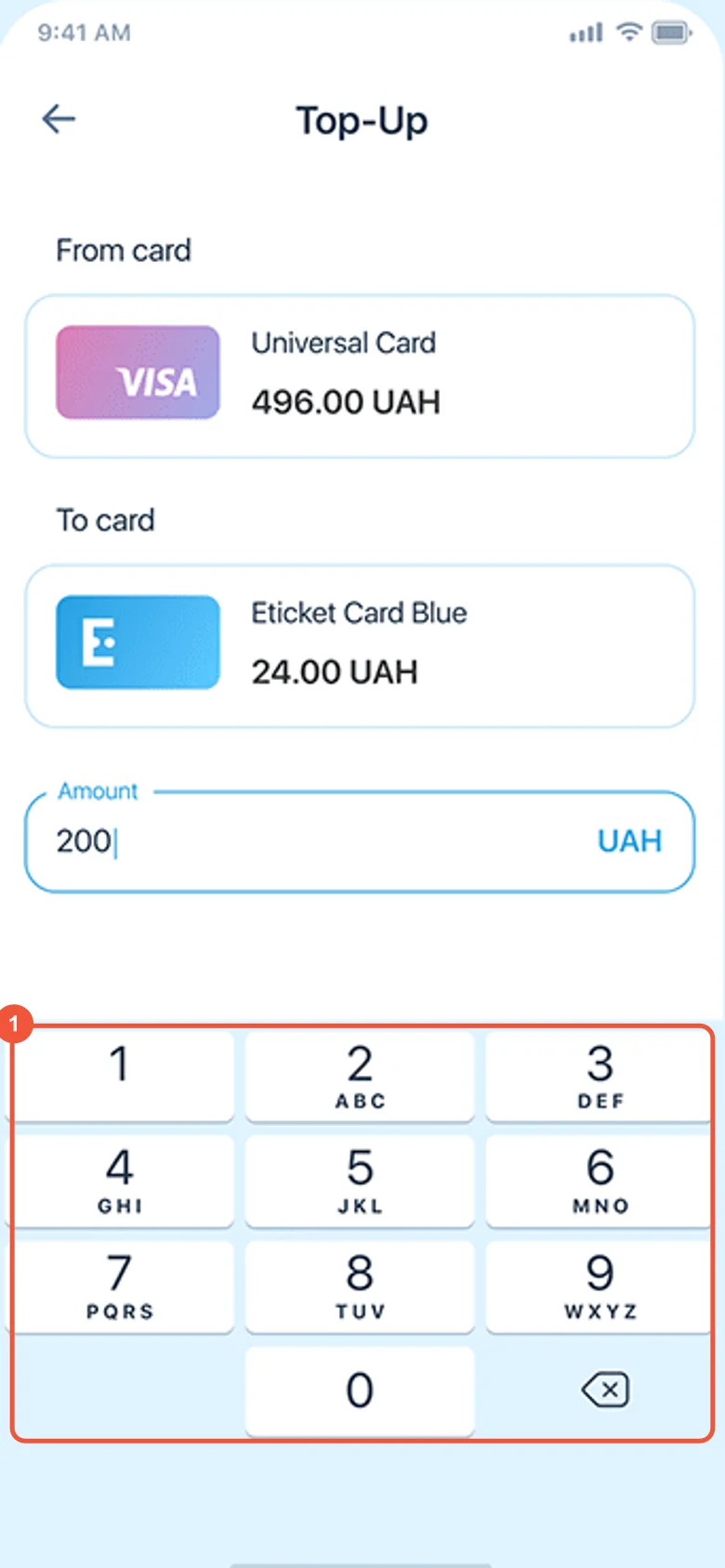
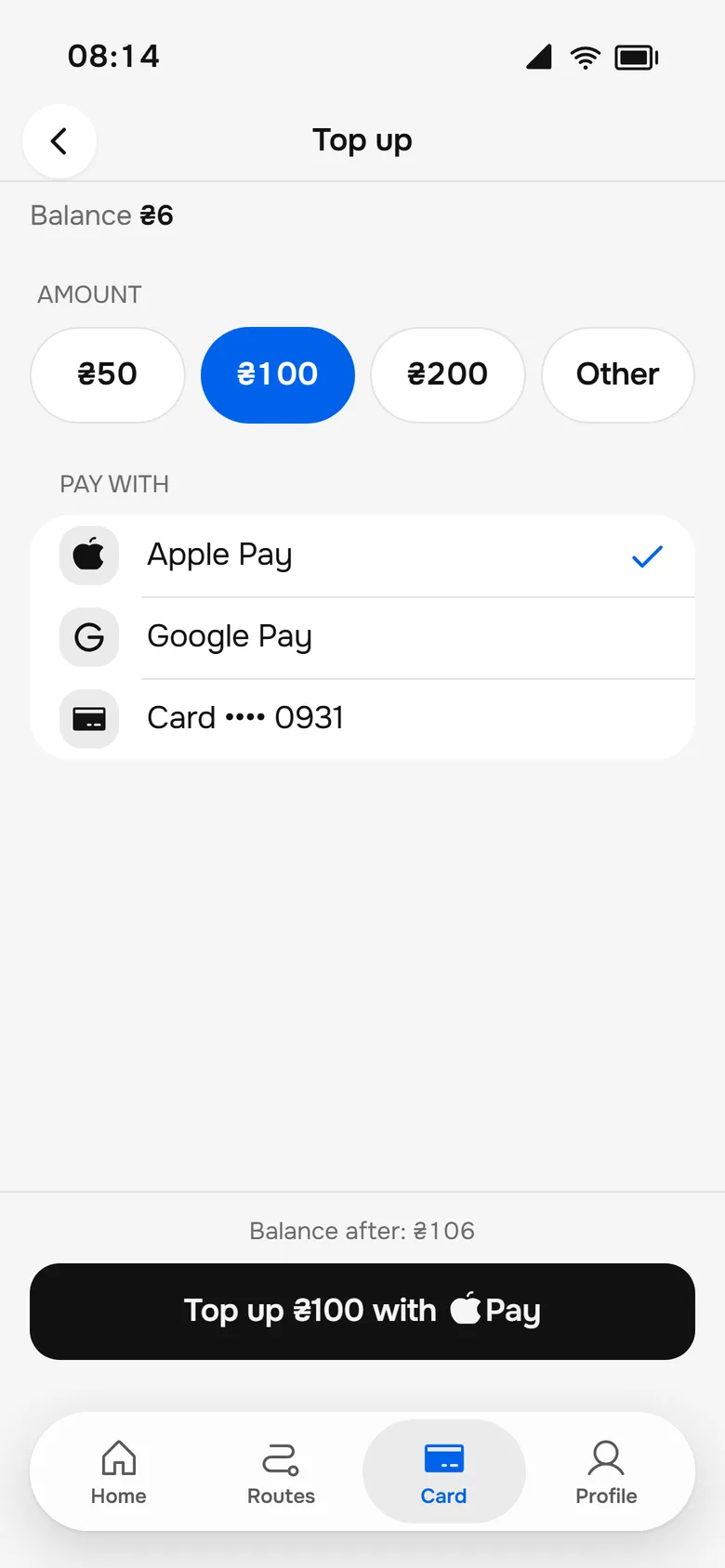
Finding 04
Top-up with a custom keypad
Amount chips and Apple Pay replace typing on a custom keypad, so a top-up is one choice and one tap.
Version 1 · 2020
Redesign · 2026
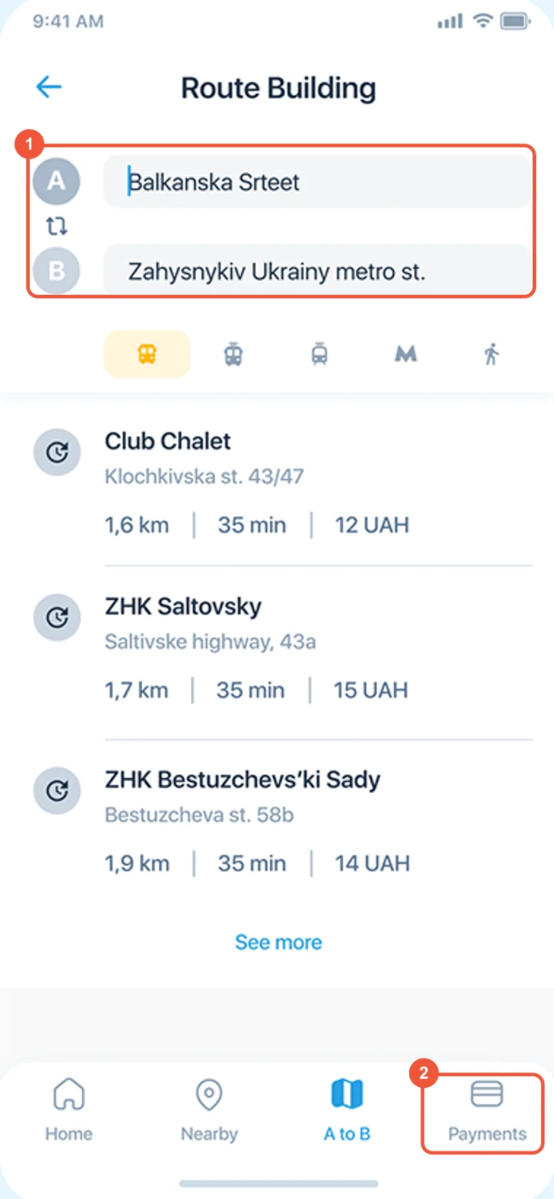
Finding 05
Two places to search a route
One "Where to?" on Home opens Routes, and the options show the total fare, so the search happens in one place.
Version 1 · 2020
Redesign · 2026
The morning commute
The morning commute, clicked end to end.
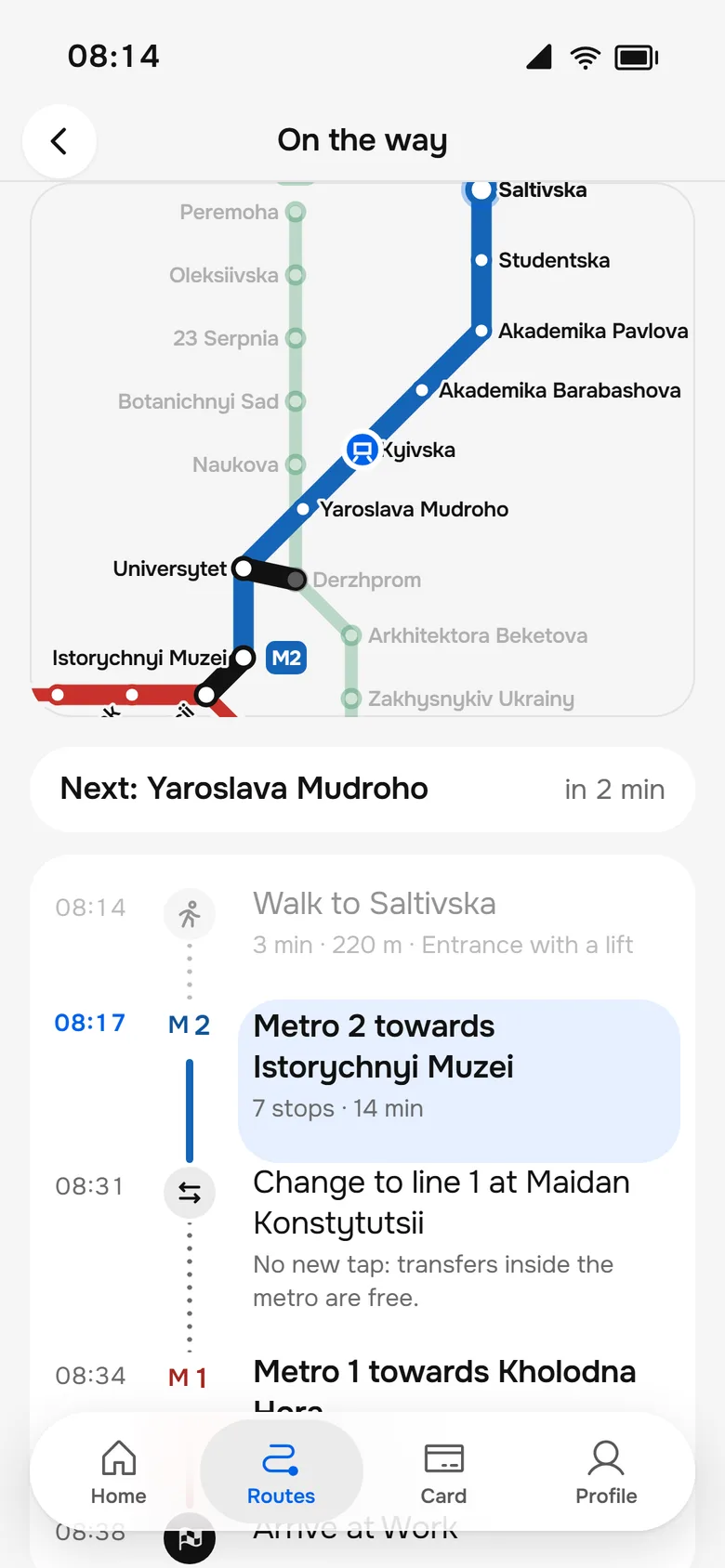
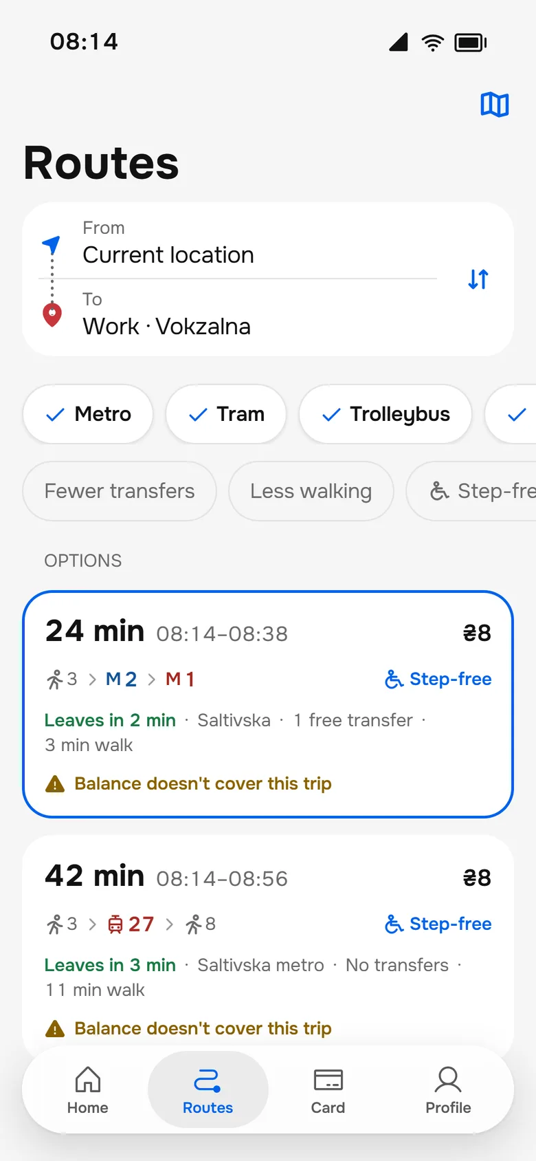
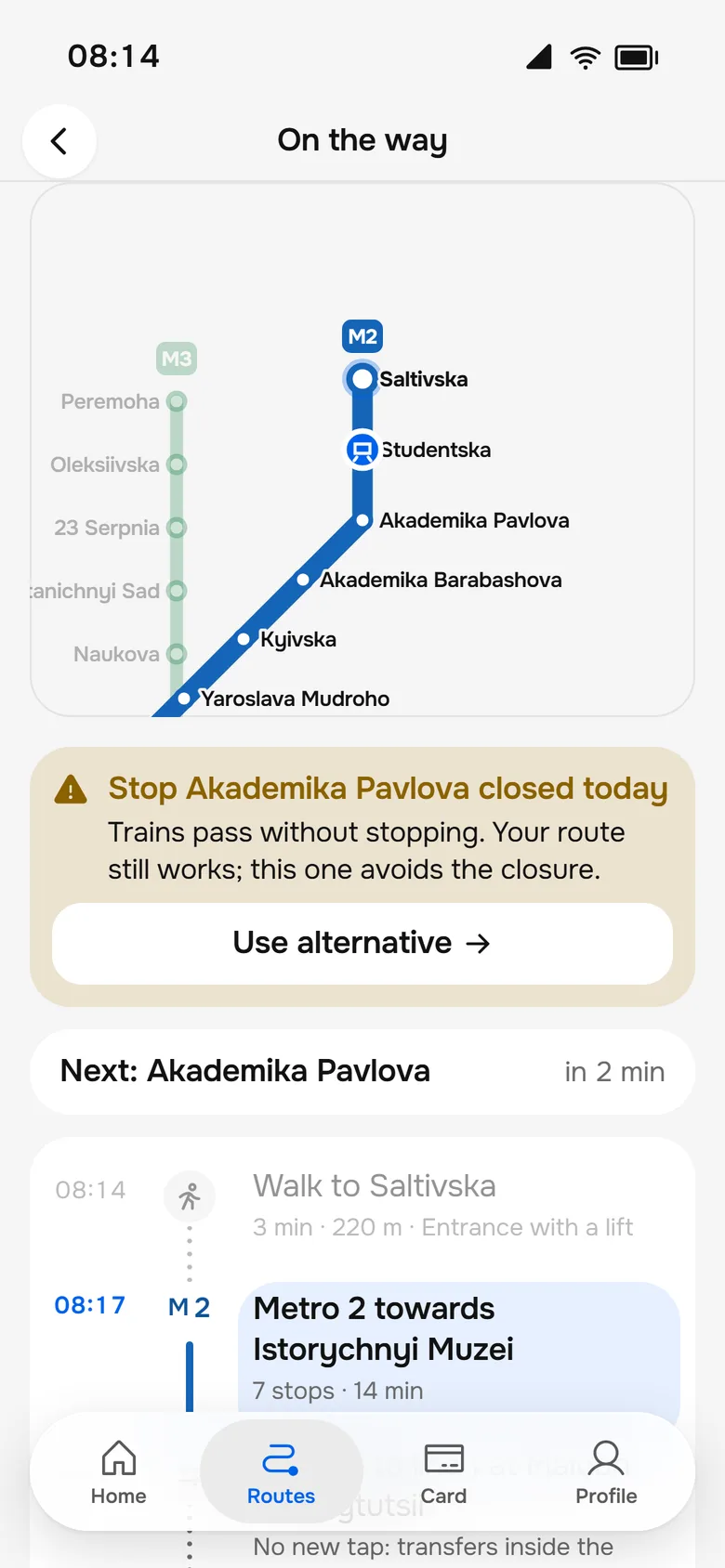
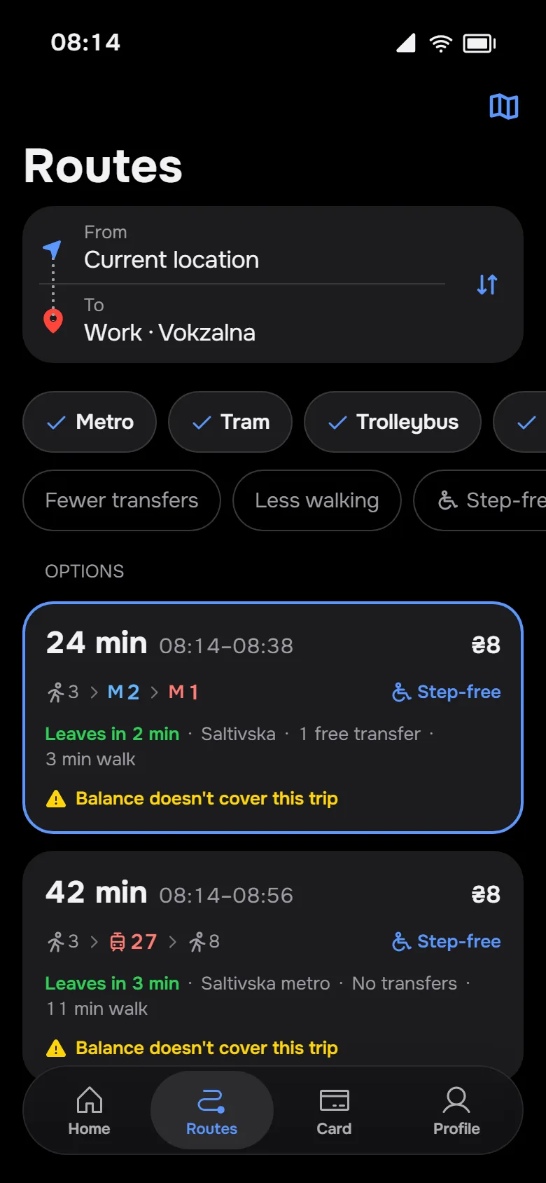
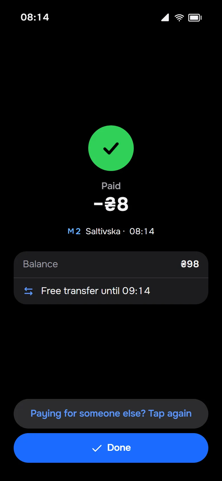
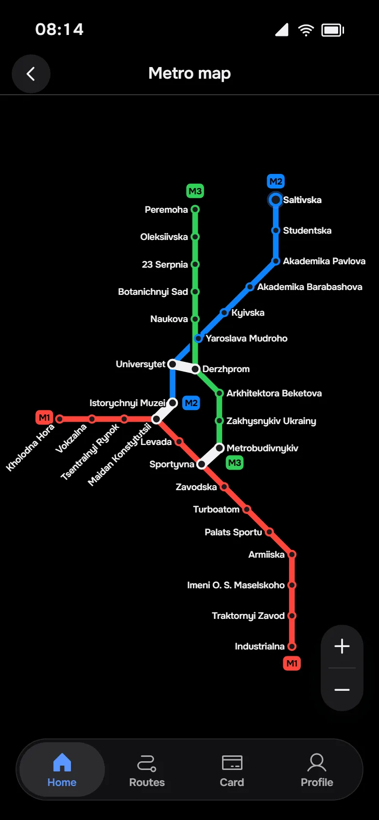
₴6 on the card. Routes to Work: metro line 2, a transfer, line 1, 24 minutes, ₴8, and a warning that the balance doesn't cover the trip. Tap at Saltivska: declined. Top up ₴100 with Apple Pay and tap again: paid, ₴98, free transfer until 09:14. The live trip follows on the metro map: "Transfer at Istorychnyi Muzei to line 1" with no new tap, then "Vokzalna is next". At the exit, Home suggests "Tram 7 · 4 min".
Eight decisions that shaped the app.
- 01Tap to pay through Wallet express modeNo app to open, no unlock, works offline. Premise: validators on all transport accept NFC.
- 02A declined tap is also the fix"₴6 left, fare ₴8" with "Top up ₴100 with Apple Pay" right there, then tap again.
- 03Live arrivals on HomeThe nearest metro station first, then "Tram 27 · 3 min" for each stop nearby, with "Notify me 5 min before".
- 04The transfer window after paying"Free transfer until 09:14" removes a common worry.
- 05Routes show the total fareThe balance is checked before you leave: "Your balance doesn't cover this trip".
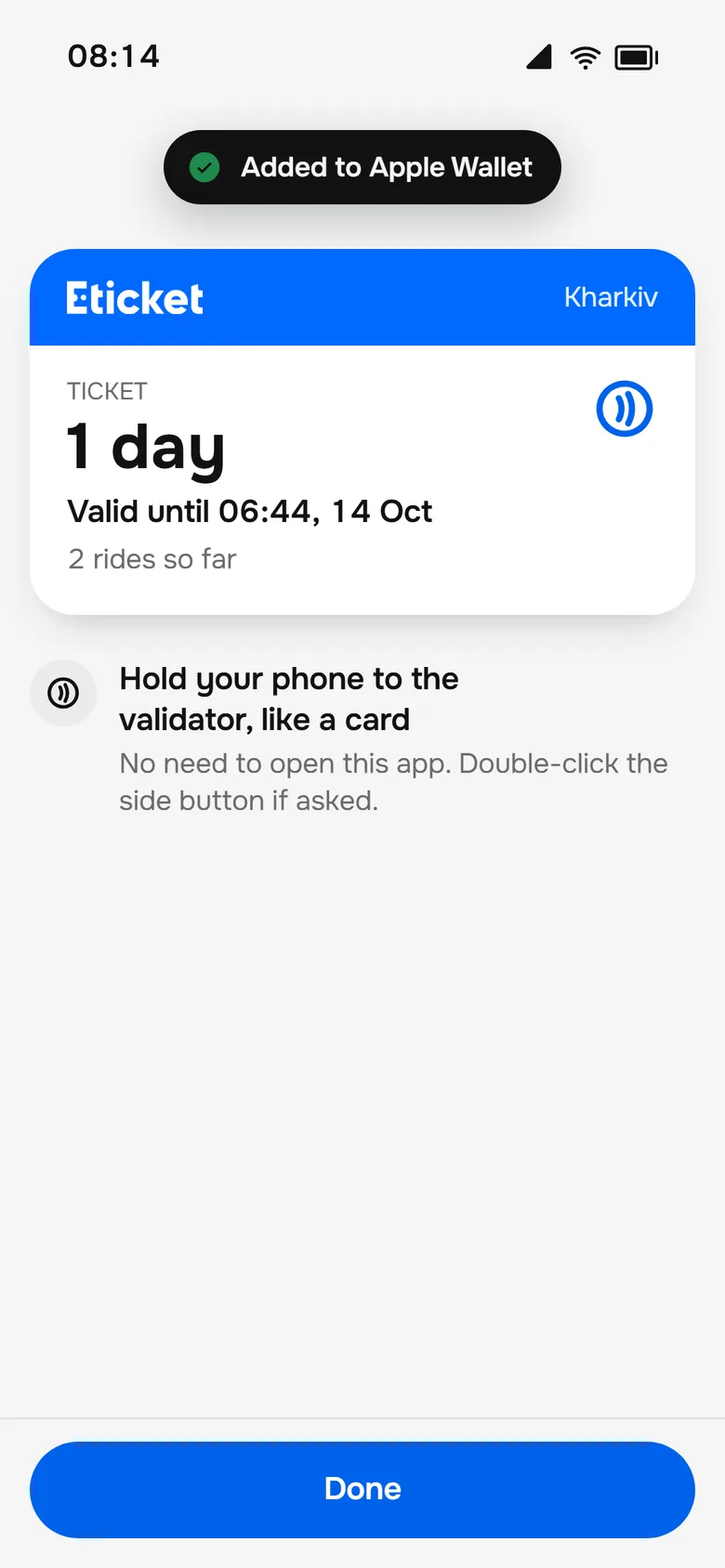
- 06Visitor tickets without an accountStraight into Wallet: single ride, 1 day, 3 days.
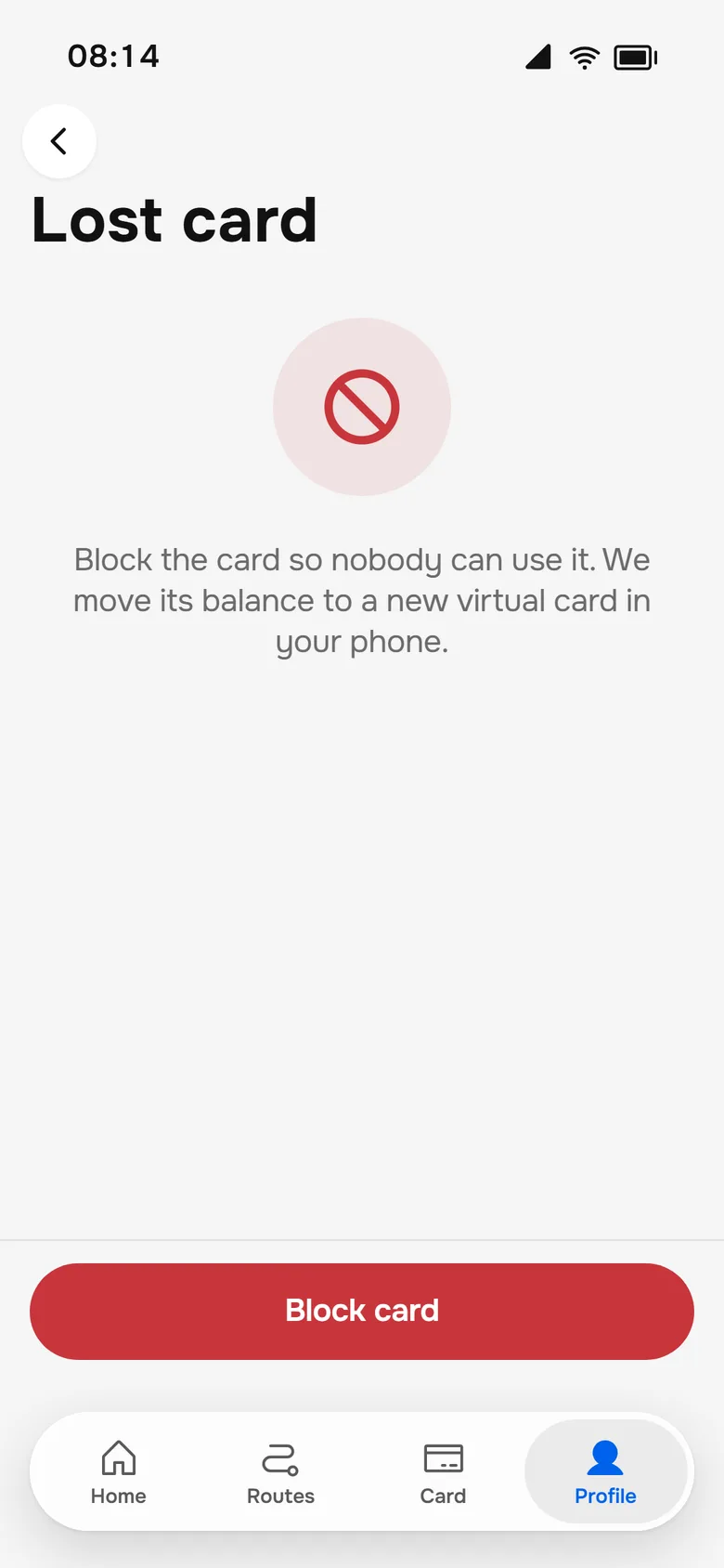
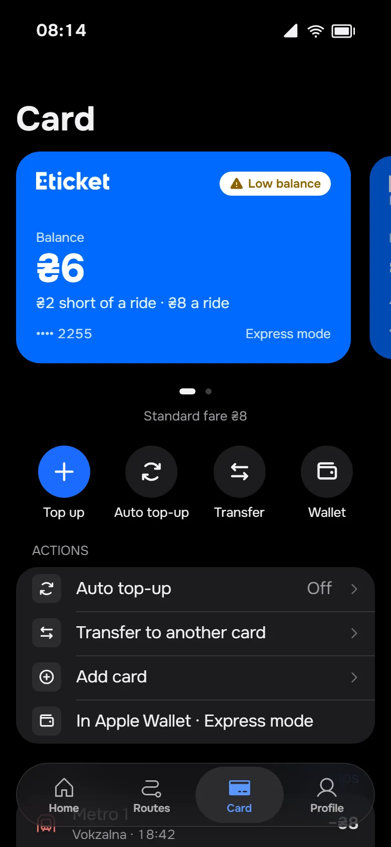
- 07Auto top-up and lost-card recoverySo the balance never becomes a problem.
- 08Four clear tabsHome, Routes, Card, Profile. One place to search a route.
Hard states
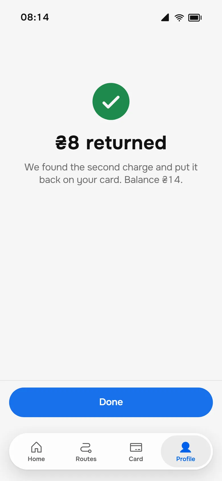
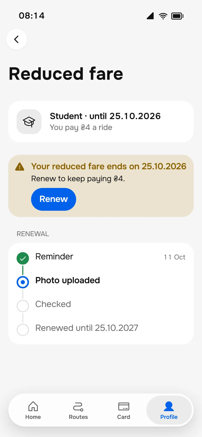
The screens nobody asks for are the ones that build trust.
Design system
Quiet interface, loud transport.
Near black and white with one blue accent. The transport code is the only other colour, and it always comes with an icon and a number.
- •Metro lines: 1 red, 2 blue, 3 green; trams, trolleybuses and buses by colour
- •A true black dark theme with the vivid iOS system colours
- •iOS patterns: large titles, a floating glass tab bar, sheets with detents, inset grouped lists
- •Onest for Latin and Cyrillic; every component in Storybook, in both themes and both languages
Outcome
What the redesign delivers.
5 → 1
steps to pay at the turnstile, now a single tap with the phone
68.8%
of the riders we researched in 2020 rode with a plastic card
3 lines, 30 stations
of the Kharkiv metro, with the current names
14
scenarios, clickable end to end
2 × 2
two themes, light and dark, and two languages, Ukrainian and English
29
key screens
Key takeaways
Three things this project taught me.
- 01
Design for the turnstile moment
Nothing between the person and the gate. Paying went from five steps to one tap, because that is the moment with the least patience.
- 02
Arrivals, not stops
A list of stops answers where. Riders were asking when. Home now leads with the time of the next vehicle.
- 03
A decline should be the fix
A declined tap that only says no leaves someone stuck at the gate. Showing the fare, the balance and the top-up in the same screen turns it into one more tap.
Try it yourself
Tap at the turnstile, build a route and ride as a visitor in the live prototype, or read the design system.