- Healthcare
- Mobile and web
- Design system
Parlo · case study
The right doctor, in your language, at the earliest real slot.
Doctor booking for Germany, built around language: find a doctor who speaks yours and takes your insurance, at the earliest real slot. In 2019 I led design of a booking marketplace; in 2026 I rebuilt it for Germany as a working prototype for patients, doctors and practices, with AI.
- Role
- Lead Product Designer
- Timeline
- 2019 · reimagined 2026
- Company
- Doctor-booking platform
- Location
- Berlin, Germany
- Team
- 2019: lead designer of the marketplace. 2026: concept, flows, design system and prototype, solo with AI
Deliverables
- Research
- User flows
- Three-role prototype
- Design system
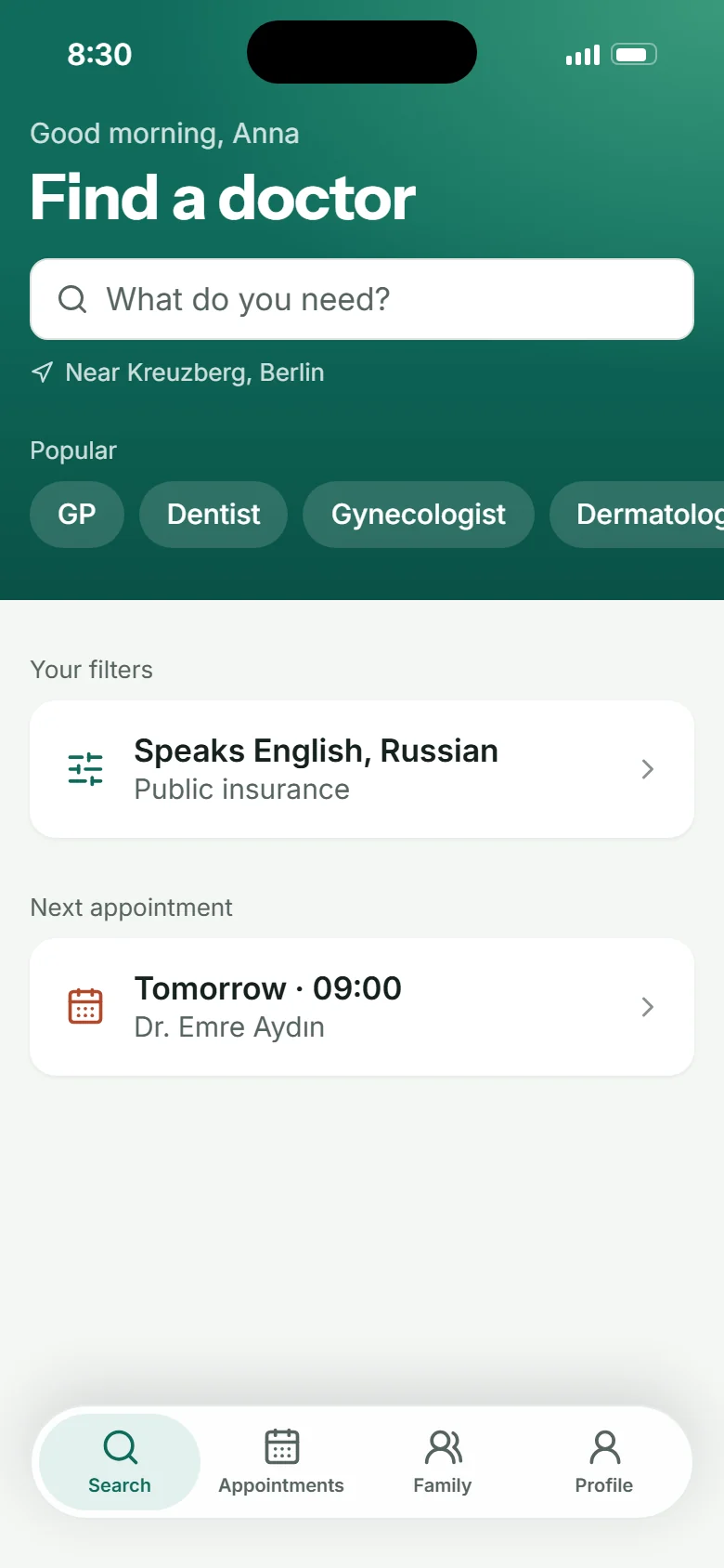
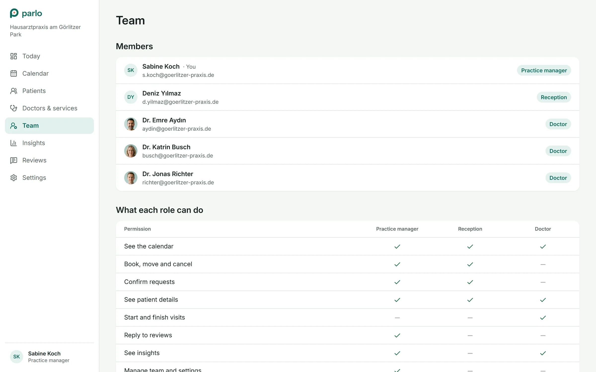
- roles on one schedule: patient, doctor, practice
- 3
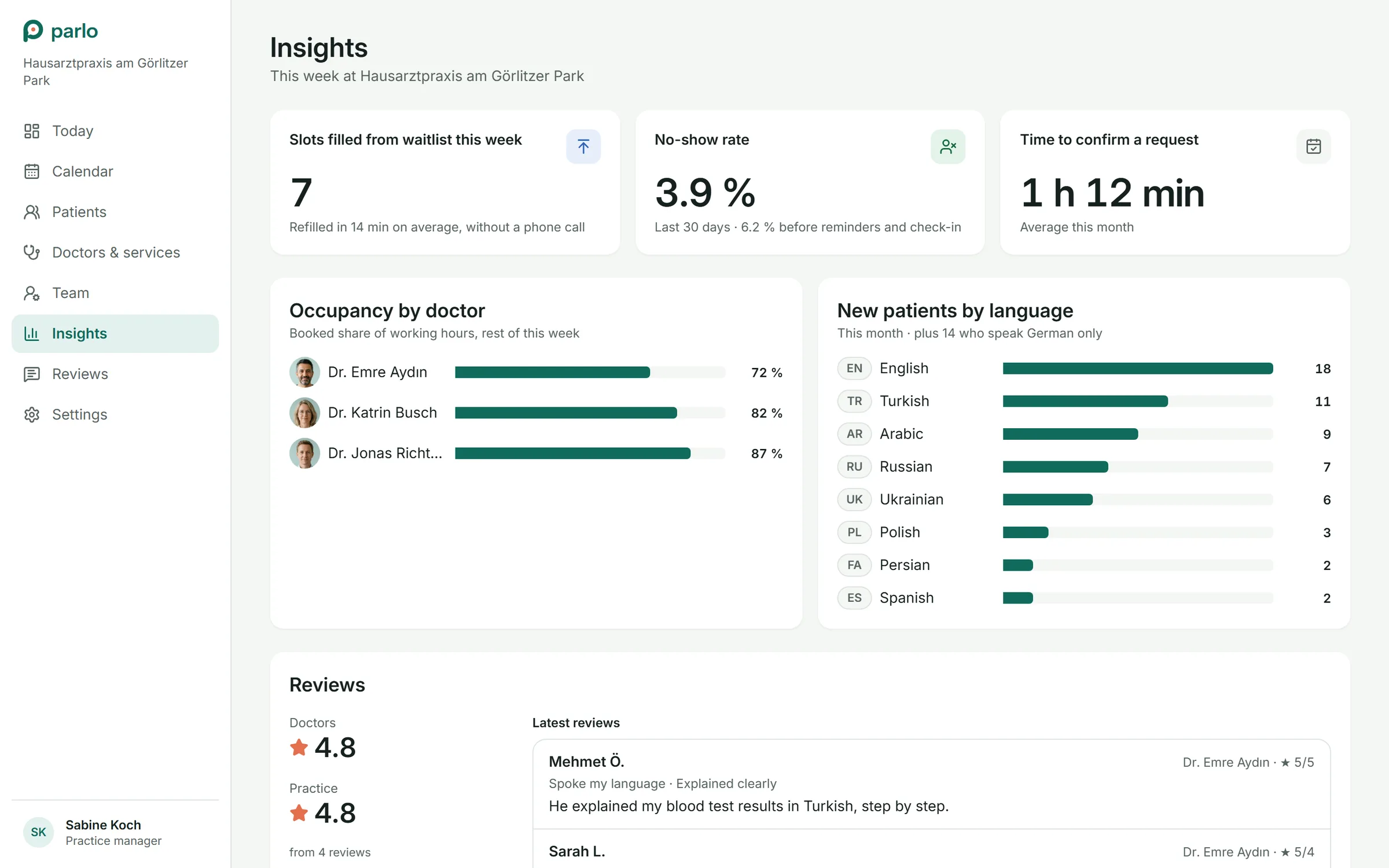
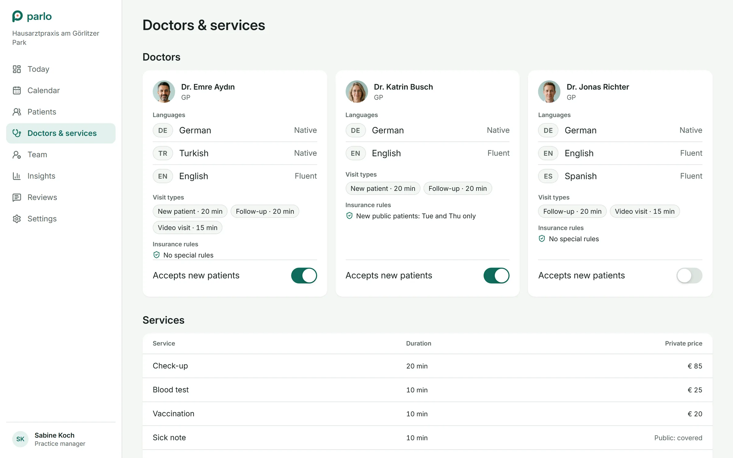
- spoken languages to search by, never flags
- 10
- to take a cancelled slot from the waitlist
- 1 tap
- phone calls to refill a cancelled appointment
- 0
Overview
Finding a free slot is solved. Finding a doctor who understands you isn't.
Booking a doctor online is normal in Germany: insurance filters, reminders and waitlists are table stakes. For the many people who moved to Berlin, the hard part is different. A visit only helps if the doctor can explain things in a language you understand, and that is the one thing the usual booking flow treats as a footnote.
In 2019 I was the lead designer of a doctor-booking marketplace that put patients, doctors and clinics on one platform. We interviewed patients and clinic staff and tested the booking flow with them. What held up became the core of this project: bookable times right in the search results, separate ratings for the doctor and the practice, one calendar for the whole practice.
In 2026 I took those ideas to Germany and rebuilt everything: brand, flows, interface and design system. With AI as my build partner, it became a working prototype where three roles share one schedule, and every change is true for all of them at once.
Who it is for
Anna, 32
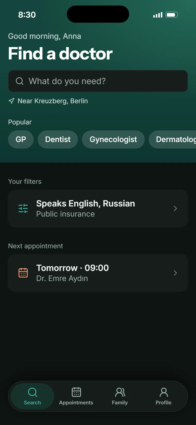
Moved to Berlin two years ago. Public insurance. English and Russian, basic German. Books for herself and her daughter Mia.
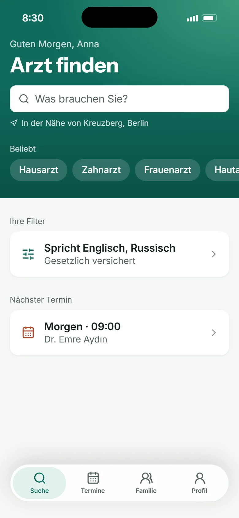
A GP who speaks English, near Kreuzberg, this week.
Omar, 41
Engineer, public insurance, English and Arabic. Booked a specialist three weeks out.
Any earlier slot, without calling the practice every morning.
Sabine, practice manager
Runs reception for three doctors. Lives in the calendar and on the phone.
Fewer calls, no empty chairs after cancellations, a day that tells her what to do.
Dr. Emre Aydın, GP
Speaks German, Turkish and English. Sees 15 to 20 patients a day.
Who is next, why, and in which language, before the door opens.
Research
Booking was solved. Language and lost slots weren't.
I started from what our 2019 research had shown and checked it against the German setting: two insurance systems, referrals, strict health-data rules and a large international population. The gaps were not in the booking form. They were before it and after it.
- 01Language decides whether a visit helpsPatients pick a doctor they can talk to, but languages sit deep in a profile, if anywhere.
- 02Insurance and referrals confuse newcomersPublic or private, which specialist needs a referral: questions people ask at the wrong moment.
- 03The earliest slot hides behind profilesLists rank by rating or distance; the time you can actually go takes three taps and a call.
- 04Cancelled slots stay emptySomeone cancels at 8 pm, someone else waits three weeks for the same doctor. Nobody connects the two.
- 05Reception lives on the phoneBookings, moves and cancellations arrive by phone, and the calendar shows status, not what to do.
- 06Doctors meet patients coldThe first time a doctor learns the reason for a visit, or that the patient prefers English, is in the room.
Pains, by role
Patients
- •Hard to find a doctor who speaks my language and takes my insurance
- •The earliest slot is buried
- •A freed slot somewhere is invisible to me
Practices
- •Phones ring all day
- •Cancellations leave empty chairs
- •No-shows and late patients break the day
Doctors
- •Little context about the next patient
- •Schedule changes ripple through the day
Define
Goals
Patients
- •Find a doctor who speaks my language and takes my insurance in under a minute
- •Get the earliest real slot, and an earlier one if it frees up
Practices
- •Fewer calls for booking and moving appointments
- •Refill cancelled slots
- •Fewer no-shows
Doctors
- •Know who is next and why, at a glance
Principles
- 01
Earliest real slot first
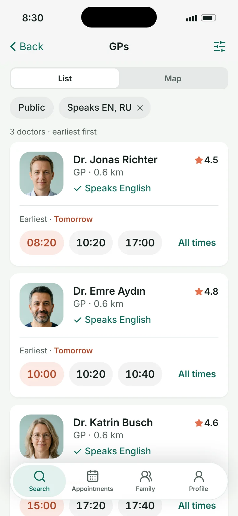
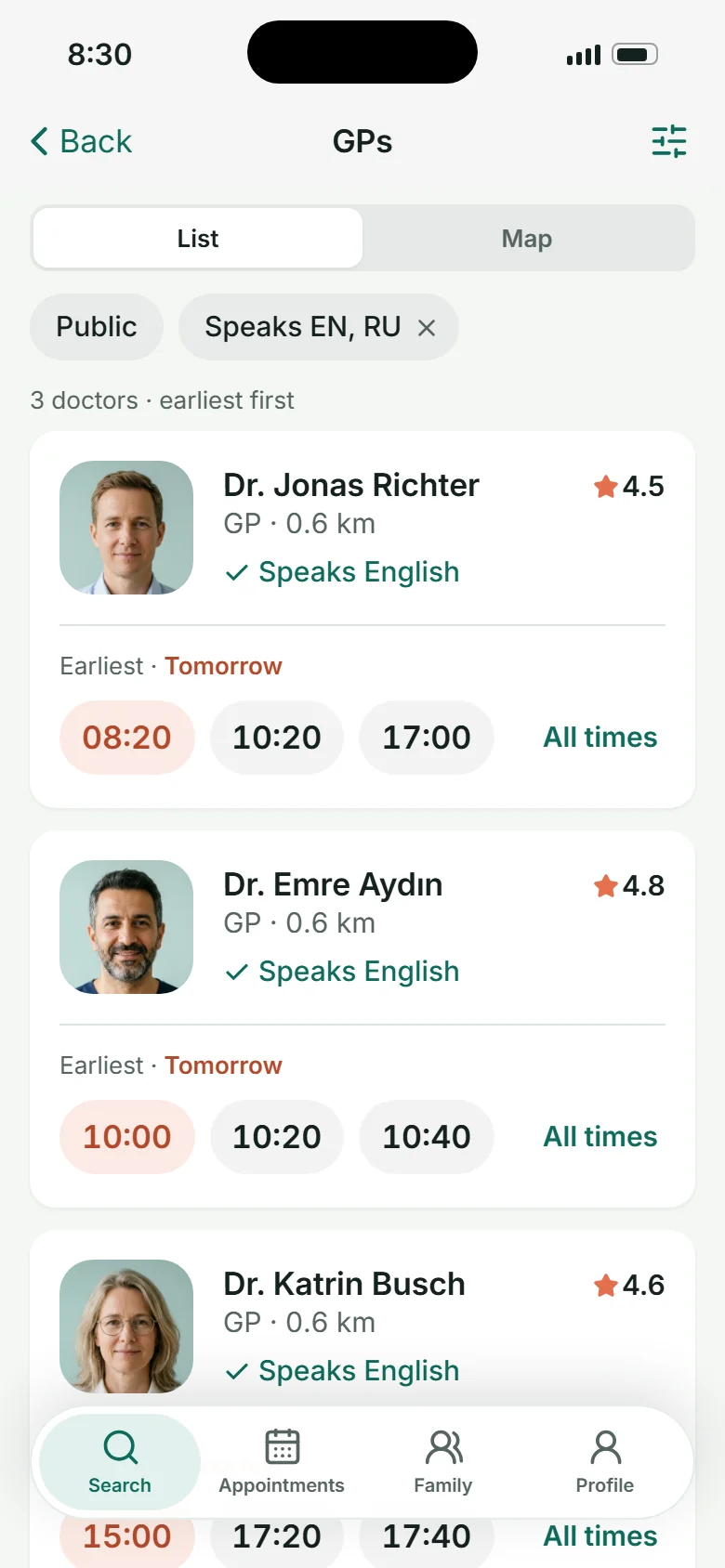
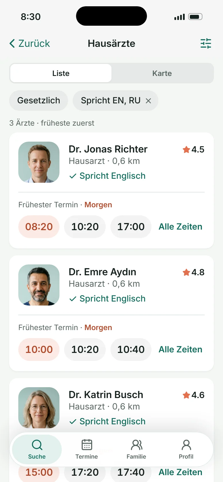
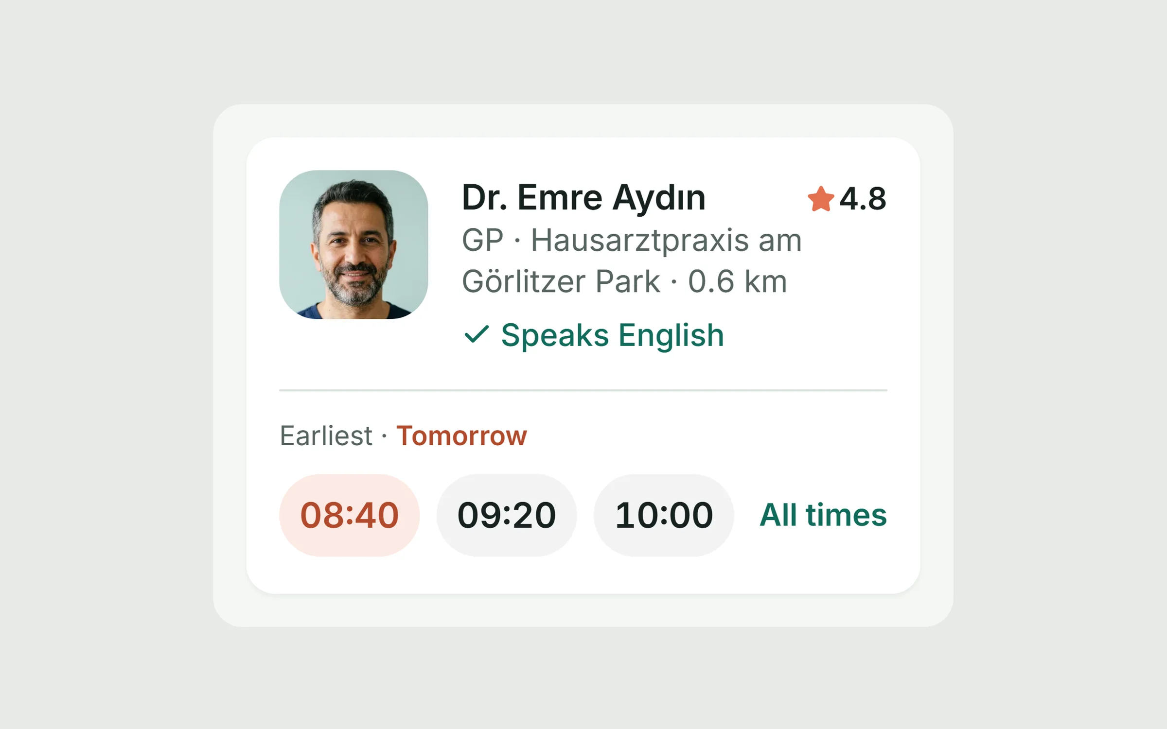
Time beats ratings in a results list. The card books in one tap.
- 02
Language is visible everywhere
As words and codes, never flags: flags are countries, not languages.
- 03
Tell staff what to do now
The practice day starts with “Needs attention”, not a grid of links.
- 04
One schedule, three views
A change is instantly true for the patient, the doctor and reception.
- 05
Consent is explicit and reversible
Patients see which practices have their data and can withdraw it.
I mapped one cancellation across all three roles first.
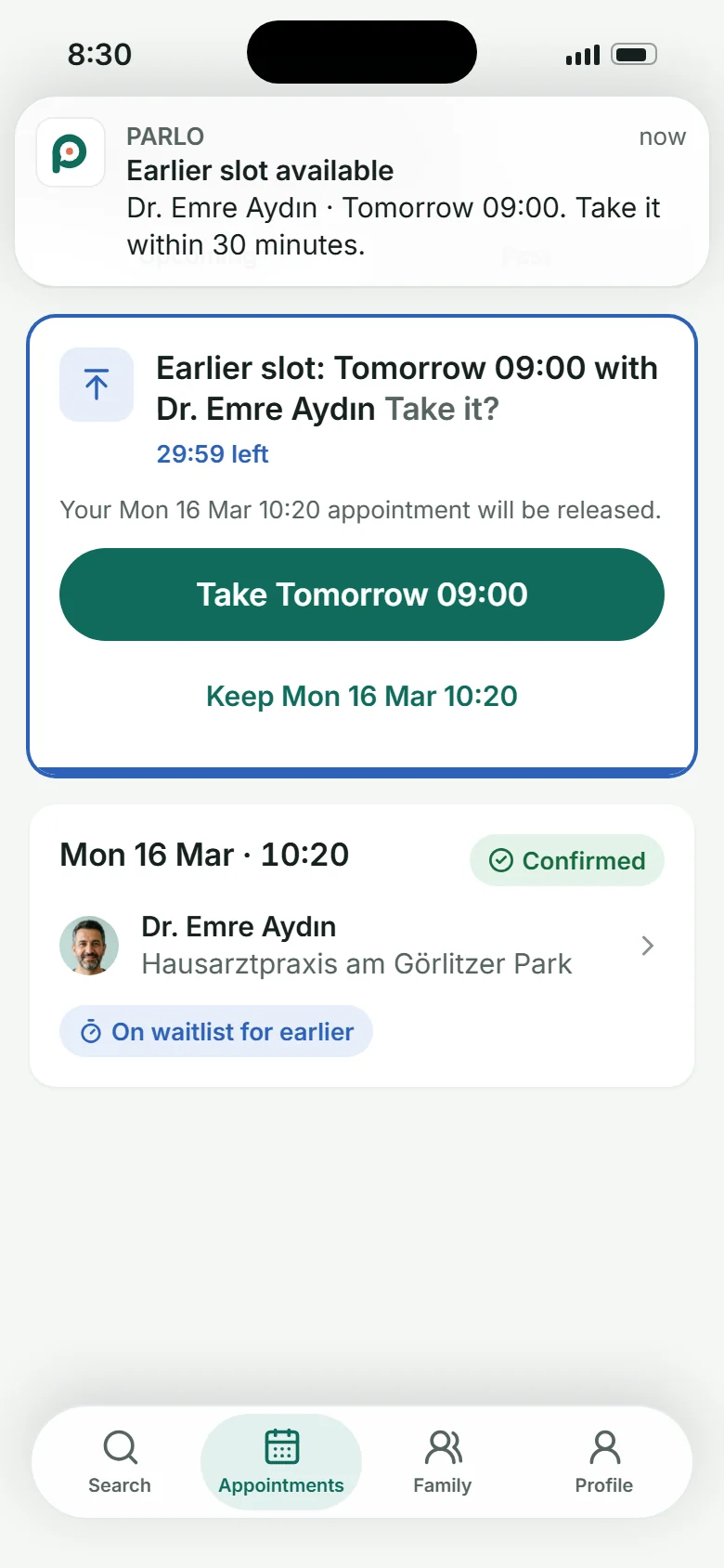
The scenario that proves the product: Anna cancels, Omar on the waitlist gets the slot, reception never picks up the phone, the doctor sees Omar's brief, and the practice counts one more slot saved. Every screen in the prototype serves a step in it.

Key decisions
Six decisions that carry the product.
01
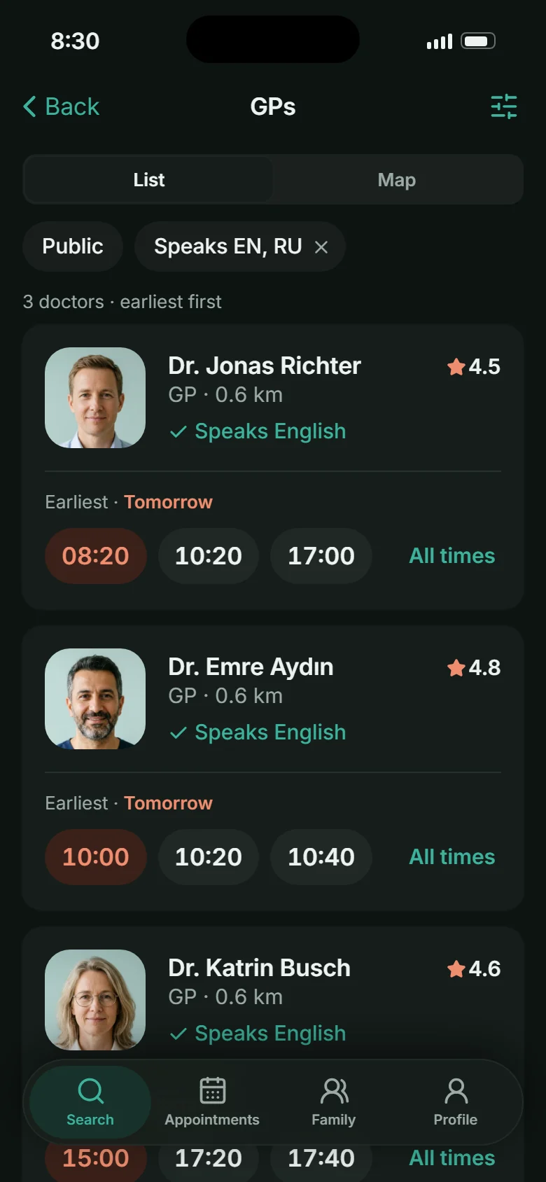
The card leads with the earliest slot
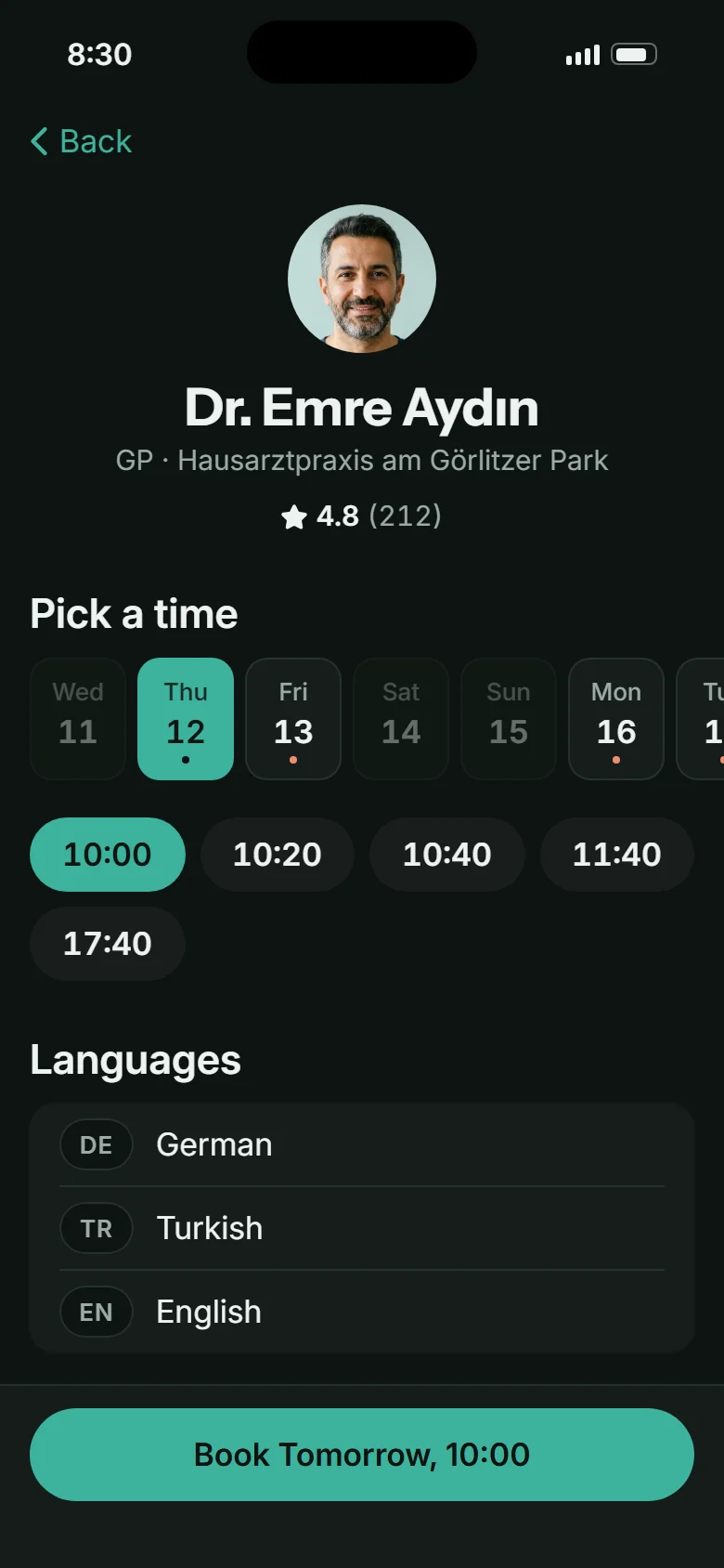
Three bookable times sit on every result. The first one is coral: the one colour that means “soonest”.
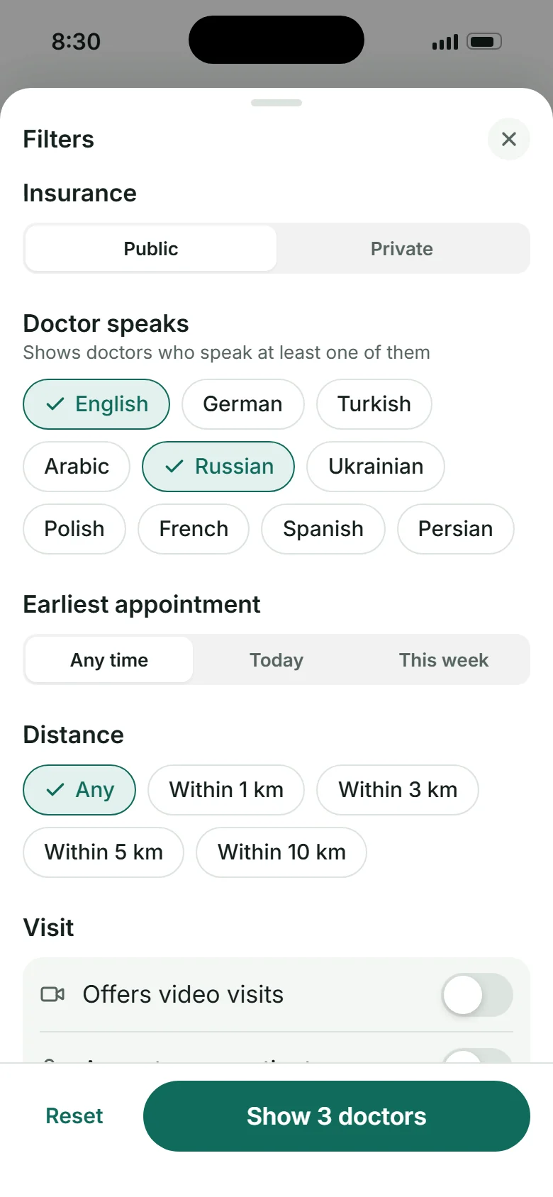
02
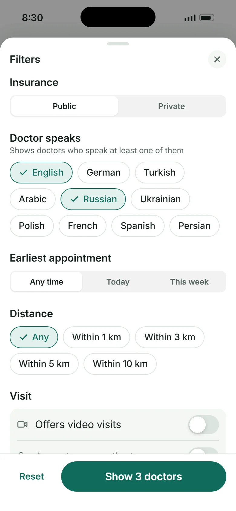
Language is a saved filter, shown as words
Anna sets English and Russian once. Every card says which of them the doctor speaks.
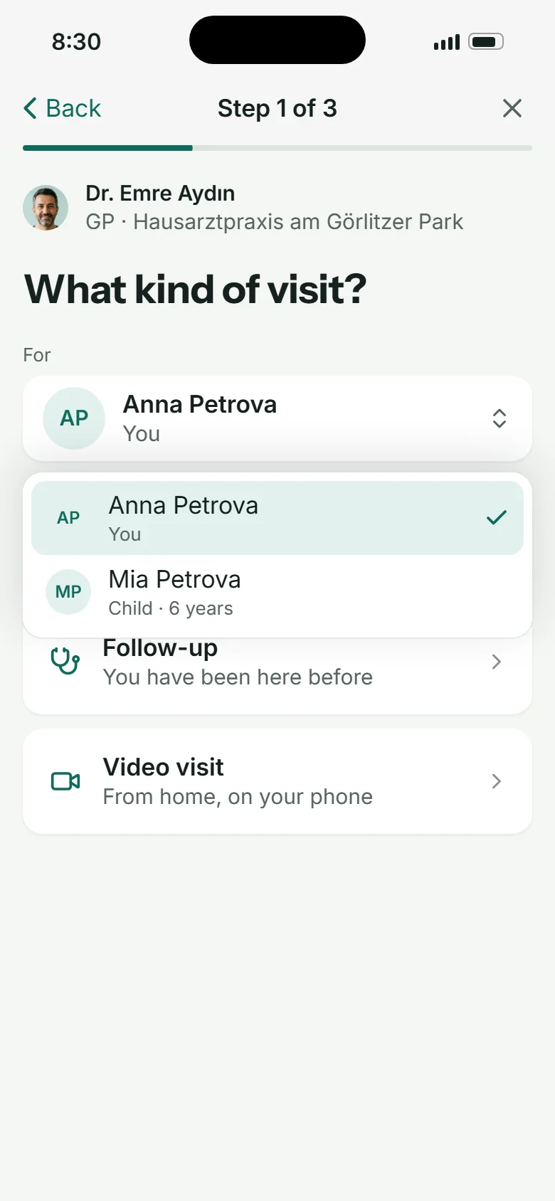
03
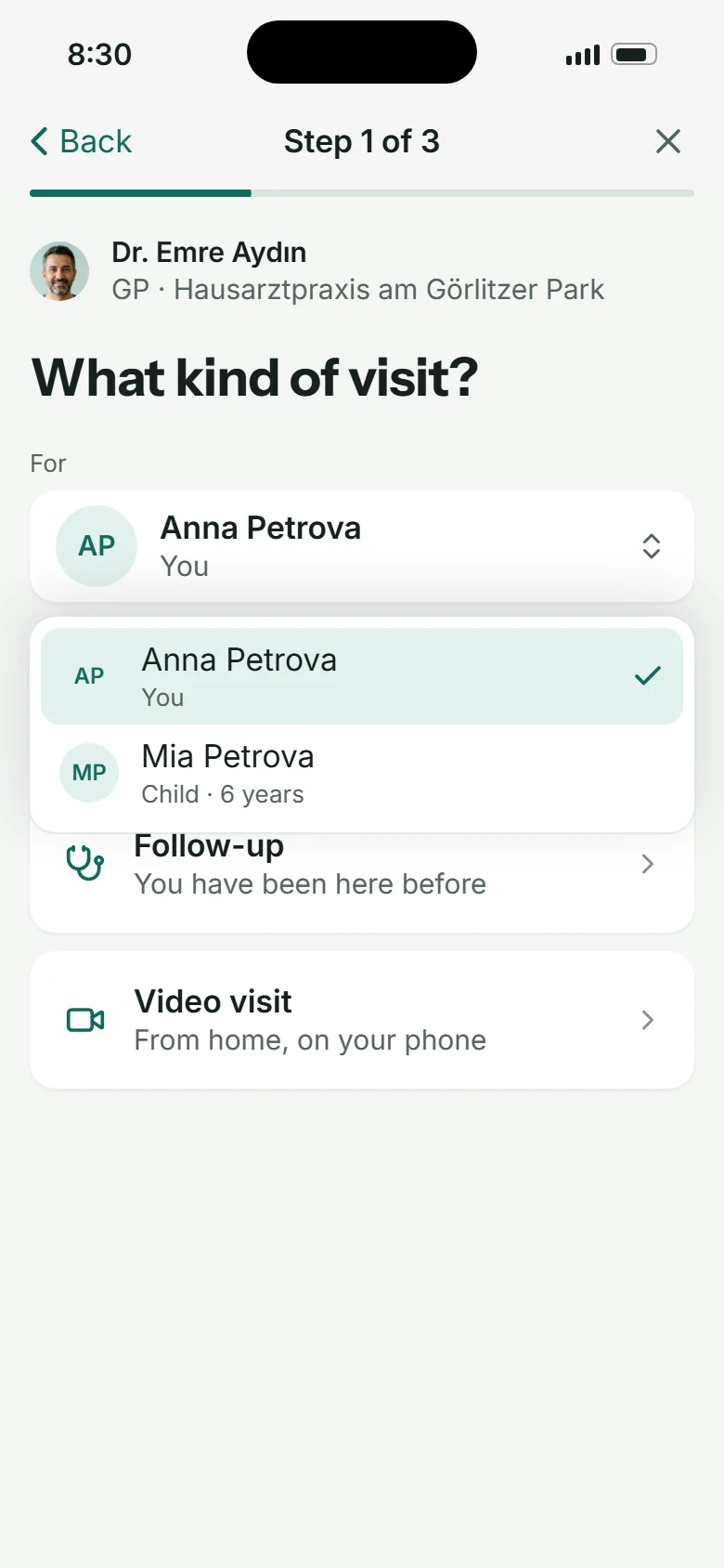
Book for anyone in the family
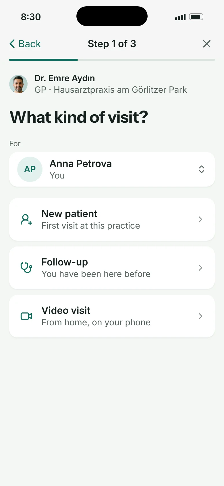
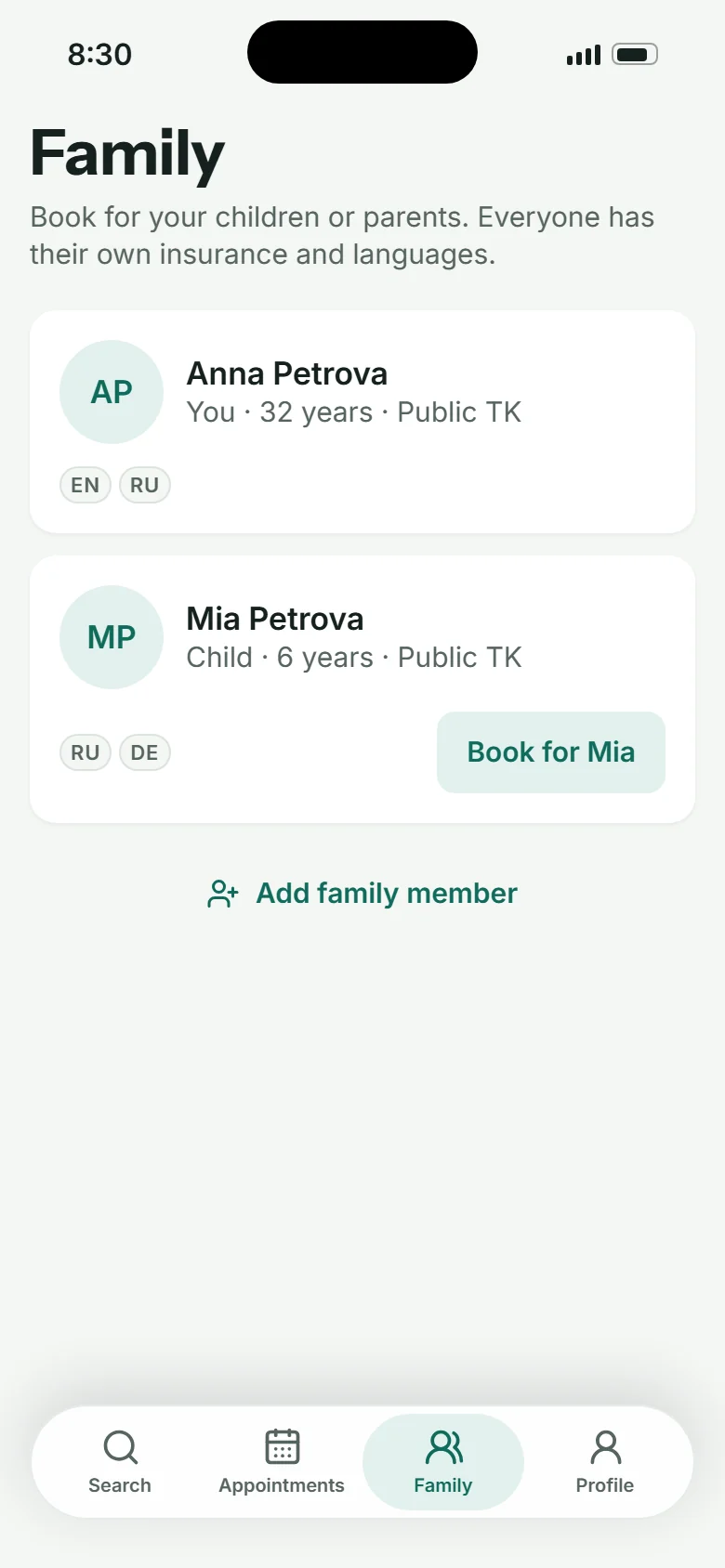
A pull-down instead of tabs: it works for one child or five relatives, each with their own insurance.
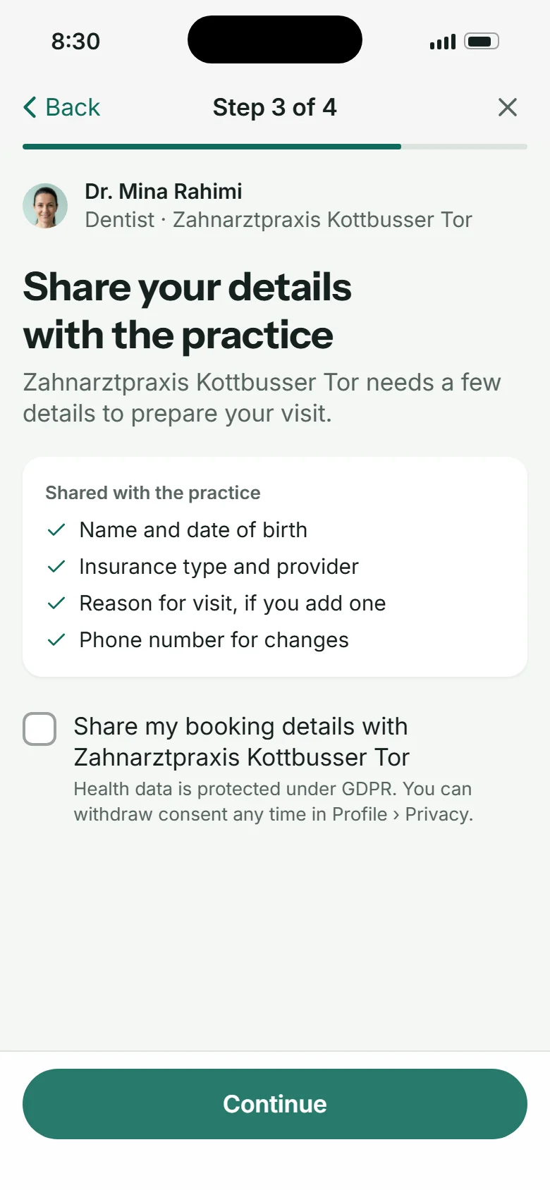
04
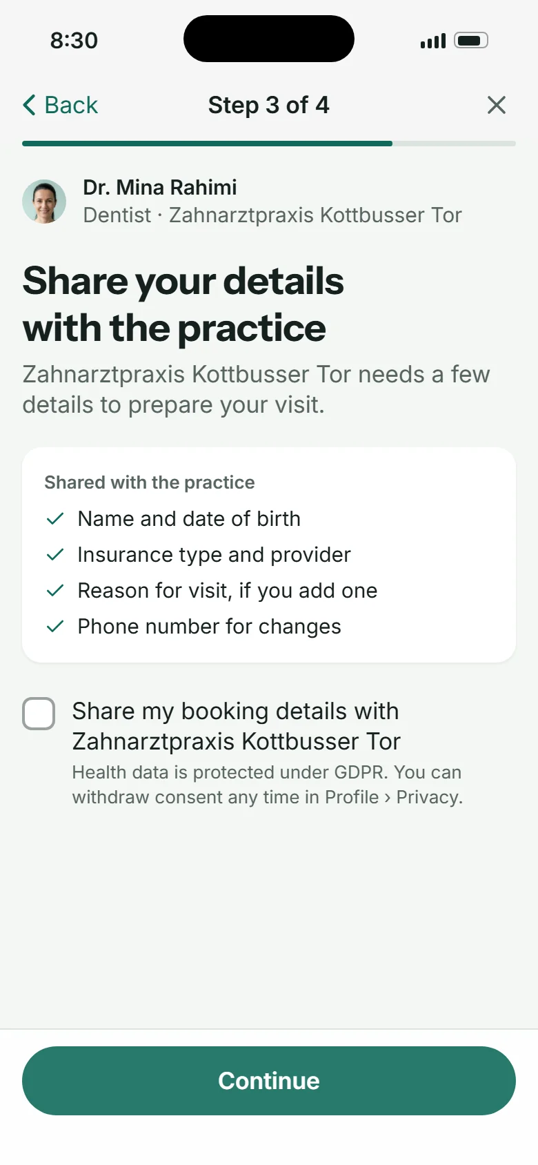
Consent before the first visit, reversible
A new practice sees nothing until the patient agrees, and the list of what is shared is right there.
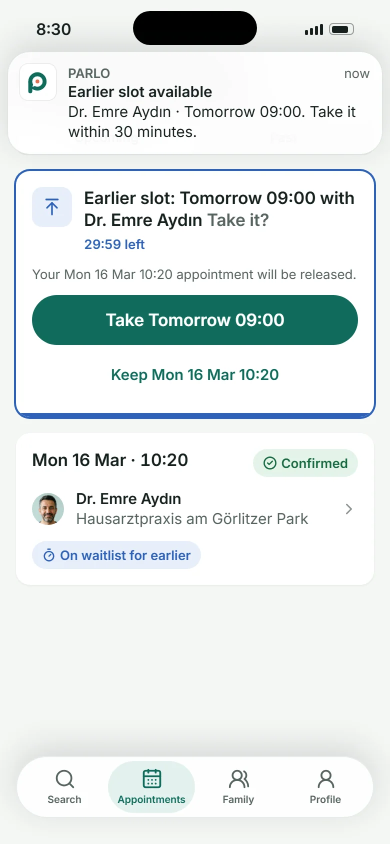
05
A freed slot is offered, not posted
Matched by doctor, insurance and language, with 30 minutes to take it. No refreshing, no calling.
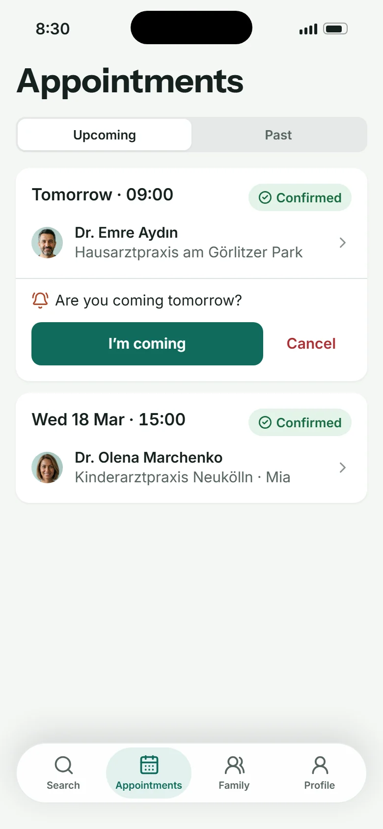
06
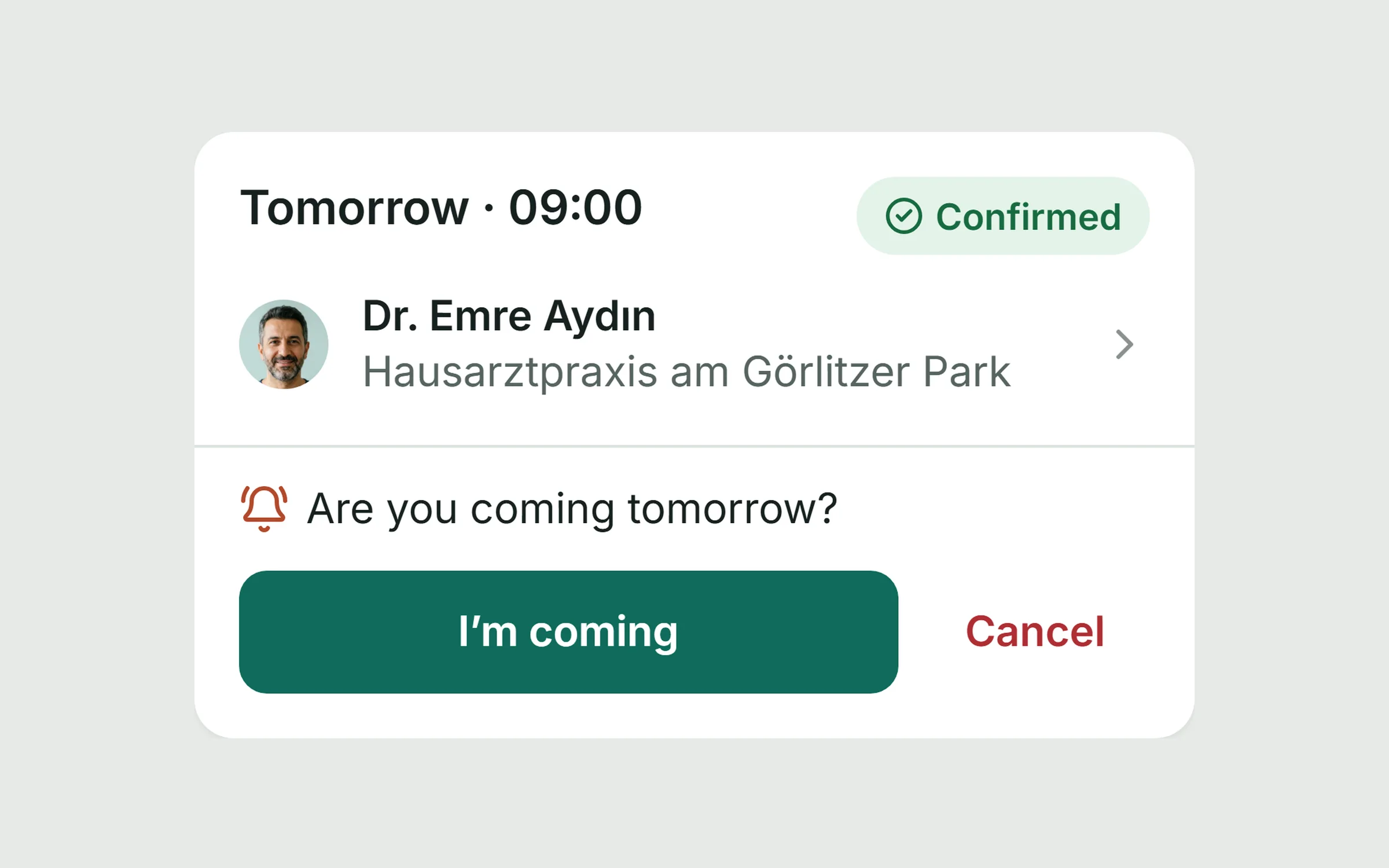
The day-before check lives in the card
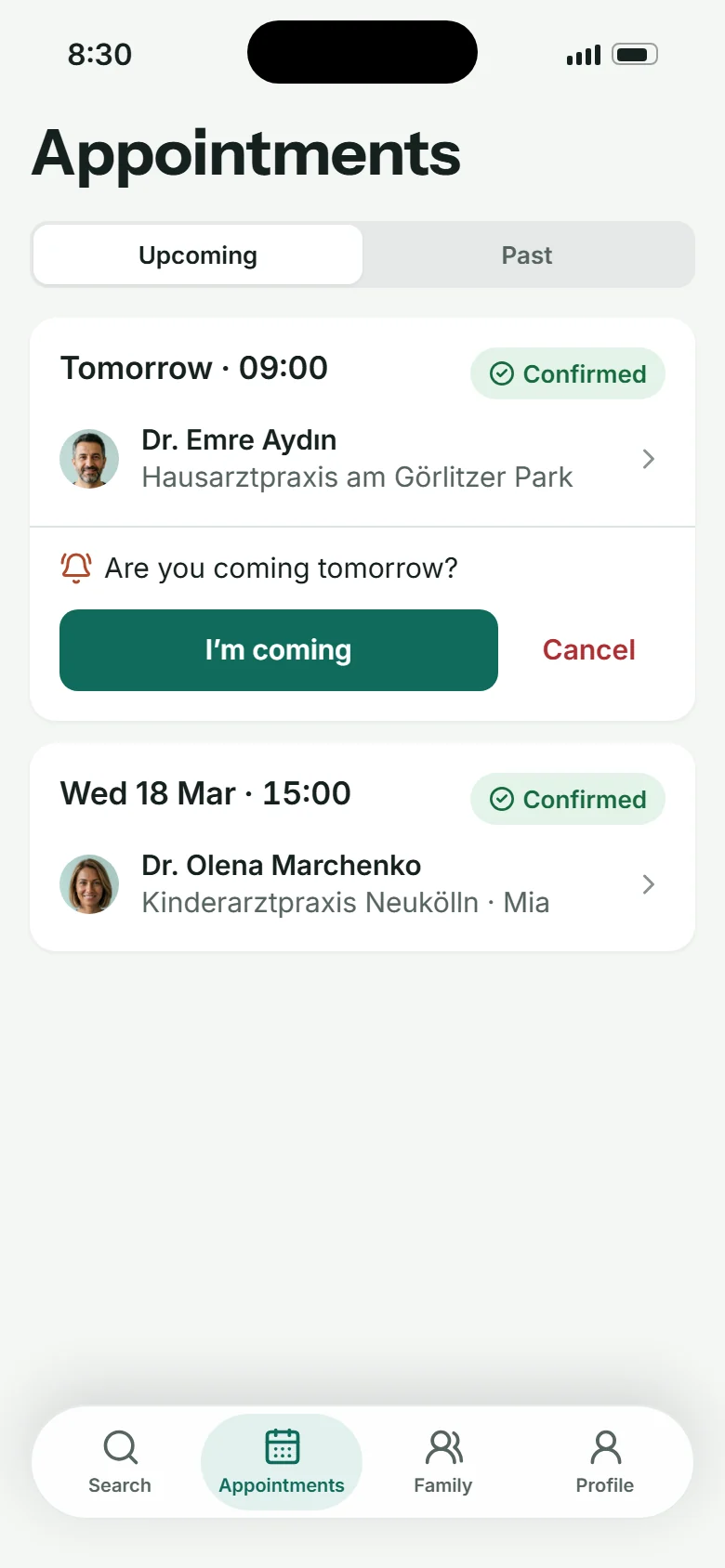
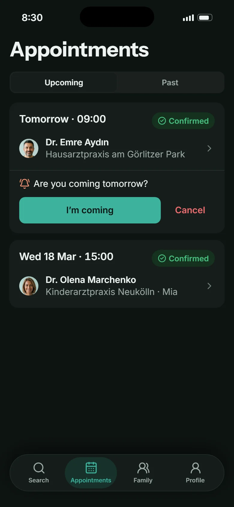
“Are you coming tomorrow?” sits inside the appointment, with one clear yes and a quiet way out.
Key flows
Four journeys, clicked through end to end.
Patient
Find and book
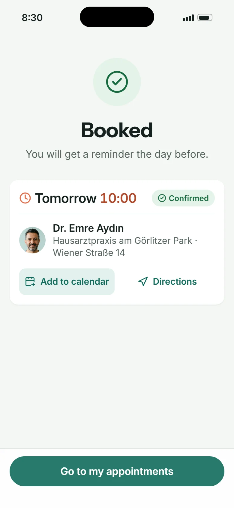
Search by specialty, symptom or name; results lead with the earliest real slot; booking is three or four short steps, with an account created inside the flow and consent only when a practice is new.
See the user flow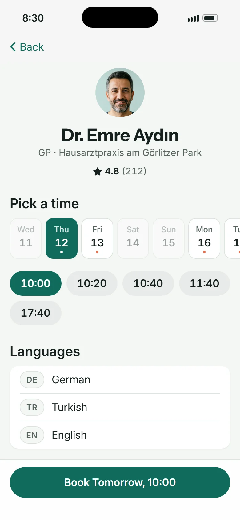
Patient
Manage, wait, review
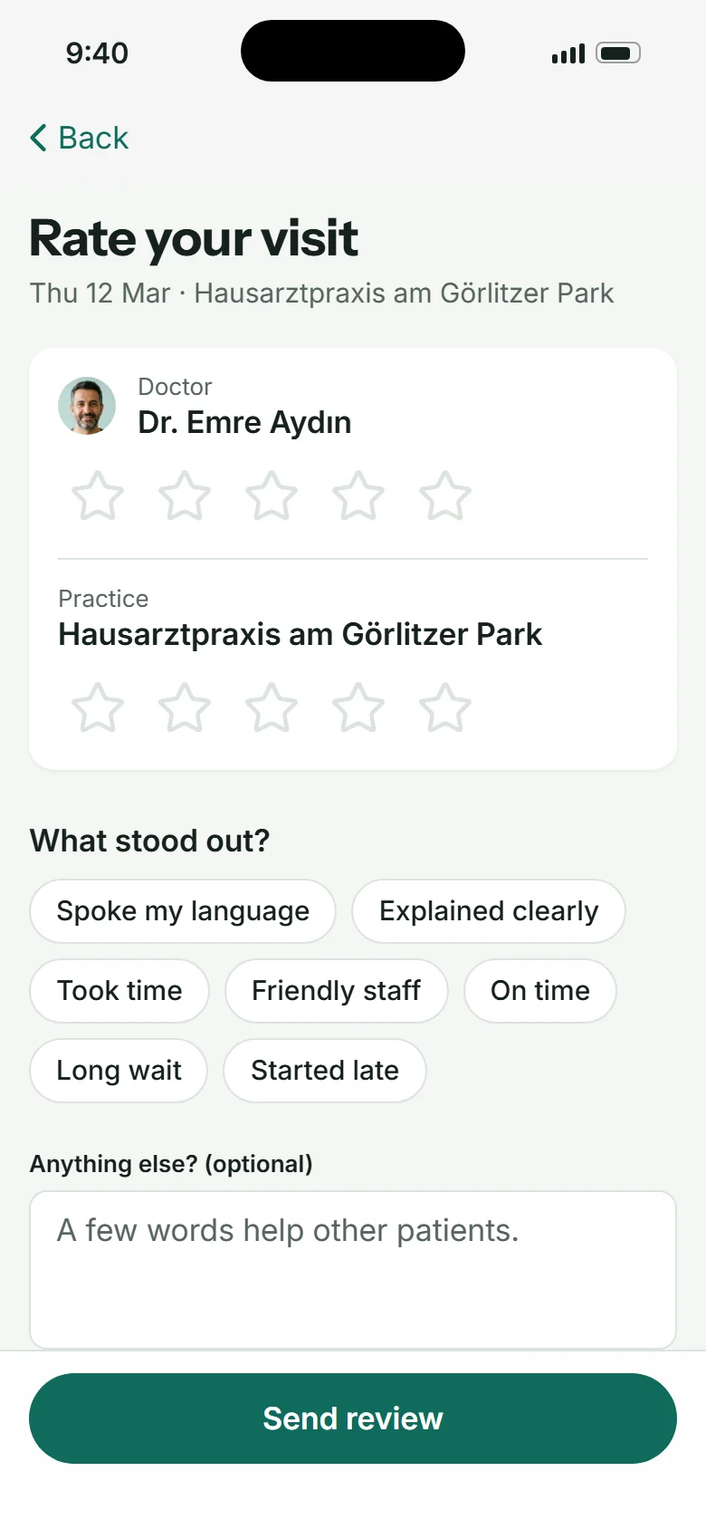
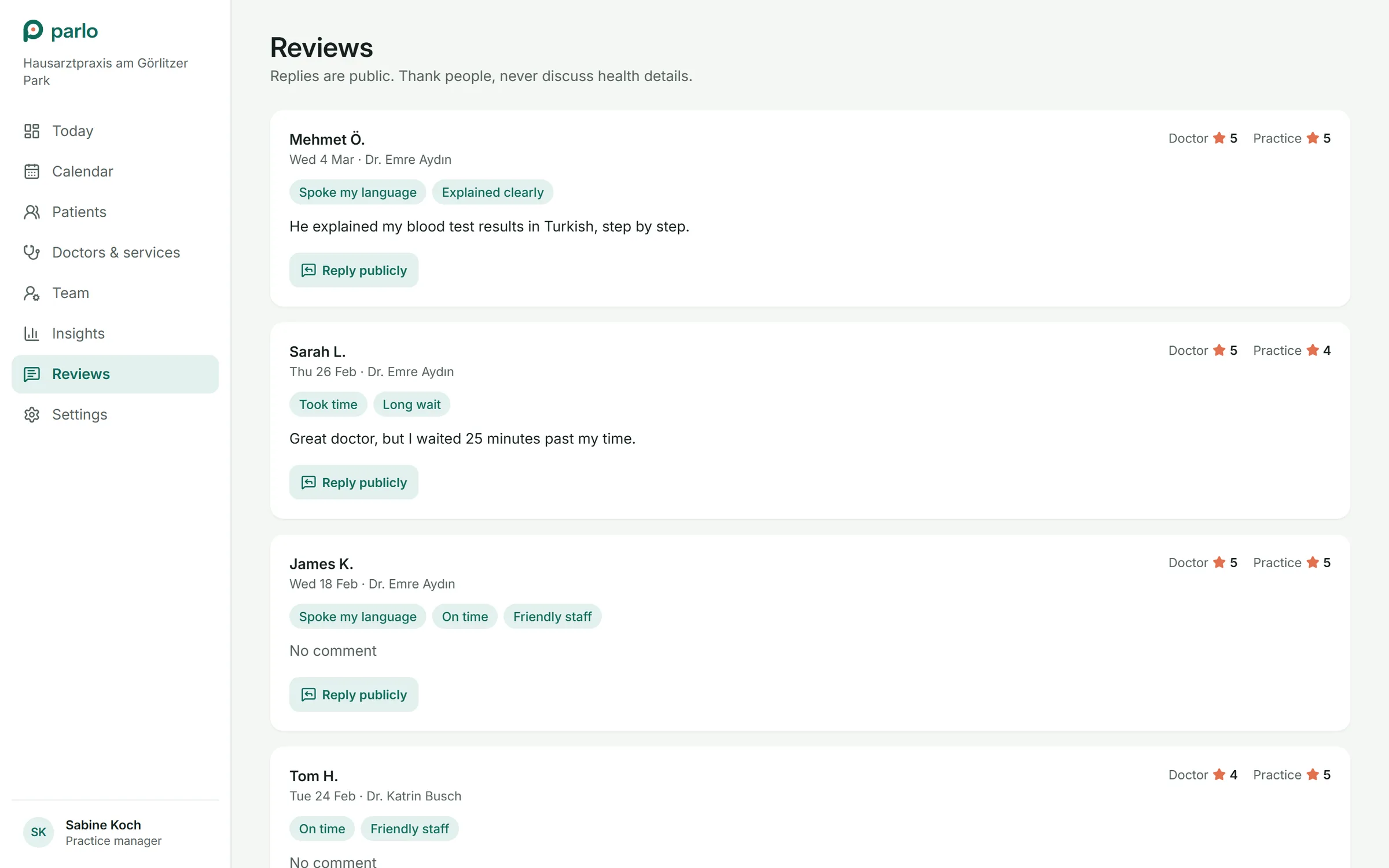
Reschedule or cancel without calling; join the waitlist for an earlier slot; confirm the day before, say you are running late, check in; afterwards rate the doctor and the practice separately, with reasons as chips.
See the user flow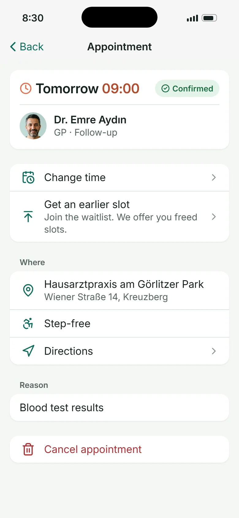
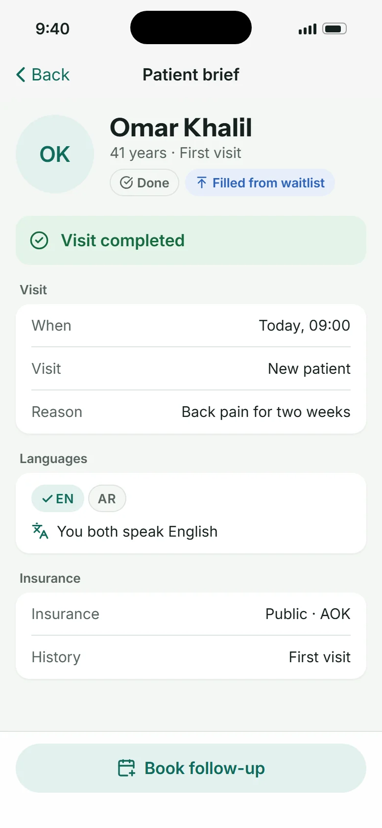
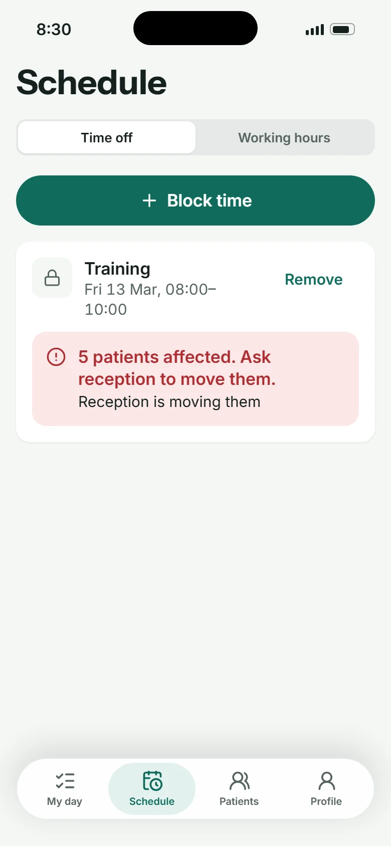
Doctor
My day
The next patient on top with time, languages and reason; a brief before the visit; start, complete, book a follow-up. If the day slips, one tap tells reception and the patients who are waiting.
See the user flow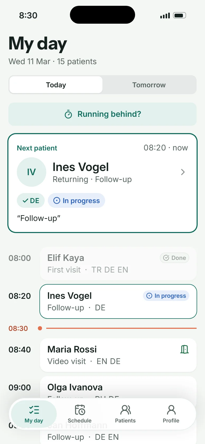
Practice
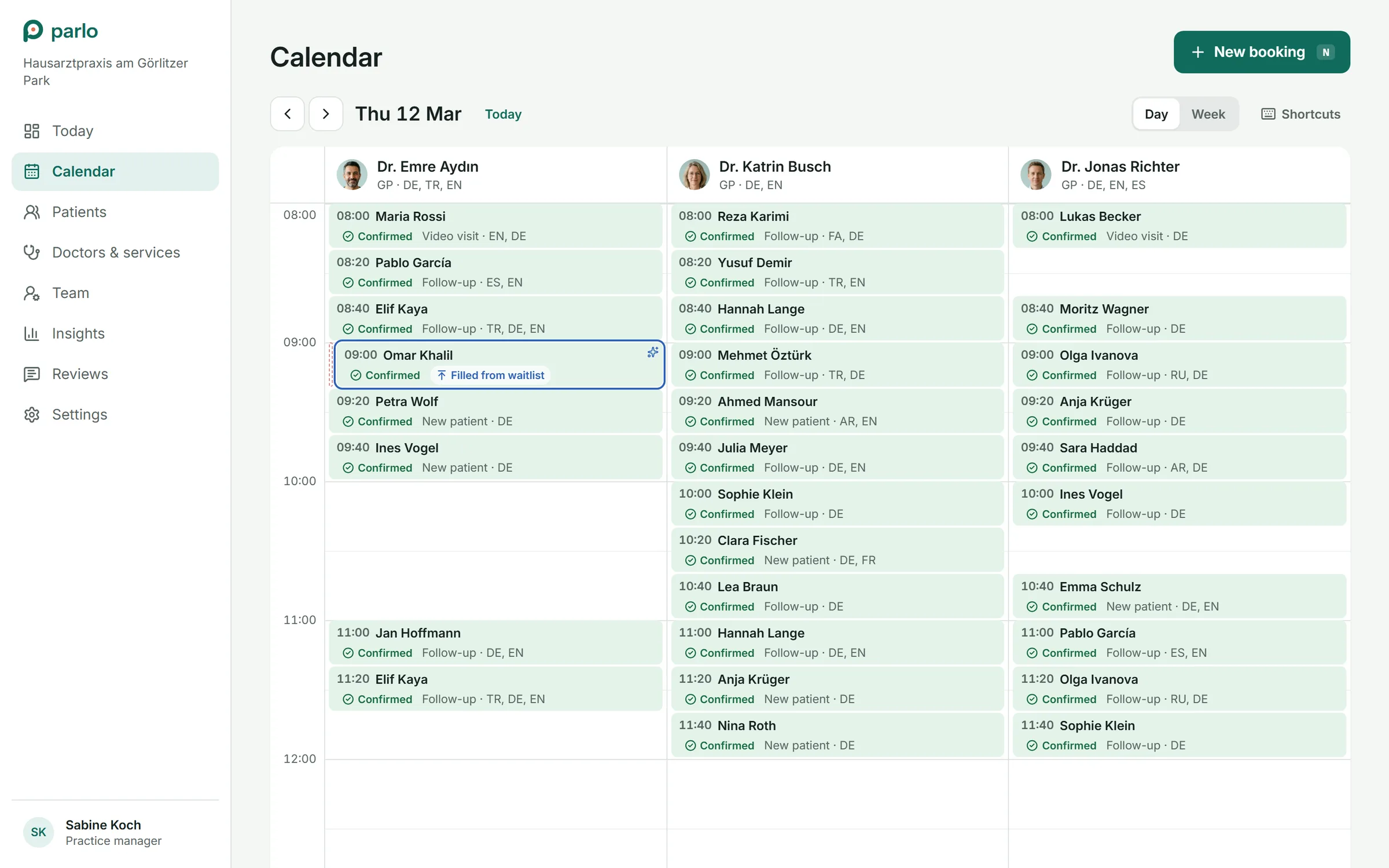
Run the day
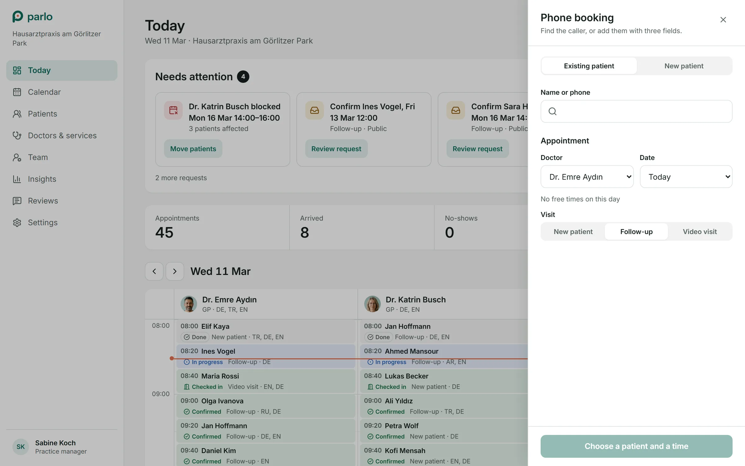
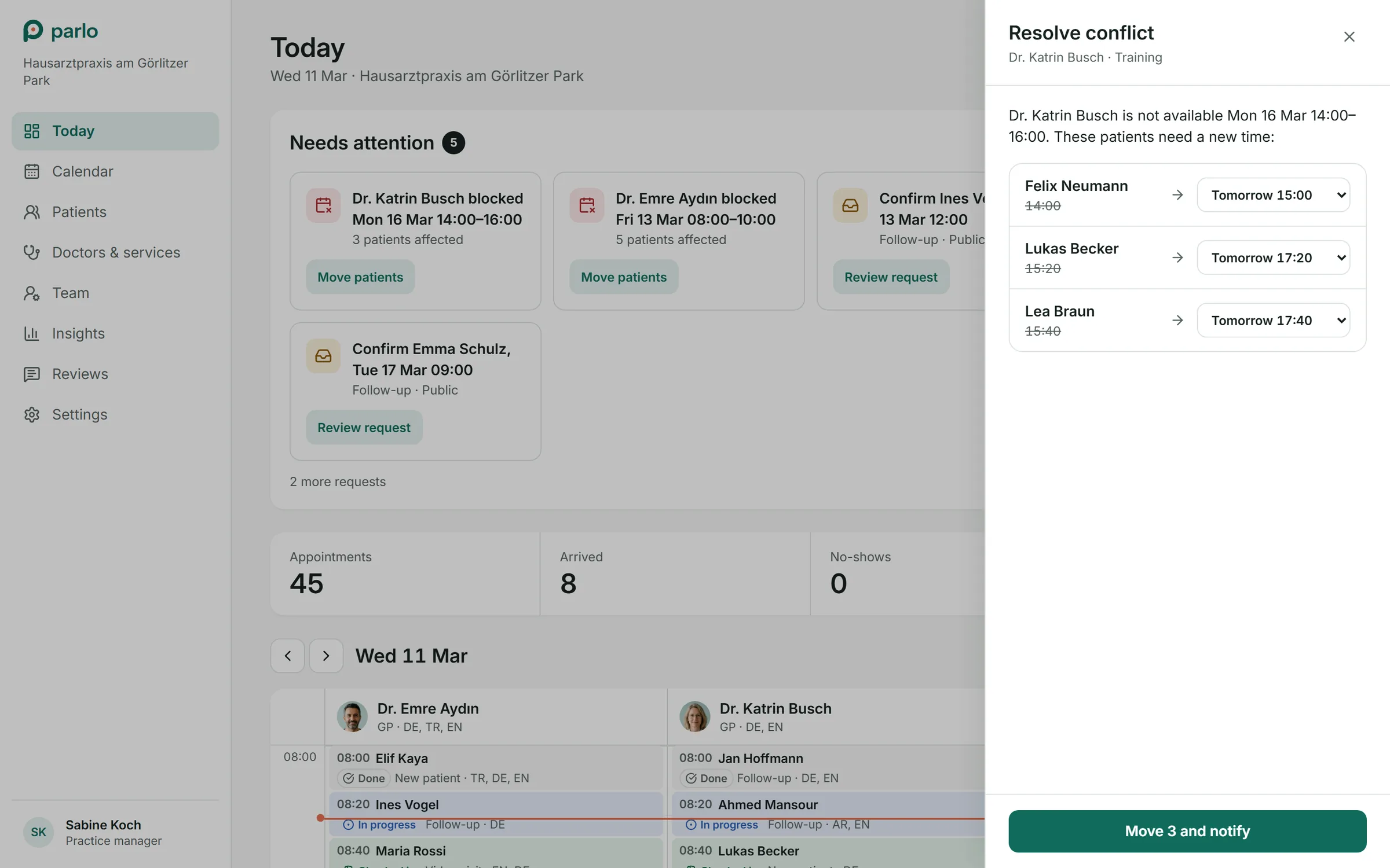
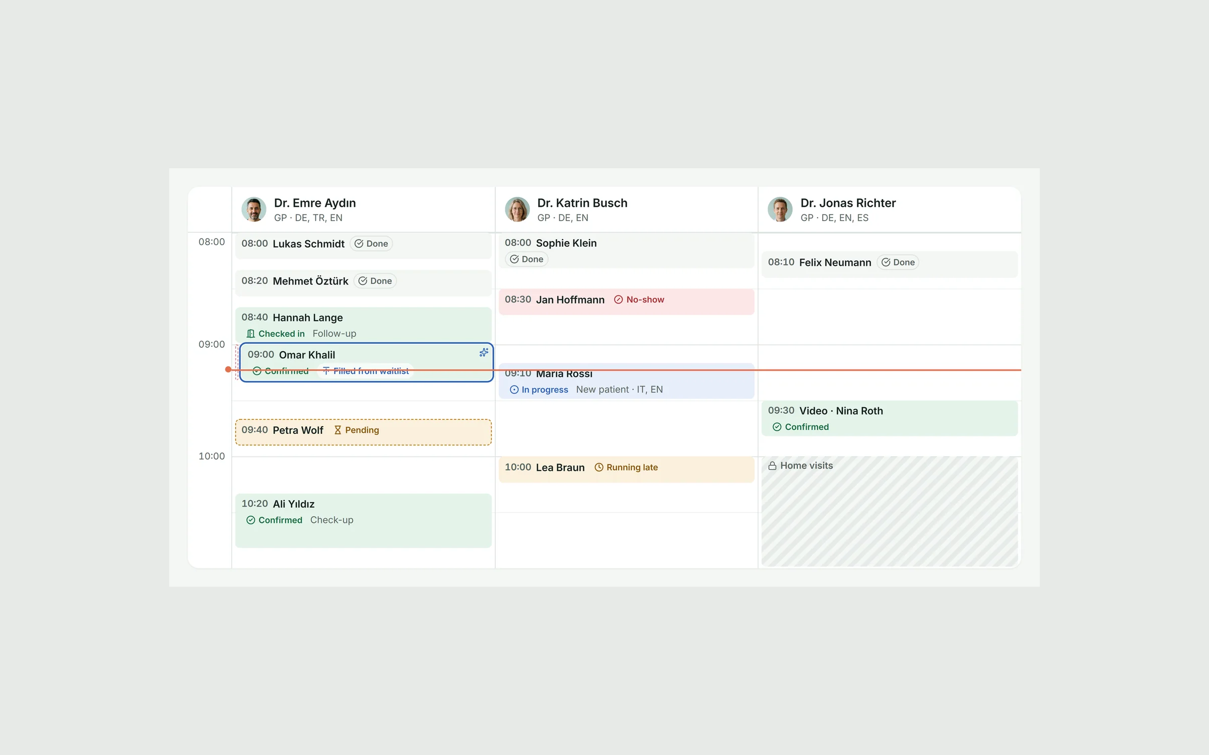
Today starts with what needs attention: requests to confirm, doctors who blocked time, late patients. The calendar shows every doctor side by side; phone bookings take three fields; moving patients notifies them in the same step.
See the user flow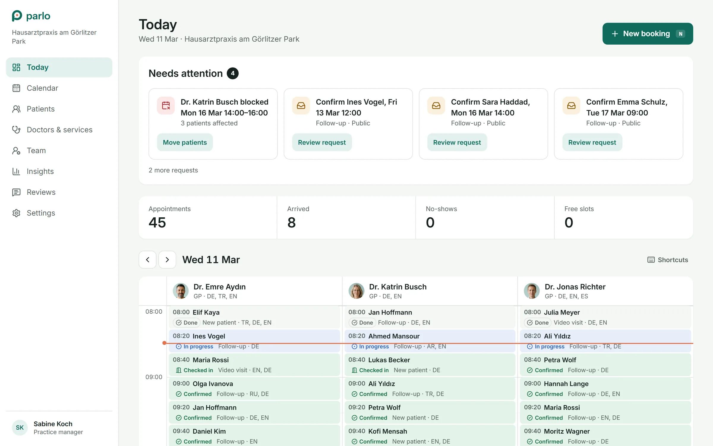
Also mapped and built
Practice onboarding
Sign up, verification, services, invite doctors, a checklist until the practice goes live in search.
See the user flowPatient account
Insurance, family, languages as a default filter, notifications, privacy with download and delete.
See the user flow
The practice
The same schedule, seen from reception.
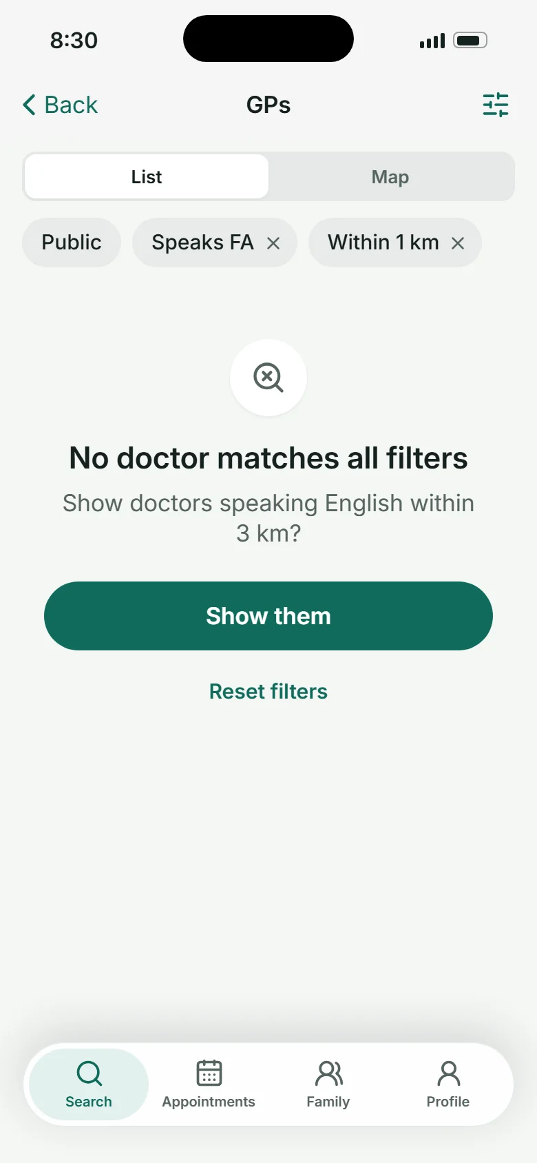
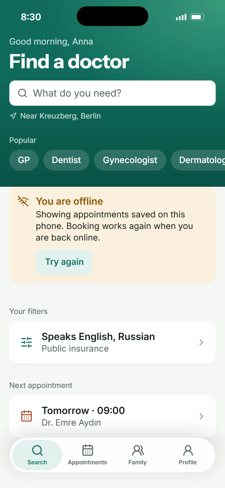
Hard states
The screens nobody plans, planned.
Design system
One token file drives the app, the web and Storybook.
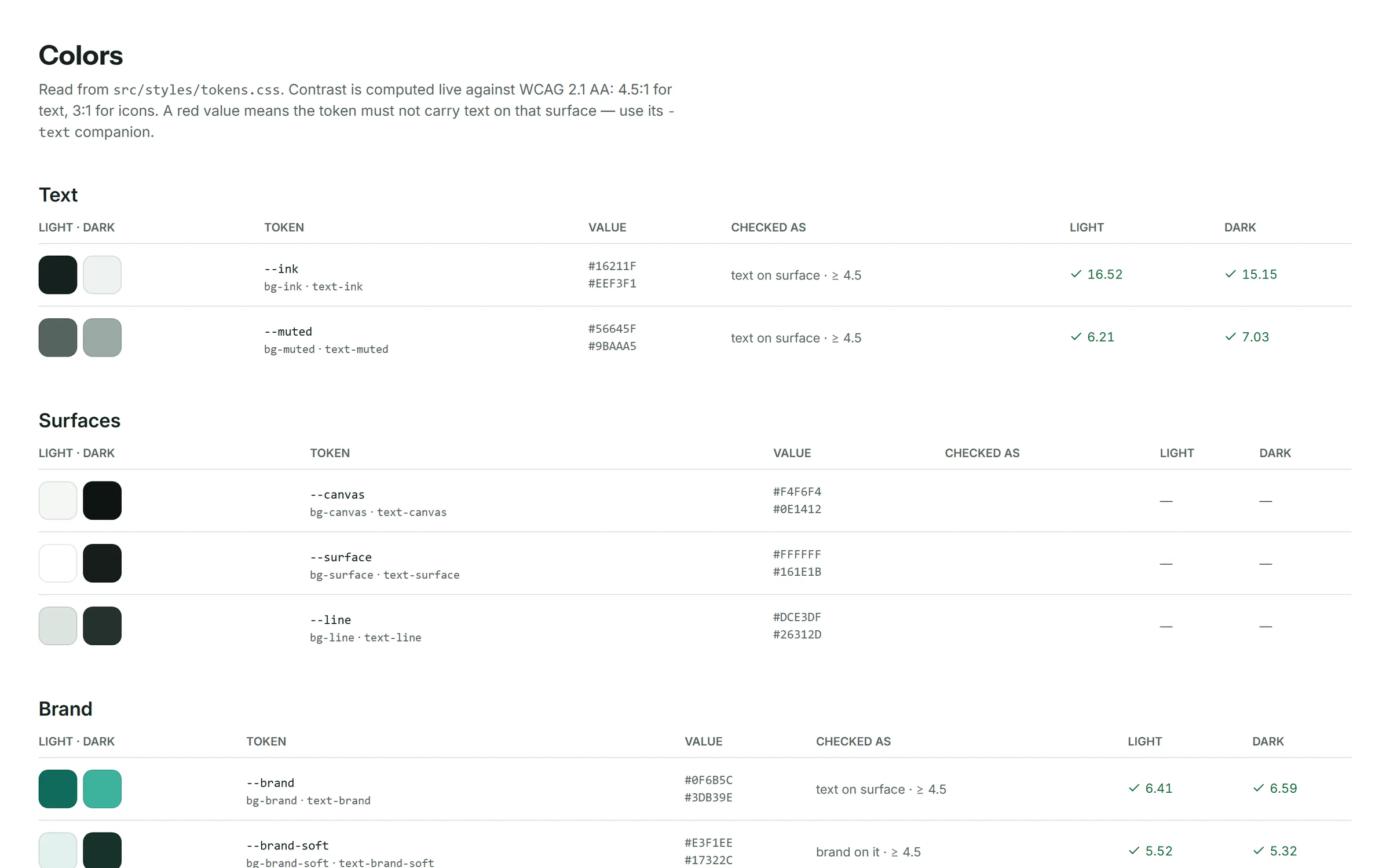
Brand green for what is yours, selected or navigation; coral, from the dot in the logo, only for “earliest”; everything else stays ink and grey, so colour keeps its meaning. iOS type scale with Inter, Instrument Sans for the wordmark. 35 components and patterns live in Storybook, with the real screens they come from.
- •Languages as codes and names, never flags
- •Status is always icon and words, never colour alone
- •Text tokens for every status colour, so text passes WCAG AA on light and dark
- •One icon size per role in a row, 44-point touch targets, tabular numbers for times


App icon: the mark on white, so it stays calm among bright health apps and still reads at small sizes.
- Parlo green#0F6B5C· from the logoBrand, selected, navigation, the home header
- Coral#E4704F· from the logoThe earliest slot. Nothing else is coral
- Confirmed#1E7F4BStatus: confirmed, done, all good
- Waiting#B8740AStatus: pending, running late
- Offer#2D62B8Waitlist offers and information
Validation
How I checked it.
The prototype is the spec, so I tested the prototype, not the mockups.
The hero scenario, end to end
Clicked across all three roles from a fresh load: cancel, offer, accept, filled from waitlist, brief, visit, review, insights. State is shared, nothing is faked between screens.
Every edge case by link
13 scenarios open straight from a URL: offer, filled, running late, conflict, no match, offline, onboarding, empty. Reviews and demos start from the same state every time.
Contrast in light and dark
Colour tokens are checked against WCAG 2.1 AA in both themes; status colours got separate text tokens where the fill was too light for text.
German on every screen
Every screen checked in German for overflow and truncation. Long compound words and longer labels shaped several layouts.
Outcome
What exists today.
3
roles in one clickable scenario, sharing one schedule
30+
screens on phone and web, in light and dark
35
components and patterns documented in Storybook
13
scenarios reachable by link
2
interface languages: English and German
42
screens shot automatically from the prototype for this case
How we'll know it works
Targets to set with pilot practices for launch, not results.
Time from search to a booked appointment
Earliest slot on the card and booking without a separate sign-up should make this fast
Target< 2 min
Cancelled slots refilled from the waitlist
Matched offers with a 30-minute window instead of an empty chair
Target50%
Bookings and moves without a phone call
Phone time is reception's biggest cost
Target70%
No-show rate
Day-before check, running-late and check-in in the same app
Target−30%
Reviews that mention “Spoke my language”
The promise of the product, measured in patients' own words
TargetTracked
Key takeaways
Three things this project taught me.
- 01
Language is a feature, not a filter
Once language sat on every card, matched to the patient, the rest of the flow could stay ordinary. One attribute, shown everywhere, changed the product.
- 02
Design the handoffs, not the screens
The hardest part was the space between roles: a cancellation becoming someone else's appointment without anyone calling anyone.
- 03
AI moved the work from pictures to behaviour
Building with AI let me test timing, shared state and edge cases instead of describing them. The questions changed from “does it look right” to “does it behave right”.
Try it yourself
Switch between patient, doctor and practice in the live prototype, play the waitlist scenario, or read the design system.